Chart
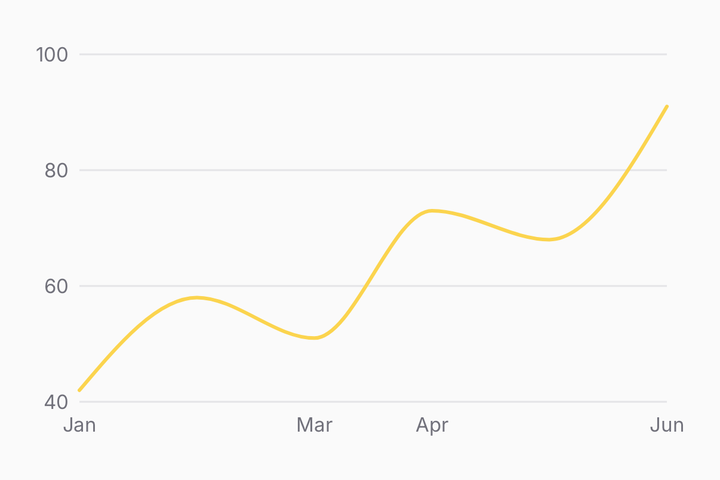
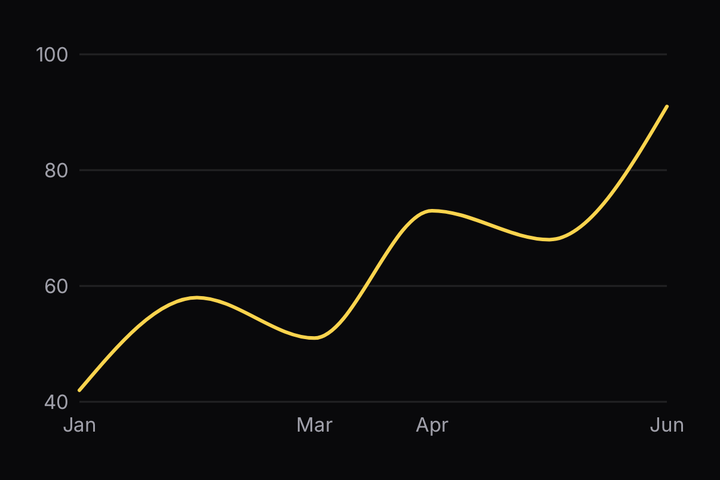
Skia charts — line, area, bar, scatter, candlestick and pie — skinned with the theme's five-colour series ramp.
Installation
Chart ships with the library — install it once, then import:
import { Chart } from "@delacour/react-native-ui/chart";Or copy the source into your project, to own and edit it:
bunx delacour@alpha add chartUsage
import { Chart } from "@/components/ui/chart";
import { View } from "react-native";

const rows = [
  { month: "Jan", revenue: 186 },
  { month: "Feb", revenue: 305 },
  { month: "Mar", revenue: 237 },
  { month: "Apr", revenue: 273 },
  { month: "May", revenue: 209 },
];

export default function Example() {
  return (
    <View className="flex-1 justify-center p-4">
      <Chart config={{ revenue: { label: "Revenue" } }} data={rows} xKey="month">
        <Chart.Grid />
        <Chart.YAxis />
        <Chart.XAxis />
        <Chart.Line yKey="revenue" />
      </Chart>
    </View>
  );
}
Two roots. Chart is every cartesian plot — anything with an x and a y — and PieChart is the
one that has neither. They share the palette, the legend and the font, and nothing else.
Line
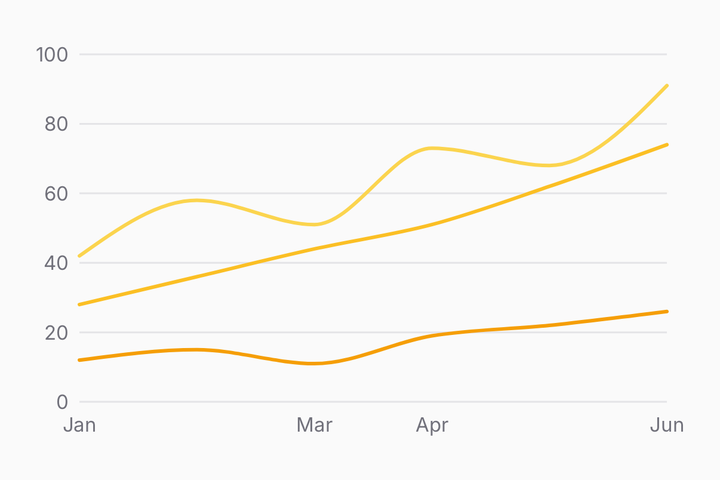
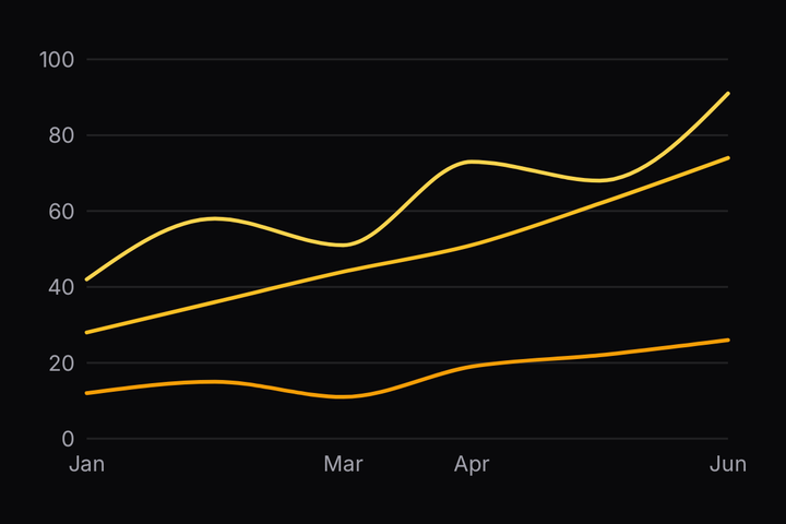
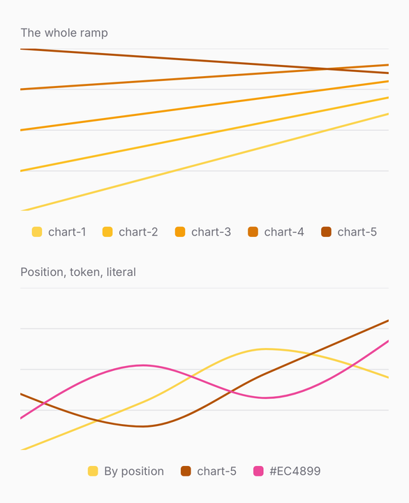
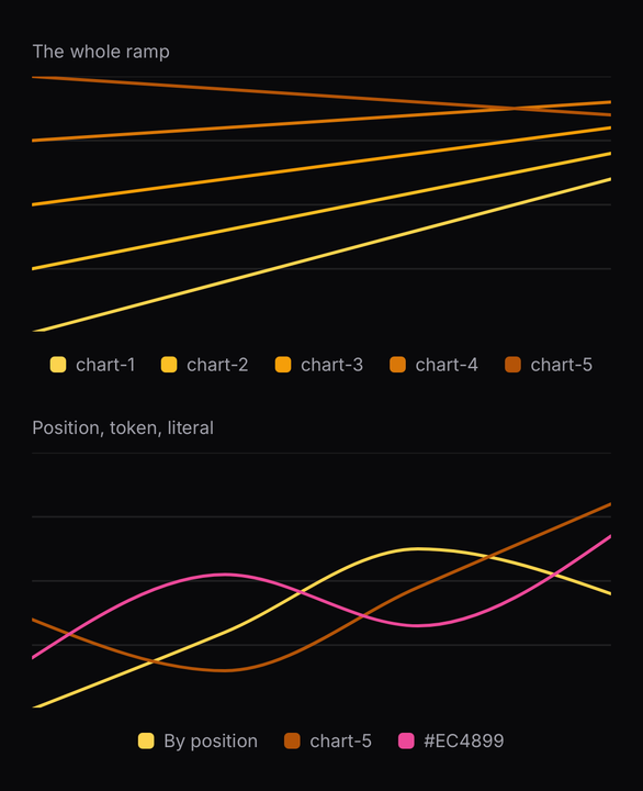
config names each series, sets the draw order, and hands out the theme's ramp by position — so a
mark names the data and never the paint. The shape is shadcn's, which means a chart config written
for a web dashboard moves across as a copy rather than a translation.
const config = {
  desktop: { label: "Desktop" },                    // chart-1, by position
  mobile:  { label: "Mobile",  color: "chart-4" },  // an explicit ramp slot
  tablet:  { label: "Tablet",  color: "primary" },  // any token the theme emits
  other:   { label: "Other",   color: "#EC4899" },  // a literal, straight through
};
The ramp stops at five and cycles. That is not an arbitrary limit: --chart-1 through --chart-5
are what a shadcn palette declares, so a sixth token would leave every pasted theme drawing five
themed series and one stranger. Past five, name the colours.
At most eight distinct token-valued colours resolve in one render, and the component throws by name past that. The ramp dedupes, so twenty series walking it cost five. Literal colours bypass the lookup entirely, so a chart of twenty literal-coloured series is fine.
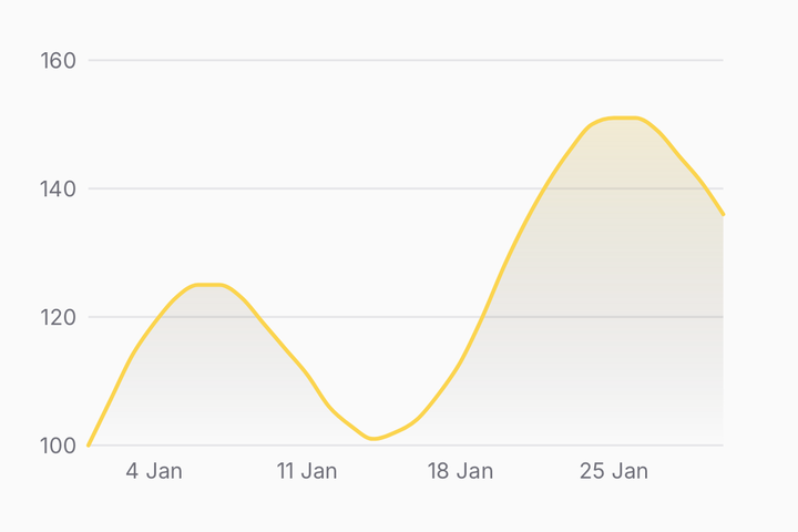
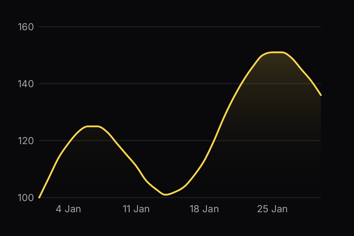
A Date in the x field makes a time axis. The ticks land on calendar boundaries and print as
20 Jan, and the tooltip heading prints the same way.
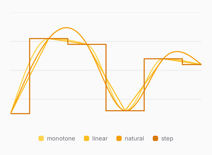
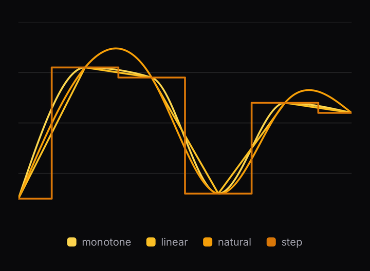
<Chart curve="step" />
<Chart.Line curve="linear" yKey="visits" />
curve is set on the chart and overridden per mark. monotone, the default, cannot overshoot a
point, which is the one a line of real data wants.
Area
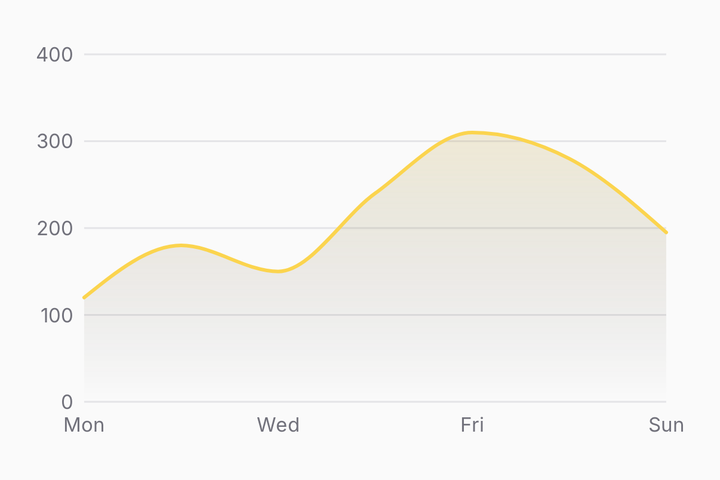
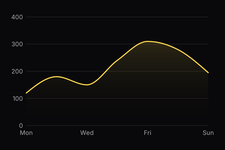
<Chart config={config} data={rows} includeZero xKey="day">
  <Chart.Area yKey="visits" />
  <Chart.Line yKey="visits" />
</Chart>
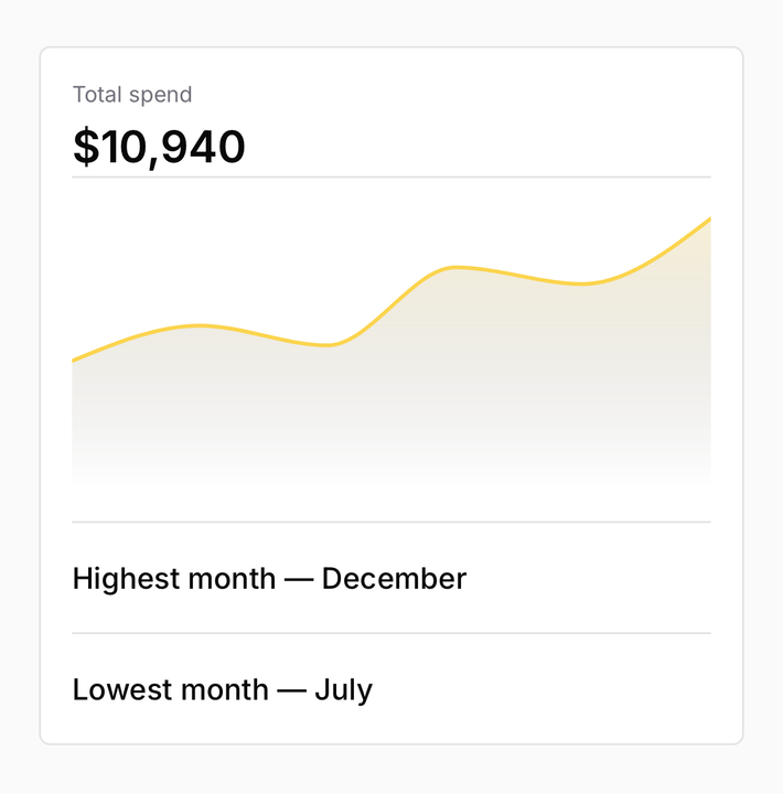
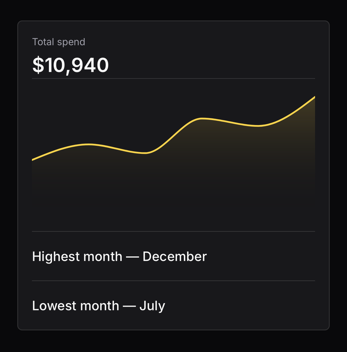
Chart.Area fades the series' own colour out towards the baseline rather than painting it flat — a
flat fill at any readable opacity competes with the line above it.
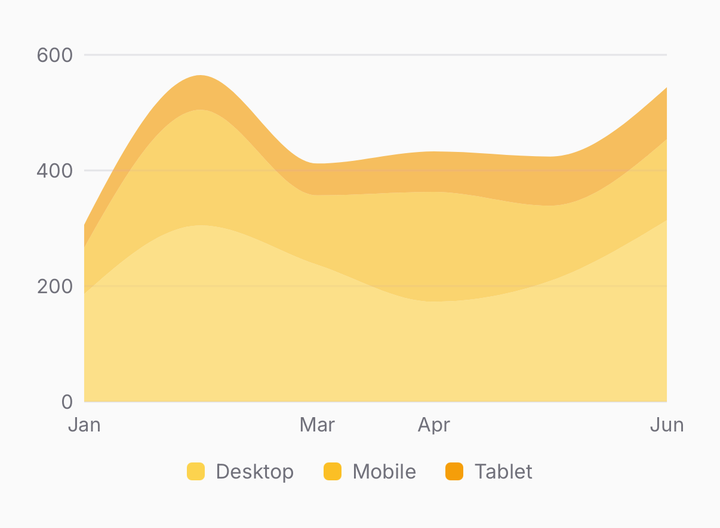
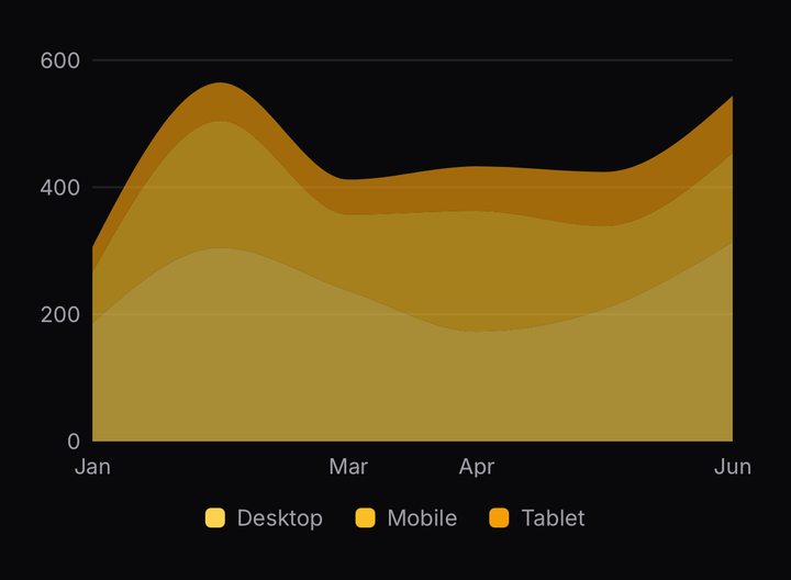
<Chart.Area stackId="devices" yKey="desktop" />
<Chart.Area stackId="devices" yKey="mobile" />
<Chart.Area stackId="devices" yKey="tablet" />
Areas naming the same stackId stand on one another: each is the band from the top of the series
below to its own running total, so the topmost edge reads as the sum. The stack is built in data
space, which is what lets the y domain cover the totals rather than the tallest single series.
Bar
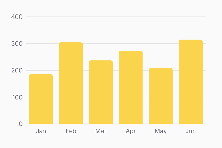
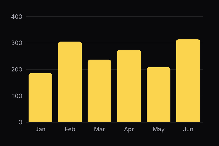
<Chart config={{ orders: { label: "Orders" } }} data={rows} xKey="month">
  <Chart.Grid />
  <Chart.YAxis />
  <Chart.XAxis />
  <Chart.Bar yKey="orders" />
</Chart>
Placing a Chart.Bar pulls zero into the y domain on its own — a bar that does not start at zero
is a lie about its length. The value end follows --radius at the chart's size, so a theme that
squares its buttons squares its bars.
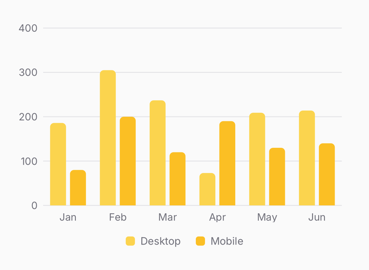
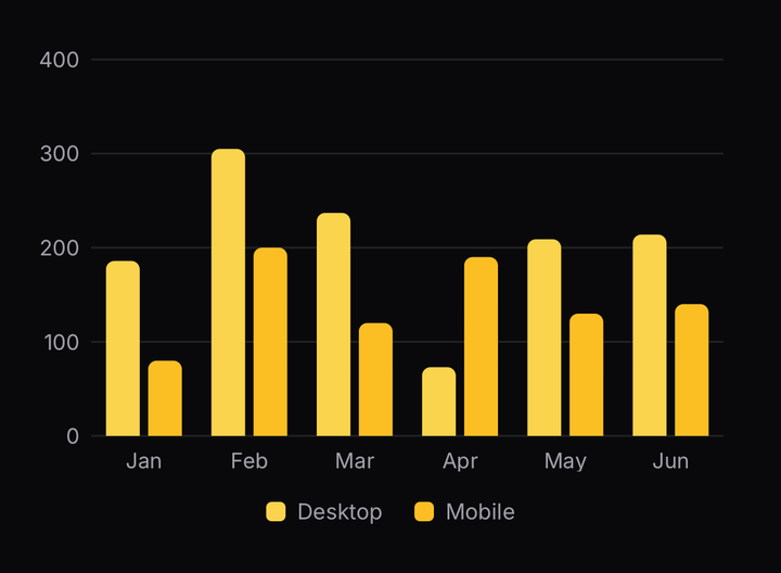
<Chart.Bar yKey="desktop" />
<Chart.Bar yKey="mobile" />
Two Chart.Bars that are siblings share each step between them. Nothing names the group — being
placed together is what groups them. That is also why a Chart.Bar wrapped in a component of your
own never groups: the root collects its direct children, and a wrapper hides the bar from it.
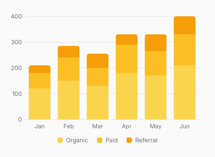
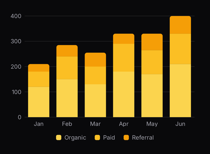
<Chart.Bar stackId="traffic" yKey="organic" />
<Chart.Bar stackId="traffic" yKey="paid" />
<Chart.Bar stackId="traffic" yKey="referral" />
Bars naming the same stackId stand on one another, first placed at the bottom, so the top of each
column reads as the total. Only the outermost segment is rounded, so a column reads as one bar
rather than a pile of pills.
One stack per chart. A second stackId, a stack beside a loose bar, or an area stack beside a
bar stack all throw by name. Throwing beats drawing something that looks stacked and is not.
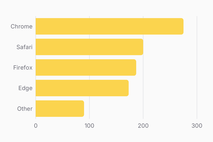
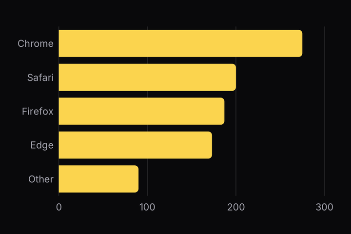
<Chart config={config} data={rows} orientation="horizontal" xKey="browser">
  <Chart.Grid axis="x" />
  <Chart.YAxis />
  <Chart.XAxis />
  <Chart.Bar yKey="visitors" />
</Chart>
orientation="horizontal" swaps the axis roles: the categories run up the left and the bars grow
rightward from them. Chart.YAxis and Chart.XAxis keep their names — each labels the axis it
sits beside, whichever field that axis now carries.
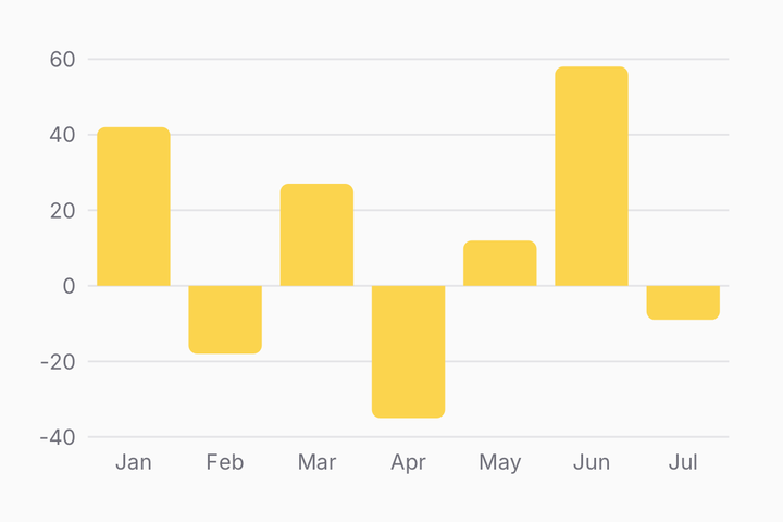
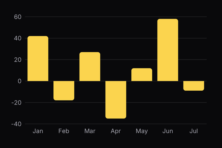
A negative value hangs from the baseline instead of standing on it, and its rounded end is the one furthest from zero. The baseline sits where zero falls in the domain, so a chart of mixed signs draws it through the middle of the plot.
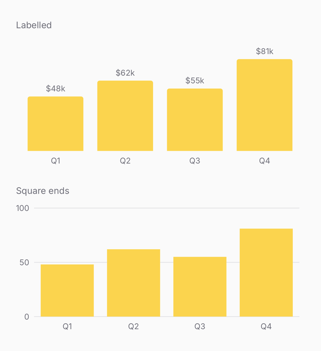
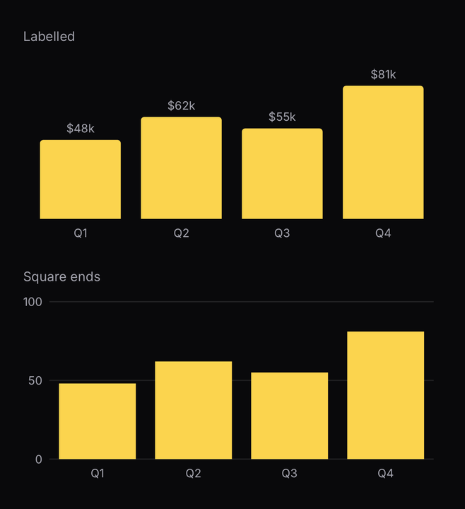
<Chart.Bar labels={(value) => `$${value}k`} yKey="revenue" />
<Chart.Bar rounded={false} yKey="revenue" />
labels prints each value against its bar, in the axis colour and the axis font. A grouped or
stacked chart draws no labels whatever is passed — there is no room between the bars for them to
read. rounded={false} squares the value end; a number is an exact radius in points.
<Chart.Bar yKey="desktop" />
<Chart.Bar yKey="mobile" />
<Chart.Tooltip.X />
<Chart.Tooltip />
Over bars, Chart.Tooltip.X is a translucent band one step wide rather than a rule, so it picks
out the whole column the readout names. The band always snaps — one that glided between columns
would highlight half of two bars. Pass band={false} to get the hairline back, or band on a
line chart to get the wash.
Scatter
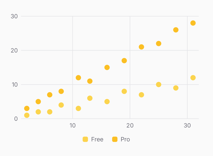
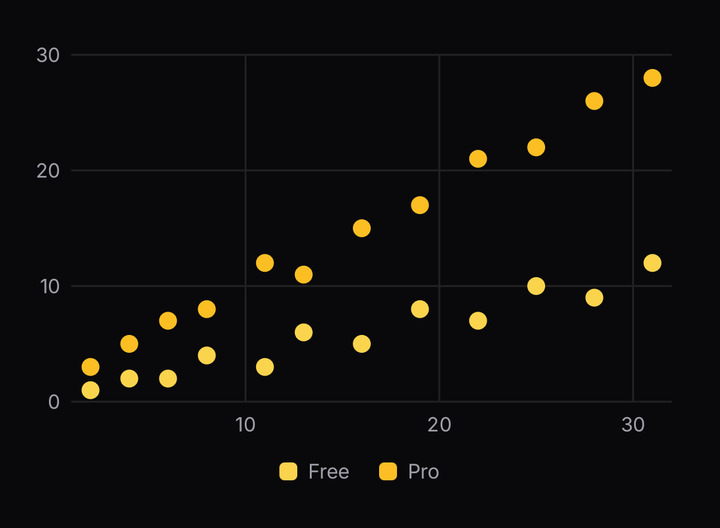
<Chart config={config} data={rows} includeZero xKey="minutes">
  <Chart.Grid axis="both" />
  <Chart.YAxis />
  <Chart.XAxis />
  <Chart.Scatter radius={5} yKey="free" />
  <Chart.Scatter radius={5} yKey="pro" />
</Chart>
One dot per row per series, on a numeric x. A whole series is one Skia path, so a hundred points is one node. A gap in the data is the same dot at radius zero, which is what lets a point come and go without the series snapping.
Candlestick
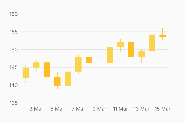
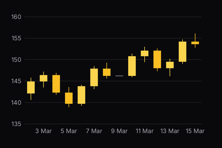
<Chart config={{ close: { label: "Close" } }} data={rows} xKey="at">
  <Chart.Grid />
  <Chart.YAxis />
  <Chart.XAxis />
  <Chart.Candlestick />
  <Chart.Tooltip.X />
  <Chart.Tooltip />
</Chart>
Open, high, low and close per row, read from fields of those names unless the props say otherwise.
A candle that closed up is chart-1, one that closed down is chart-2, and a flat one is
muted-foreground — the top of the same ramp every other chart wears, so a pasted palette
recolours them with it.
The config names the close field alone, so the legend and the readout name one price rather than
four; the tooltip prints all four, swatched by sentiment.
Pie and donut
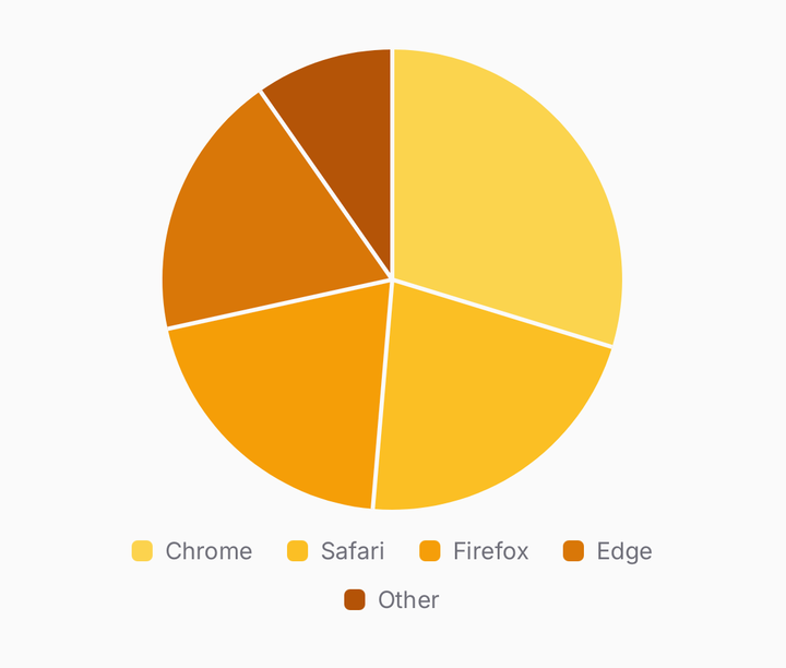
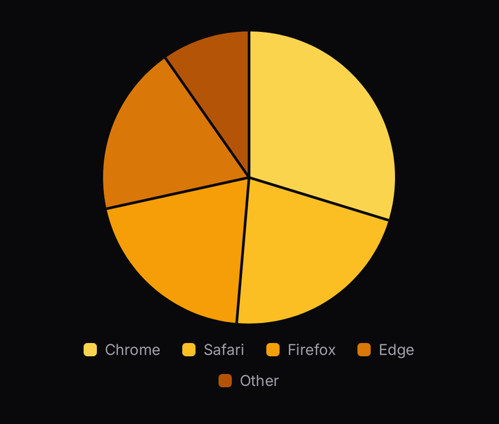
<PieChart data={rows} nameKey="browser" valueKey="visitors">
  <PieChart.Slice />
  <PieChart.Legend />
</PieChart>
A second root, not a part of Chart. Its categories are its rows: the first row is chart-1,
the second chart-2, and no config is needed at all. Pass one to relabel or recolour a row by
its name. A row with a negative, missing or unreadable value is dropped before anything is drawn.
A hairline in the chart's background runs between neighbouring slices. Two ramp colours side by side with no gap read as one shape with a stripe.
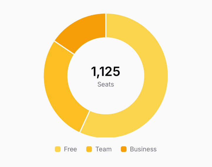
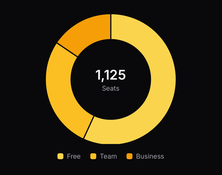
<PieChart data={rows} innerRadius={0.62} nameKey="plan" valueKey="seats">
  <PieChart.Slice />
  <PieChart.Center label="Seats" value="1,125" />
  <PieChart.Legend />
</PieChart>
innerRadius is the hole as a fraction of the radius. PieChart.Center puts a headline figure in
it — a React Native view, so it carries the type scale and takes a className. It takes no
touches, so a tap through it still lands on a slice.
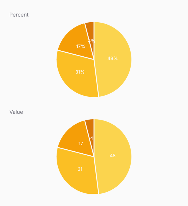
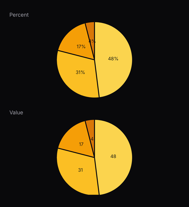
<PieChart.Label />
<PieChart.Label format="value" />
<PieChart.Label format={(slice) => slice.label} />
PieChart.Label prints on every slice wide enough to hold one, in the chart's background colour so
it reads on any slice of the ramp. The default is the share as a percentage. A slice under twelve
degrees gets none — a label wider than its wedge lands on the neighbours.
<PieChart data={rows} nameKey="source" valueKey="sessions">
  <PieChart.Slice />
  <PieChart.Tooltip />
</PieChart>
A pie has no x to scrub along, so PieChart.Tooltip answers a tap. The tapped slice keeps its
colour and the rest dim; tapping outside clears it. The readout sits just past the slice's outer
edge on its bisector, where a callout line would point.
Placing a tooltip is what makes the chart take taps at all. Without one, an onSelect or a
controlled selectedIndex, a pie takes no gesture and scrolls with its parent like a picture.
Grid, axes, tooltip and legend
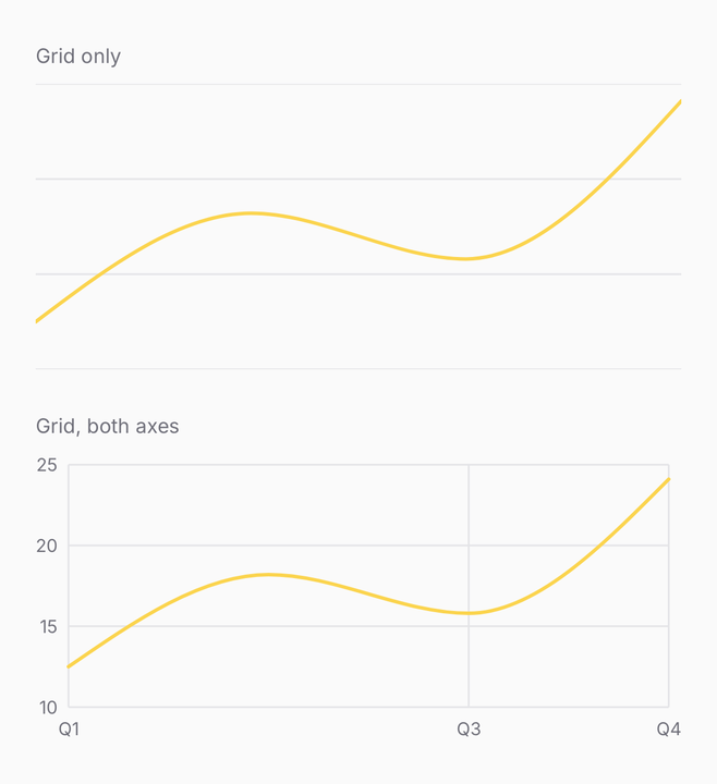
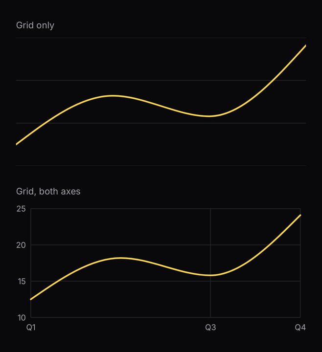
<Chart.Grid />              {/* y ticks, painted with `border` */}
<Chart.Grid axis="both" />
<Chart.YAxis />
<Chart.XAxis />
The grid paints with border and the labels with muted-foreground, so both follow a pasted
palette without a chart-specific token existing at all.
Hold and drag. The readout follows the finger on the UI thread; its text updates only when the nearest point changes.
<Chart config={config} data={rows} xKey="month">
  <Chart.Line yKey="desktop" />
  <Chart.Tooltip.X />
  <Chart.Tooltip.Dot />
  <Chart.Tooltip />
</Chart>Chart.Tooltip.X, .Y and .Dot mark the position on the plot itself — a vertical rule, a
horizontal one, and a dot on each series. They are siblings of Chart.Tooltip, not children:
the readout is a React Native view over the canvas and these are drawn inside it, so one cannot
contain the other.
All three sit on the nearest datum by default, which is what the readout names. Pass glide to
follow the finger continuously instead, and expect the marks to describe a different position from
the number beside them. A dot skips a series that is only a bar — a bar has no curve to sit on,
and the band already picks out its column.
Holding first is deliberate — a chart inside a scrolling list must not steal the scroll. Pass
scrubConfig={{ behaviour: "claim" }} on a chart that owns its width, and a horizontal drag
scrubs while a vertical one still scrolls.
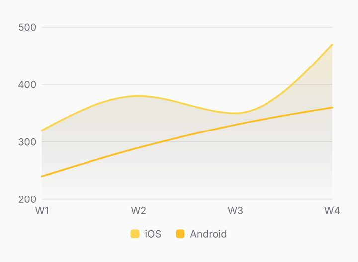
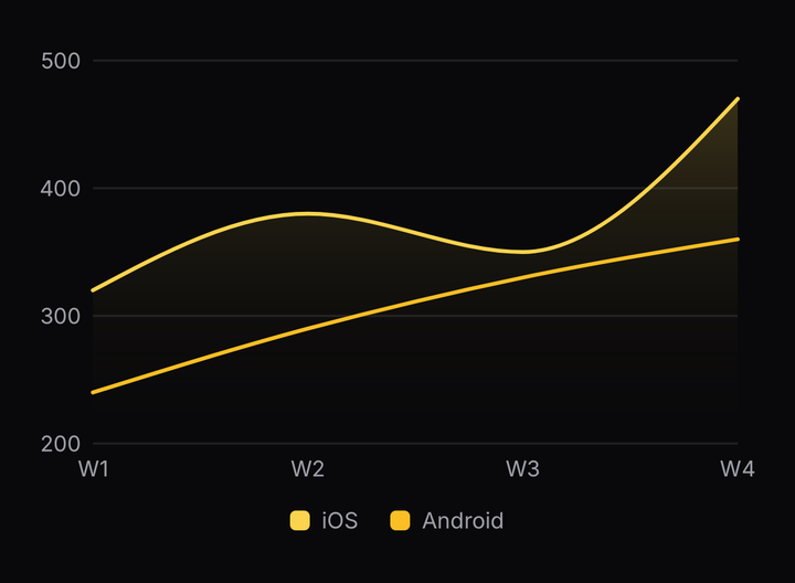
<Chart.Legend />
<Chart.Legend keys={["ios"]} />
<PieChart.Legend />
The same legend serves both roots. Under a pie, one swatch per row.
A colour on a config entry is a token or a literal. A colour on a mark is a literal: the canvas is a
second reconciler with no theme provider above it, so a token given to a mark has nothing to
resolve it. Name tokens in the config.
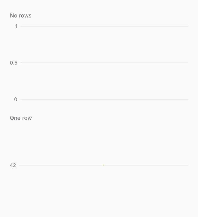
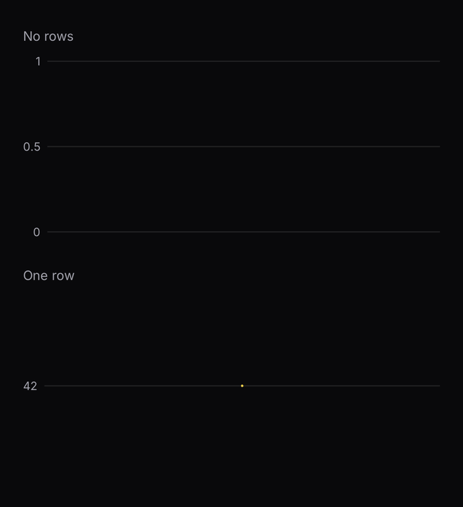
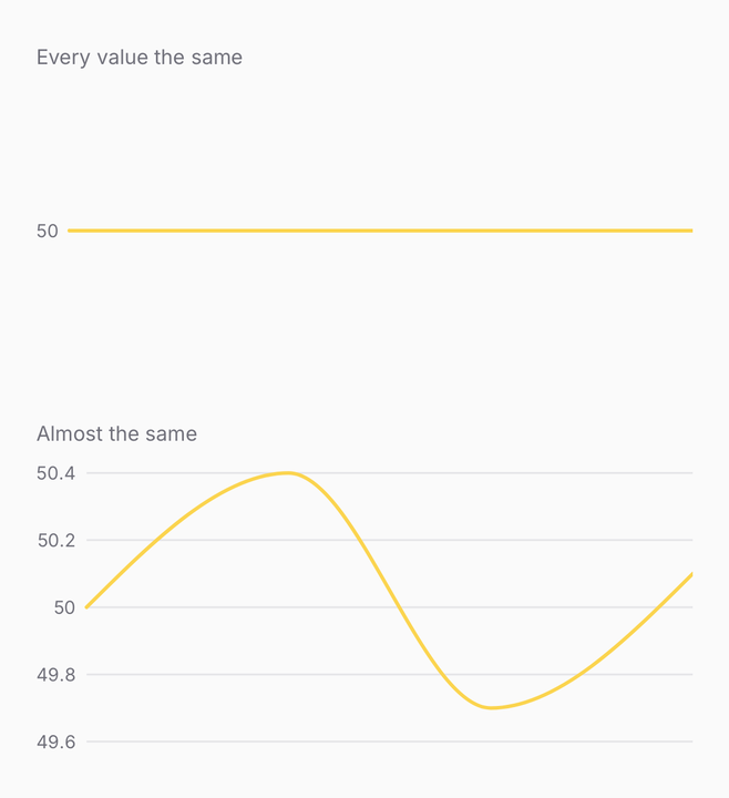
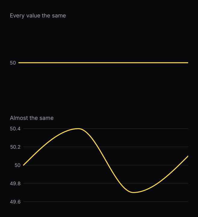
An empty series and a single point are both real states, and neither is allowed to crash: with no
rows the domain falls back to [0, 1], so the axis still has something to say. A series whose
every value is the same draws flat through the middle rather than being stretched to fill the
height — expanding a zero-width domain would invent a spread the data does not have.
Sizes
<Chart size="sm" />
<Chart size="md" />
<Chart size="lg" />
<PieChart size="sm" />
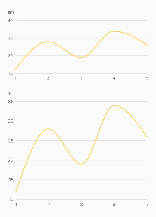
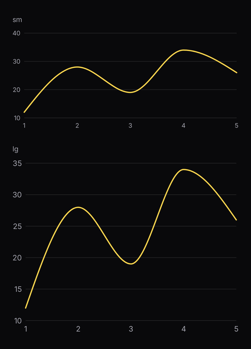
A height token rather than an aspect ratio, so two charts at different widths still line up on a dashboard. The axis font, the tick count and the bar radius step with it. A pie takes the same height, and its diameter is the shorter side of the frame.
API Reference
| Part | |
|---|---|
Chart.Grid | A hairline rule at each tick. Draws first, under every mark |
Chart.Line | A stroked line through one series |
Chart.Area | The region under one series, fading towards the baseline. stackId stacks it |
Chart.Bar | One bar per datum. Siblings group; a shared stackId stacks |
Chart.Scatter | One dot per datum |
Chart.Candlestick | Open-high-low-close candles, coloured by sentiment |
Chart.XAxis | Tick labels below the plot |
Chart.YAxis | Tick labels beside the plot |
Chart.Tooltip | A floating readout that follows the scrub |
Chart.Tooltip.Dot | A dot on each series at the scrubbed point |
Chart.Tooltip.X | A vertical rule through the scrubbed position — a band, over bars |
Chart.Tooltip.Y | A horizontal rule at one series' value |
Chart.Legend | A swatch and a label per series |
PieChart.Slice | Every slice, with a hairline between them |
PieChart.Label | A percentage, a value or a name on every slice wide enough |
PieChart.Center | A headline figure and a caption in the hole of a donut |
PieChart.Tooltip | A readout for the tapped slice |
PieChart.Legend | A swatch and a label per slice |
A part must be a direct child of its root: the root sorts them by identity to decide what is
drawn into the canvas, what floats over it and what sits under it. An array from .map() is fine;
a mark wrapped in your own component is not.
Chart
Prop
Type
Chart.Line
Prop
Type
Chart.Area
Prop
Type
Chart.Bar
Prop
Type
Chart.Scatter
Prop
Type
Chart.Candlestick
Prop
Type
Chart.Grid
Prop
Type
Chart.XAxis
Prop
Type
Chart.YAxis
Prop
Type
Chart.Tooltip
Prop
Type
Chart.Tooltip.Dot
Prop
Type
Chart.Tooltip.X
Prop
Type
Chart.Tooltip.Y
Prop
Type
Chart.Legend
Prop
Type
PieChart
Prop
Type
PieChart.Slice
Prop
Type
PieChart.Label
Prop
Type
PieChart.Center
Prop
Type
PieChart.Tooltip
Prop
Type
The drawing is @delacour/react-native-charts, a headless Skia engine with no
tokens and no className of its own, documented under its own tab. It installs alongside this
component and is where to go for a chart this one does not skin — a render prop, a custom mark,
or the scale maths on its own.
Zooming and brushing are not here yet. The scrub and the pie's tap are the only gestures a chart takes today.