Label
A form control's name, with required, invalid and disabled states.
Installation
Label ships with the library — install it once, then import:
import { Label } from "@delacour/react-native-ui/label";Or copy the source into your project, to own and edit it:
bunx delacour@latest add labelUsage
import { Input } from "@/components/ui/input";
import { Label } from "@/components/ui/label";
import { View } from "react-native";

export default function Example() {
  return (
    <View className="flex-1 justify-center gap-1.5 p-4">
      <Label isRequired>Email</Label>
      <Input inputMode="email" placeholder="you@example.com" />
    </View>
  );
}
Basic
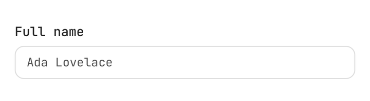
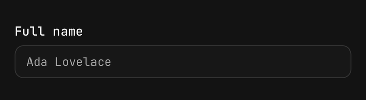
<Label>Full name</Label>
<Input placeholder="Ada Lovelace" />
States
The three are independent, so a required field that is also wrong shows both.
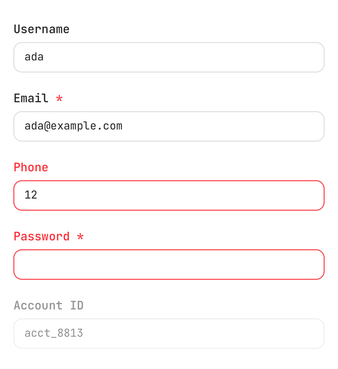
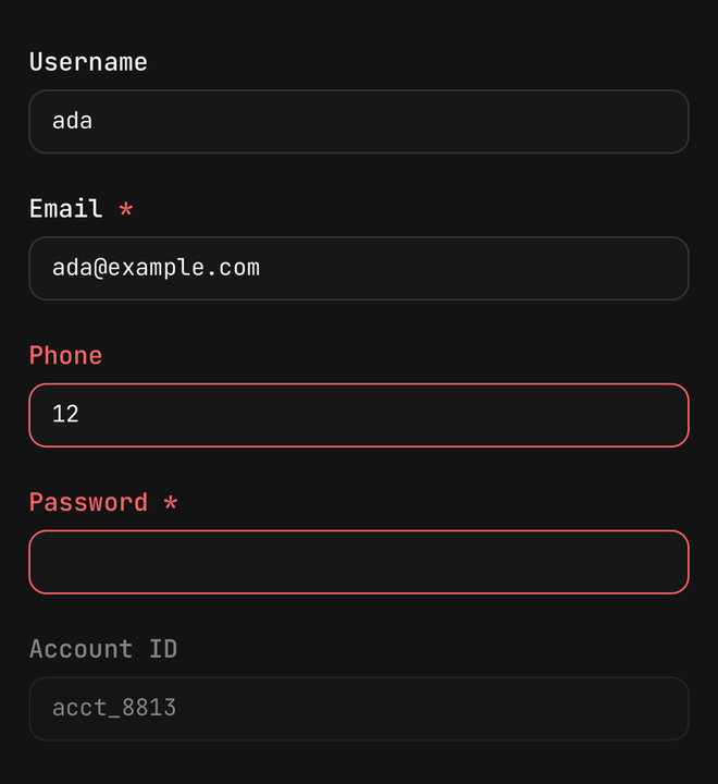
<Label isRequired>Email</Label>
<Label isInvalid>Phone</Label>
<Label isInvalid isRequired>Password</Label>
<Label isDisabled>Account ID</Label>
Sizes
size is Text's own axis, and the required mark steps with it.
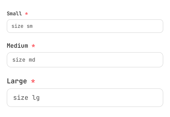
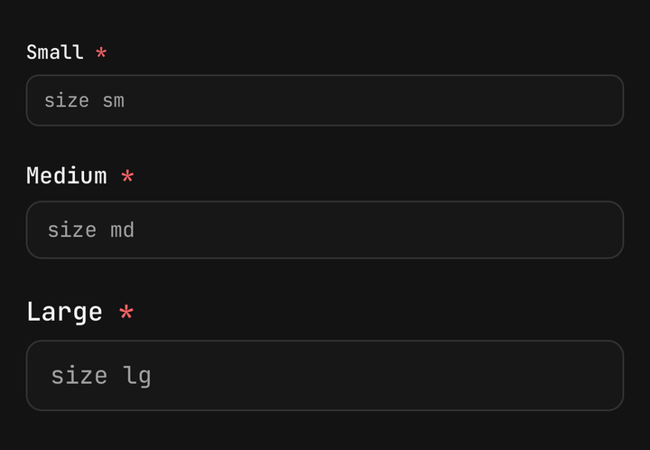
<Label isRequired size="xs">Small</Label>
<Label isRequired size="sm">Medium</Label>
<Label isRequired size="md">Large</Label>
A label that wraps
The asterisk follows the last word onto the last line.
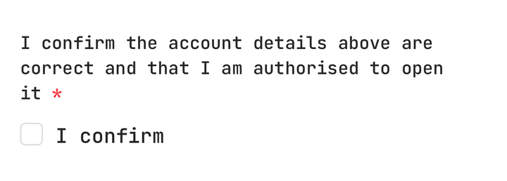
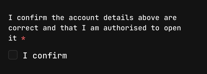
<Label isRequired>
  I confirm the account details above are correct and that I am authorised to open it
</Label>
Restyling the mark
<Label isRequired requiredMarkClassName="text-muted-foreground">
  First name
</Label>
Inside a Field
Field.Label reads the field's state and has no required mark, so a required field passes its
state to a Label directly.
<Field isInvalid={isInvalid}>
  <Label isInvalid={isInvalid} isRequired>
    Email
  </Label>
  <Input inputMode="email" onChangeText={setEmail} value={email} />
  <Field.Error>{error}</Field.Error>
</Field>
Accessibility
A required label of plain text is announced as "Email, required". Pass accessibilityLabel when
the children are not text, and on Android pair the label's nativeID with the control's
accessibilityLabelledBy.
<Label isRequired nativeID="email-label">
  Email
</Label>
<Input accessibilityLabelledBy="email-label" />
API Reference
LabelProps
TextProps with variant omitted and children and accessibilityLabel narrowed to plain
values, plus:
Prop
Type
Exports
import {
  LABEL_REQUIRED_MARK,
  LABEL_REQUIRED_MARK_COLOR,
  labelText,
  labelVariants,
  resolveLabelAccessibilityLabel,
  resolveLabelColor,
} from "@delacour/react-native-ui/label";