Textarea
A multiline text field, sized in rows.
Installation
Textarea ships with the library — install it once, then import:
import { Textarea } from "@delacour/react-native-ui/textarea";Or copy the source into your project, to own and edit it:
bunx delacour@latest add textareaUsage
import { Field } from "@/components/ui/field";
import { Textarea } from "@/components/ui/textarea";
import { useState } from "react";
import { View } from "react-native";

export default function Example() {
  const [notes, setNotes] = useState("");

  return (
    <View className="flex-1 justify-center p-4">
      <Field>
        <Field.Label>Notes</Field.Label>
        <Textarea value={notes} onChangeText={setNotes} placeholder="Anything we should know?" />
      </Field>
    </View>
  );
}
Rows
rows is how many lines tall the field is before it scrolls.
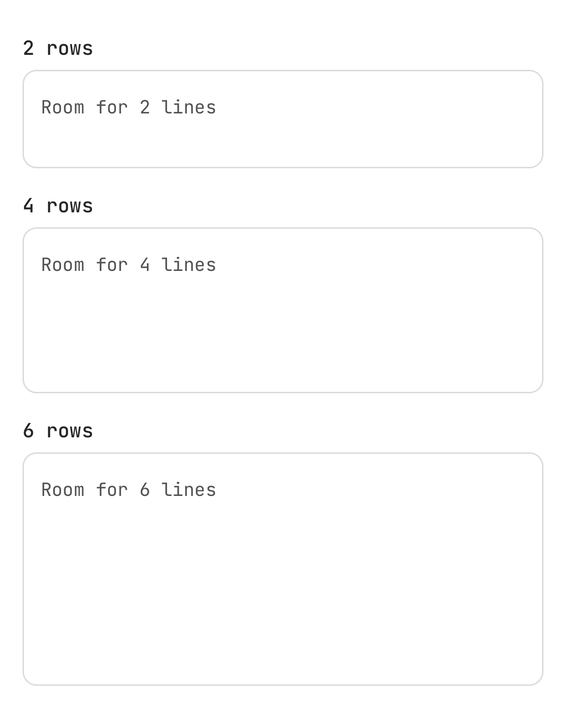
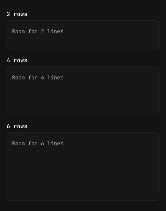
<Textarea rows={2} />
<Textarea rows={4} />
<Textarea rows={6} />
Auto-grow
autoGrow starts at rows and grows a line at a time up to maxRows, then scrolls.
<Textarea autoGrow rows={2} maxRows={6} placeholder="Message" />Character count
showCount needs maxLength, and turns destructive at the limit.
<Textarea maxLength={80} showCount value={status} onChangeText={setStatus} />Variants
The box is Input's, so the variants are too.
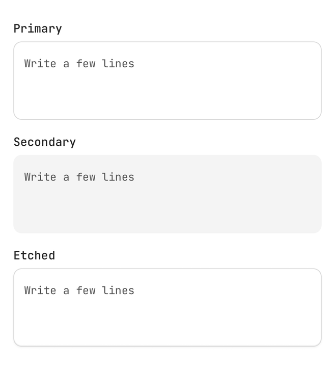
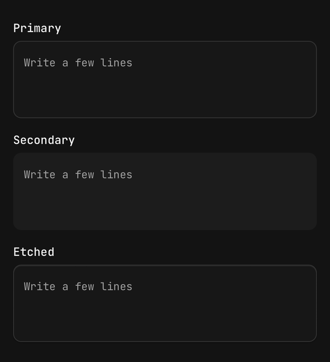
<Textarea variant="primary" />
<Textarea variant="secondary" />
Sizes
size moves the type and the leading, not the row count.
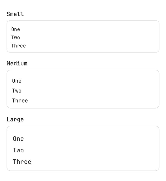
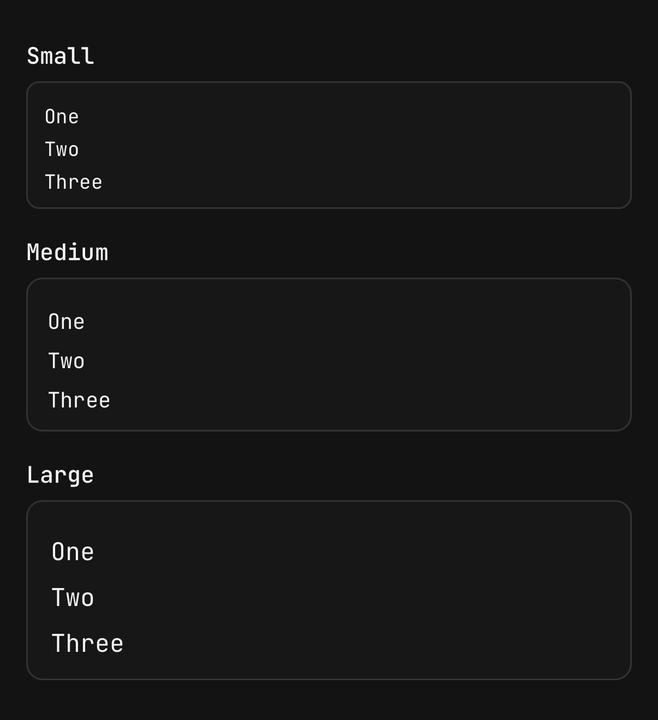
<Textarea size="sm" rows={3} />
<Textarea size="md" rows={3} />
<Textarea size="lg" rows={3} />
States
Invalid and disabled are read from an enclosing Field, the same way Input reads them.
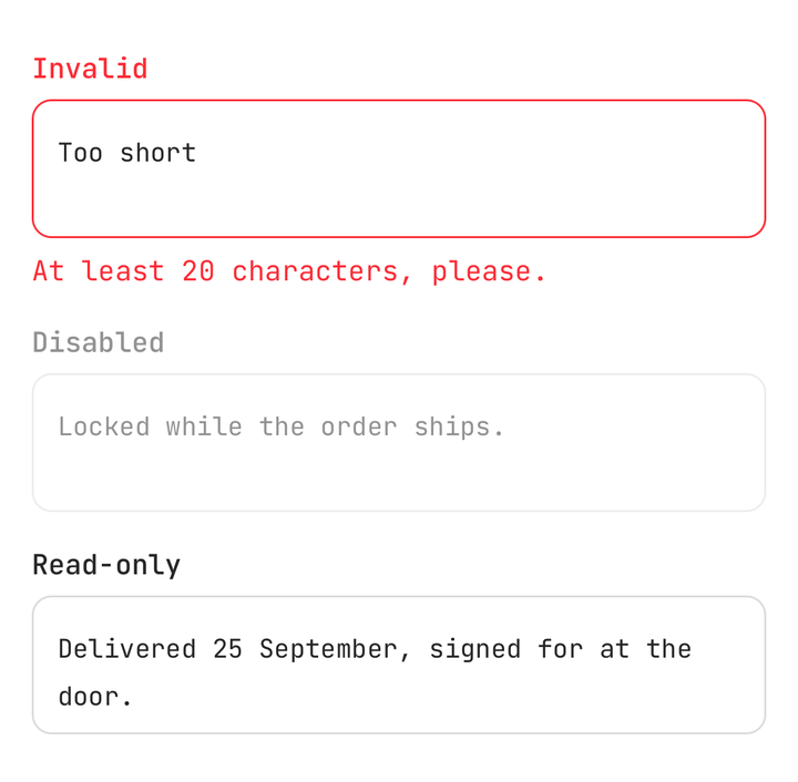
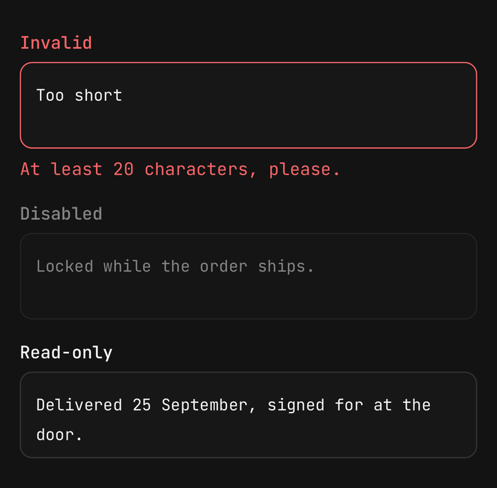
<Field isInvalid={isInvalid}>
  <Field.Label>Reason</Field.Label>
  <Textarea value={reason} onChangeText={setReason} />
  <Field.Error>At least 20 characters, please.</Field.Error>
</Field>
In a form
A textarea under a single-line field reads as the same control at a different height.
API Reference
Textarea
Extends Input's props, without multiline and numberOfLines — it is always multiline, and its
height comes from rows.
Prop
Type