Rating
A row of stars that reads or sets a score, by tap or by drag.
Installation
Rating ships with the library — install it once, then import:
import { Rating } from "@delacour/react-native-ui/rating";Or copy the source into your project, to own and edit it:
bunx delacour@latest add ratingUsage
import { Rating } from "@/components/ui/rating";
import { useState } from "react";
import { View } from "react-native";

export default function Example() {
  const [score, setScore] = useState(3);

  return (
    <View className="flex-1 items-center justify-center p-4">
      <Rating value={score} onChange={setScore}>
        <Rating.Stars accessibilityLabel="Your rating" />
        <Rating.Output />
      </Rating>
    </View>
  );
}
Half stars
step={0.5} splits every star at its centre.
<Rating step={0.5} value={score} onChange={setScore}>
  <Rating.Stars accessibilityLabel="Your rating" />
</Rating>
Colours
color paints the filled stars; an empty star looks the same at every colour.
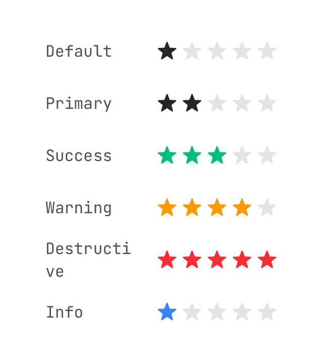
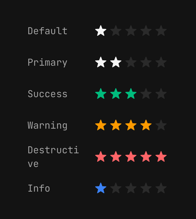
<Rating color="default" />
<Rating color="primary" />
<Rating color="success" />
<Rating color="warning" />
<Rating color="destructive" />
<Rating color="info" />
Sizes
The star steps up the icon scale while the row stays a 44-point target.
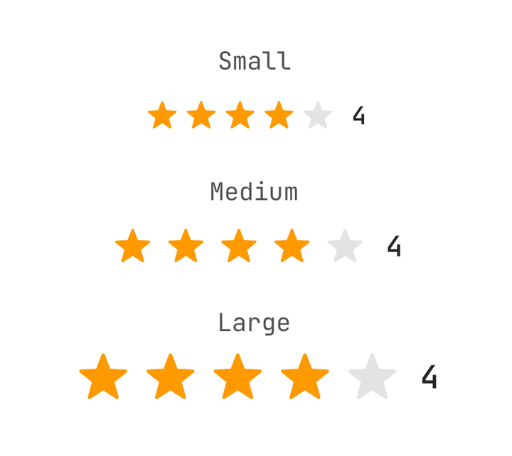
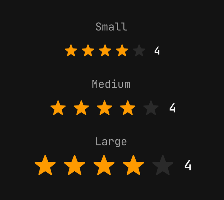
<Rating size="sm" />
<Rating size="md" />
<Rating size="lg" />
Read-only
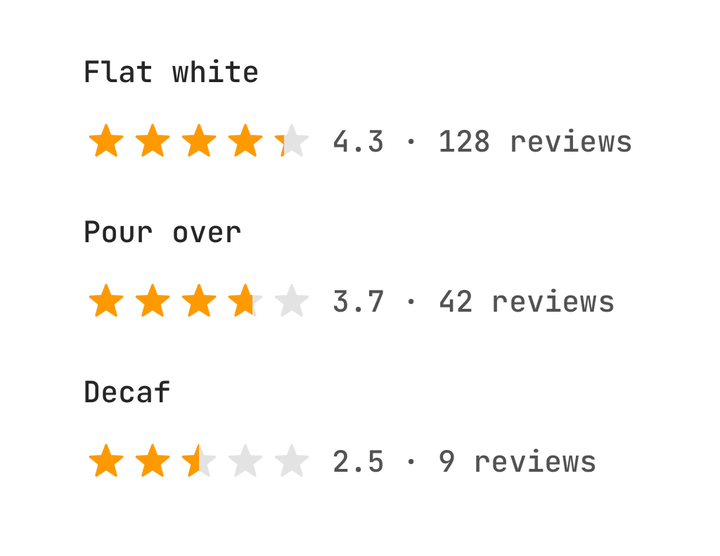
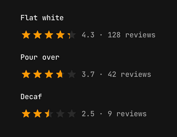
isReadOnly shows any value — an average of 4.3 fills part of the fifth star — without taking a touch.
<Rating className="flex-row items-center gap-2" isReadOnly size="sm" value={4.3}>
  <Rating.Stars accessibilityLabel="Average rating" />
  <Rating.Output>{({ value }) => `${value.toFixed(1)} · 128 reviews`}</Rating.Output>
</Rating>
Clearing
allowClear lets a tap on the star already held withdraw the rating.
<Rating allowClear defaultValue={4}>
  <Rating.Stars accessibilityLabel="Your rating" />
</Rating>
Star count
maxValue is how many stars the row draws.
<Rating defaultValue={7} maxValue={10} size="sm">
  <Rating.Stars accessibilityLabel="Score out of ten" />
  <Rating.Output>{({ value, count }) => `${value} / ${count}`}</Rating.Output>
</Rating>
In a form
A Field cascades isInvalid and isDisabled, and the empty stars turn destructive too.
<Field isInvalid={score === 0}>
  <Field.Label>Required</Field.Label>
  <Rating value={score} onChange={setScore}>
    <Rating.Stars accessibilityLabel="Required rating" />
  </Rating>
  <Field.Error>{score === 0 ? "Choose at least one star." : undefined}</Field.Error>
</Field>
Label the row with accessibilityLabel on Rating.Stars, not on the root. The stars are the
control screen readers adjust; without a label they say only "Rating".
API Reference
Anatomy
| Part | What it is |
|---|---|
Rating | Owns the value, the count, the step and the axes |
Rating.Stars | The row of stars — the drag surface and the adjustable control |
Rating.Output | The value, formatted. Give it a function to label it yourself |
Rating
Prop
Type
Rating.Stars
Prop
Type
Rating.Output
Prop
Type