Meter
A measurement on a fixed scale, coloured by where it falls.
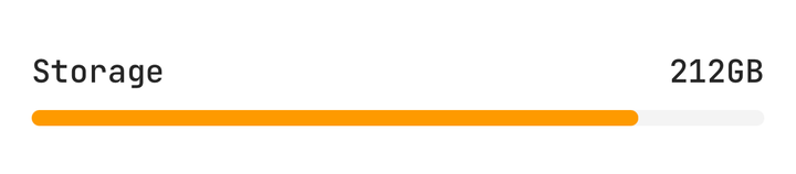
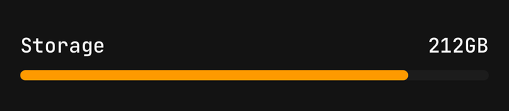
Installation
Meter ships with the library — install it once, then import:
import { Meter } from "@delacour/react-native-ui/meter";Or copy the source into your project, to own and edit it:
bunx delacour@latest add meterUsage
import { Meter } from "@/components/ui/meter";
import { View } from "react-native";

export default function Example() {
  return (
    <View className="flex-1 justify-center p-4">
      <Meter
        formatOptions={{ style: "unit", unit: "gigabyte" }}
        high={240}
        low={192}
        maxValue={256}
        optimum={0}
        value={212}
      >
        <Meter.Header>
          <Meter.Label>Storage</Meter.Label>
          <Meter.Output />
        </Meter.Header>
        <Meter.Track>
          <Meter.Fill />
        </Meter.Track>
      </Meter>
    </View>
  );
}
A progress bar says how far a task has got. A meter says what a quantity is — storage used, a battery's charge, a password's strength — and its colour is a judgement about that reading. It is built on Progress: the same track, fill and header.
Bare
With no children the meter draws its own track and fill — or its blocks, when given segments.
<Meter accessibilityLabel="Storage" value={68} />Low, high and optimum
low and high split the scale into three parts, and optimum says which of them is good. The
reading is painted success in the good region, warning next to it, and destructive on the far side.
// The bottom is good: a disk.
<Meter high={90} low={70} optimum={0} value={82} />

// The top is good: a battery.
<Meter high={50} low={20} optimum={100} value={14} />

// The band is good, either side is worse: a room.
<Meter high={24} low={18} maxValue={35} minValue={5} optimum={21} value={21} />
low and high default to the ends of the scale and optimum to its middle. Each is clamped into
the scale, and high is never below low.
Colour is never the only signal. Put the judgement into words for anyone who cannot see it: a
valueLabel function is handed the region, and what it returns is drawn and spoken alike.
<Meter
  high={50}
  low={20}
  optimum={100}
  value={battery}
  valueLabel={({ formatted, region }) => (region === "critical" ? `Charge now · ${formatted}` : formatted)}
>
  <Meter.Header>
    <Meter.Label>Battery</Meter.Label>
    <Meter.Output />
  </Meter.Header>
  <Meter.Track>
    <Meter.Fill />
  </Meter.Track>
</Meter>
Thresholds
thresholds names the colour outright from points on the scale, in the reading's own units. The
highest one reached wins, whatever order they are listed in; below all of them color applies. A
meter takes regions or thresholds, never both — passing both is a type error.
<Meter
  thresholds={[
    { from: 0, color: "info" },
    { from: 70, color: "warning" },
    { from: 90, color: "destructive" },
  ]}
  value={load}
/>
Segments
segments draws the scale as whole blocks. A block is all or nothing — four blocks say "three out
of four" where a bar says "about seventy percent" — and any reading above the floor lights at least
one.
<Meter
  maxValue={4}
  segments={4}
  thresholds={[
    { from: 1, color: "destructive" },
    { from: 2, color: "warning" },
    { from: 3, color: "success" },
  ]}
  value={strength}
  valueLabel={["Too short", "Weak", "Fair", "Good", "Strong"][strength]}
>
  <Meter.Header>
    <Meter.Label>Strength</Meter.Label>
    <Meter.Output />
  </Meter.Header>
  <Meter.Segments />
</Meter>
Colours
On a plain scale — no regions, no thresholds — color paints the fill. The set is Progress's.
<Meter color="default" value={58} />
<Meter color="primary" value={72} />
<Meter color="success" value={91} />
<Meter color="warning" value={64} />
<Meter color="destructive" value={23} />
<Meter color="info" value={40} />
Sizes
size sets the track's thickness and the header's type step. A block is as thick as the track.
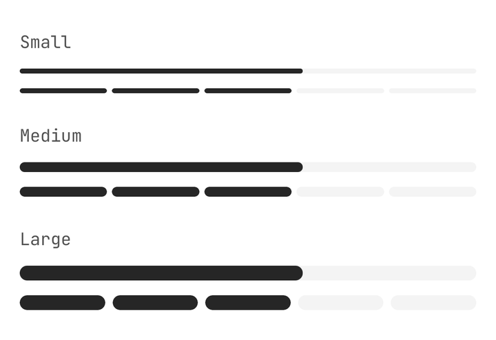
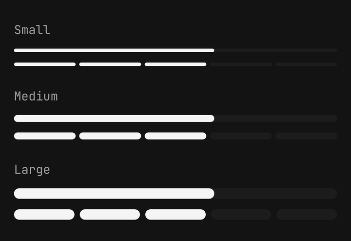
<Meter size="sm" value={62} />
<Meter size="md" value={62} />
<Meter size="lg" segments={5} value={62} />
Formatting
Set maxValue and the meter speaks in what is measured. formatOptions goes to
Intl.NumberFormat; a percent style formats the share of the scale, any other style formats the
reading itself. valueLabel swaps the number for a word, on screen and to the screen reader alike.
<Meter formatOptions={{ style: "unit", unit: "gigabyte" }} maxValue={256} value={168} />

<Meter maxValue={10} value={7} valueLabel="Busy" />
A reading off the scale clamps to its nearer end, NaN reads at the floor, and an inverted or
empty scale reads as empty.
Plan usage
A billing card: every quota judged the same way, so the eye finds the one about to run out.
<Meter
  formatOptions={{ style: "unit", unit: "gigabyte" }}
  high={quota.limit * 0.95}
  low={quota.limit * 0.8}
  maxValue={quota.limit}
  optimum={0}
  size="sm"
  value={quota.used}
  valueLabel={`${left} left`}
>
  <Meter.Header>
    <Meter.Label>Storage</Meter.Label>
    <Meter.Output />
  </Meter.Header>
  <Meter.Track>
    <Meter.Fill />
  </Meter.Track>
</Meter>
Accessibility
The meter is one accessible element with the progressbar role — React Native has no meter role —
and publishes the scale and the reading as its accessibilityValue. The reading is spoken as a
percentage over 0–100, as 168 of 256 over any other scale, or as valueLabel. Meter.Label is
its name; a meter with no label needs an accessibilityLabel. Meter.Output is hidden from screen
readers, because the root already speaks the value — so words drawn by an output function are seen
but not heard. Put a judgement in valueLabel instead.
A meter reports; it takes no input, so there is no disabled, invalid or loading state. A reading that is not known yet is Progress's indeterminate bar, not a meter.
API Reference
Anatomy
| Part | What it is |
|---|---|
Meter | Owns the reading, the scale and how it is judged. One accessible element with the progressbar role |
Meter.Header | The row above the scale: a label at the start, a readout at the end |
Meter.Label | What is being measured. Read as the meter's accessible name |
Meter.Output | The reading, formatted. Give it a function to word it — or its region — yourself |
Meter.Track | The continuous groove the fill slides along |
Meter.Fill | The painted bar, in the judged colour |
Meter.Segments | The scale as whole blocks, for a meter given segments |
Meter
Prop
Type
Meter.Output
Prop
Type
Meter.Segments
Prop
Type