Progress
A bar showing how far a task has got, or a looping segment while it is under way.
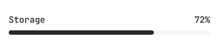
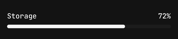
Installation
Progress ships with the library — install it once, then import:
import { Progress } from "@delacour/react-native-ui/progress";Or copy the source into your project, to own and edit it:
bunx delacour@latest add progressUsage
import { Progress } from "@/components/ui/progress";
import { View } from "react-native";

export default function Example() {
  return (
    <View className="flex-1 justify-center p-4">
      <Progress value={72}>
        <Progress.Header>
          <Progress.Label>Storage</Progress.Label>
          <Progress.Output />
        </Progress.Header>
        <Progress.Track>
          <Progress.Fill />
        </Progress.Track>
      </Progress>
    </View>
  );
}
Bare
With no children the bar draws its own track and fill.
<Progress value={40} />Colours
color paints the fill, never the track.
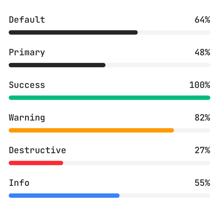
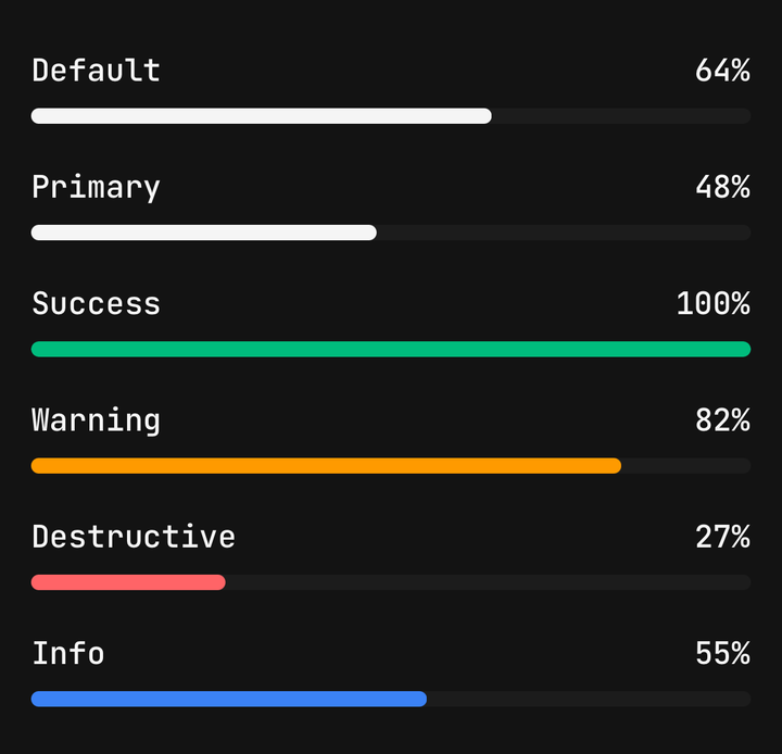
<Progress color="default" value={64} />
<Progress color="primary" value={48} />
<Progress color="success" value={100} />
<Progress color="warning" value={82} />
<Progress color="destructive" value={27} />
<Progress color="info" value={55} />
Sizes
size sets the track's thickness and the header's type step.
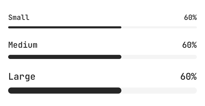
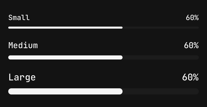
<Progress size="sm" value={60} />
<Progress size="md" value={60} />
<Progress size="lg" value={60} />
Indeterminate
isIndeterminate loops a segment along the track for work whose length is not known yet.
<Progress accessibilityLabel="Syncing" isIndeterminate />With Reduce Motion on, the segment stops travelling and the whole track breathes in place instead. A bar with no Progress.Label needs an accessibilityLabel, or a screen reader announces a busy progress bar with no name.
Formatting
formatOptions goes to Intl.NumberFormat, a function child words the readout itself, and valueLabel replaces it everywhere.
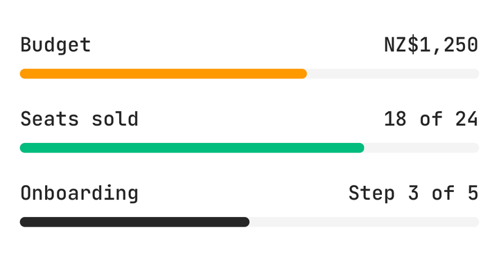
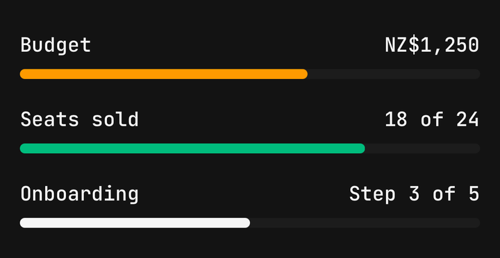
<Progress formatOptions={{ currency: "NZD", style: "currency" }} maxValue={2000} value={1250}>
  <Progress.Header>
    <Progress.Label>Budget</Progress.Label>
    <Progress.Output />
  </Progress.Header>
  <Progress.Track>
    <Progress.Fill />
  </Progress.Track>
</Progress>

<Progress maxValue={24} value={18}>
  <Progress.Header>
    <Progress.Label>Seats sold</Progress.Label>
    <Progress.Output>{({ value, maxValue }) => `${value} of ${maxValue}`}</Progress.Output>
  </Progress.Header>
  <Progress.Track>
    <Progress.Fill />
  </Progress.Track>
</Progress>
An upload queue
A bar per file, coloured by its state and fed by the upload's own counter.
<Progress
  color={failed ? "destructive" : done ? "success" : "primary"}
  formatOptions={{ style: "unit", unit: "megabyte" }}
  maxValue={file.sizeMb}
  size="sm"
  value={file.sentMb}
>
  <Progress.Header>
    <Progress.Label>{file.name}</Progress.Label>
    <Progress.Output />
  </Progress.Header>
  <Progress.Track>
    <Progress.Fill />
  </Progress.Track>
</Progress>
API Reference
Anatomy
| Part | What it is |
|---|---|
Progress | Owns the value, the range and the axes. One accessible element with the progressbar role |
Progress.Header | The row above the track: a label at the start, a readout at the end |
Progress.Label | What the bar is measuring. Read as the bar's accessible name |
Progress.Output | The value, formatted. Give it a function to word it yourself |
Progress.Track | The clipped groove the fill slides along |
Progress.Fill | The painted bar — a value, or a looping segment while indeterminate |
Progress
Prop
Type
Progress.Output
Prop
Type