Switch
An on/off control with a thumb you can drag as well as tap.
import { Switch } from "@delacour/native-ui/switch";import { SWITCH_SIZES, Switch } from "@delacour/native-ui/switch";import type { ReactElement } from "react";import { View } from "react-native";export function Demo(): ReactElement { return ( <View className="flex-row items-center gap-4"> {SWITCH_SIZES.map((size) => ( <Switch color="primary" defaultSelected key={size} size={size} testID={`switch-${size}`} /> ))} </View> );}One Gesture.Pan() drives the whole control. A tap toggles it; a drag takes the thumb with your
finger, and letting go settles by position — or by the flick's velocity if you release fast. Drag
one half way and back and it commits nothing.
Leave isSelected off and the switch holds its own state; defaultSelected sets the starting
point.
Colours

import { SWITCH_COLORS, Switch } from "@delacour/native-ui/switch";import { Text } from "@delacour/native-ui/text";import { type ReactElement, useState } from "react";import { View } from "react-native";/** * One colour, on and off, side by side. * * Built from the exported `as const` array rather than written out, so a colour * added to `SWITCH_COLORS` appears here with no edit. */function ColorRow({ color }: { color: (typeof SWITCH_COLORS)[number] }): ReactElement { const [isSelected, setSelected] = useState(true); return ( <View className="flex-row items-center gap-4"> <Switch color={color} isSelected={isSelected} onSelectedChange={setSelected} /> <Switch color={color} defaultSelected={false} /> <Text.Caption>{color}</Text.Caption> </View> );}export function Demo(): ReactElement { return ( <View className="gap-3"> {SWITCH_COLORS.map((color) => ( <ColorRow color={color} key={color} /> ))} </View> );}default, primary, success, warning, danger, info — Badge's, Checkbox's and Slider's set.
An off switch is the same chrome at all six: the colour only says what being on means. Both the
track and the knob fade between two token values, driven by the thumb's own travel.
Sizes

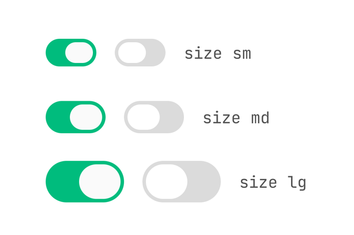
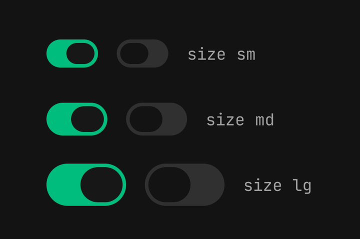
import { SWITCH_SIZES, Switch } from "@delacour/native-ui/switch";import { Text } from "@delacour/native-ui/text";import type { ReactElement } from "react";import { View } from "react-native";export function Demo(): ReactElement { return ( <View className="gap-3"> {SWITCH_SIZES.map((size) => ( <View className="flex-row items-center gap-4" key={size}> <Switch color="success" defaultSelected size={size} /> <Switch color="success" size={size} /> <Text.Caption>size {size}</Text.Caption> </View> ))} </View> );}sm, md, lg. The knob is a rounded rectangle lying on its side, not a disc — as wide as the
track is tall, and shorter than it by twice the vertical inset. Both are fully rounded, so the two
capsules come out concentric by construction rather than by a number.
Anatomy
| Part | What it is |
|---|---|
Switch | The track. Owns the gesture, the spring and the state |
Switch.Thumb | The knob. Composed in automatically; write it out to restyle it or fill it |
Switch.StartContent | Behind the thumb at the leading edge — revealed as the switch turns on |
Switch.EndContent | Behind the thumb at the trailing edge — revealed as the switch turns off |

import { Icon } from "@delacour/native-ui/icon";import { IconCheckmark1Small, IconX } from "@delacour/native-ui/icons/central";import { SWITCH_SIZES, Switch } from "@delacour/native-ui/switch";import type { ReactElement } from "react";import { View } from "react-native";export function Demo(): ReactElement { return ( <View className="flex-row items-center gap-4"> {SWITCH_SIZES.map((size) => ( <Switch color="primary" defaultSelected key={size} size={size} testID={`switch-${size}`}> <Switch.StartContent> <Icon icon={IconCheckmark1Small} /> </Switch.StartContent> <Switch.EndContent> <Icon icon={IconX} /> </Switch.EndContent> </Switch> ))} </View> );}Both layers are written once with no conditionals. StartContent is revealed as the switch turns
on and EndContent as it turns off, each fading with the thumb's travel — so the knob reads as
uncovering the other end. The glyphs take their size step and colour from the switch.
A hand-written Switch.Thumb is moved to the end of the children for you. Every part here is
absolutely positioned and React Native paints later siblings on top, so a thumb written first —
which is the order the anatomy reads best in — would slide under the content layers.
Drag as well as tap
The whole track is the target. A tap toggles; a drag carries the thumb and commits on release,
with a fling past SWITCH_FLING_VELOCITY counting as a flip even when the thumb has not crossed
the middle.
Movement is measured as Math.max(|translationX|, |translationY|). A vertical swipe that began on
the switch has to count as movement, or every attempt to scroll past the control would read as a
tap and toggle it.
The haptic fires at the commit, never at the grab.
The spring is critically damped
SWITCH_THUMB_SPRING has no overshoot, and that is deliberate: a wider thumb travels a shorter
distance inside a track that clips it, so an overshoot has nowhere to go — the knob would visibly
squash against the end of its own capsule on every toggle.
The colour the switch travels through and the press scale are two entries in one
useAnimatedStyle, not two calls. Two animated styles on one view fight for the same props and
the later one silently wins.
State inside a Field

import { Icon } from "@delacour/native-ui/icon";import { IconBell } from "@delacour/native-ui/icons/central";import { ListGroup } from "@delacour/native-ui/list-group";import { Switch } from "@delacour/native-ui/switch";import { Text } from "@delacour/native-ui/text";import { type ReactElement, useState } from "react";import { View } from "react-native";const SETTINGS = [ { key: "wifi", title: "Wi-Fi", description: "Join known networks automatically" }, { key: "bluetooth", title: "Bluetooth", description: "Discoverable while this screen is open" }, { key: "airdrop", title: "AirDrop", description: "Receive from everyone for ten minutes" },] as const;export function Demo(): ReactElement { const [settings, setSettings] = useState<Record<string, boolean>>({ wifi: true }); const enabled = Object.values(settings).filter(Boolean).length; const toggleSetting = (key: string) => setSettings((current) => ({ ...current, [key]: !current[key] })); return ( <View className="gap-3"> <ListGroup> {SETTINGS.map((setting) => ( <ListGroup.Item key={setting.key} onPress={() => toggleSetting(setting.key)} testID={`row-${setting.key}`}> <ListGroup.ItemPrefix> <Icon icon={IconBell} /> </ListGroup.ItemPrefix> <ListGroup.ItemContent> <ListGroup.ItemTitle>{setting.title}</ListGroup.ItemTitle> <ListGroup.ItemDescription>{setting.description}</ListGroup.ItemDescription> </ListGroup.ItemContent> <ListGroup.ItemSuffix> <Switch accessibilityLabel={setting.title} color="success" isSelected={settings[setting.key] ?? false} onSelectedChange={() => toggleSetting(setting.key)} size="sm" testID={`switch-${setting.key}`} /> </ListGroup.ItemSuffix> </ListGroup.Item> ))} </ListGroup> <Text.Caption>{`${enabled} of ${SETTINGS.length} settings on`}</Text.Caption> </View> );}isDisabled and isInvalid are inherited from an enclosing Field, and the switch registers its
toggle with the field — so the whole row drives it and a form switch can be a bare <Switch />
with Field.Label naming it. See Field.
Accessibility

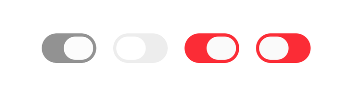
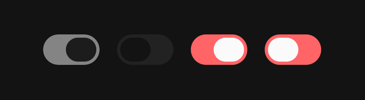
import { Switch } from "@delacour/native-ui/switch";import type { ReactElement } from "react";import { View } from "react-native";export function Demo(): ReactElement { return ( <View className="flex-row items-center gap-4"> <Switch color="primary" defaultSelected isDisabled /> <Switch color="primary" isDisabled /> <Switch defaultSelected isInvalid /> <Switch isInvalid /> </View> );}The root is not a Pressable, so there is no touch responder for TalkBack's activation to land on.
The component supplies accessibilityActions and onAccessibilityTap itself, and marks the root
accessible — without that the view is not an accessibility element on iOS and its role and state
never reach VoiceOver.
There is no Switch.Label and no Switch.Group — use Field. And RTL is not handled: the
thumb travels on translateX, which does not flip.
API
Prop
Type
ViewProps, minus children and style — the root writes its own animated style.