EmptyState
A placeholder for a list or screen with nothing in it, and the action that fills it.
Installation
EmptyState ships with the library — install it once, then import:
import { EmptyState } from "@delacour/react-native-ui/empty-state";Or copy the source into your project, to own and edit it:
bunx delacour@latest add empty-stateUsage
import { Button } from "@/components/ui/button";
import { EmptyState } from "@/components/ui/empty-state";
import { Icon } from "@/components/ui/icon";
import { IconInboxEmpty } from "@/lib/icons/central";
import { View } from "react-native";

export default function Example() {
  return (
    <View className="flex-1 p-4">
      <EmptyState>
        <EmptyState.Header>
          <EmptyState.Media variant="icon">
            <Icon icon={IconInboxEmpty} />
          </EmptyState.Media>
          <EmptyState.Title>No messages yet</EmptyState.Title>
          <EmptyState.Description>New conversations will show up here.</EmptyState.Description>
        </EmptyState.Header>
        <EmptyState.Content>
          <Button onPress={() => console.log("compose")}>New message</Button>
        </EmptyState.Content>
      </EmptyState>
    </View>
  );
}
Variants
default grows into its parent and centres itself there; card is a dashed block for an empty
section beside populated ones.
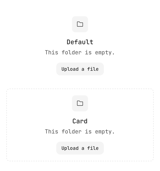
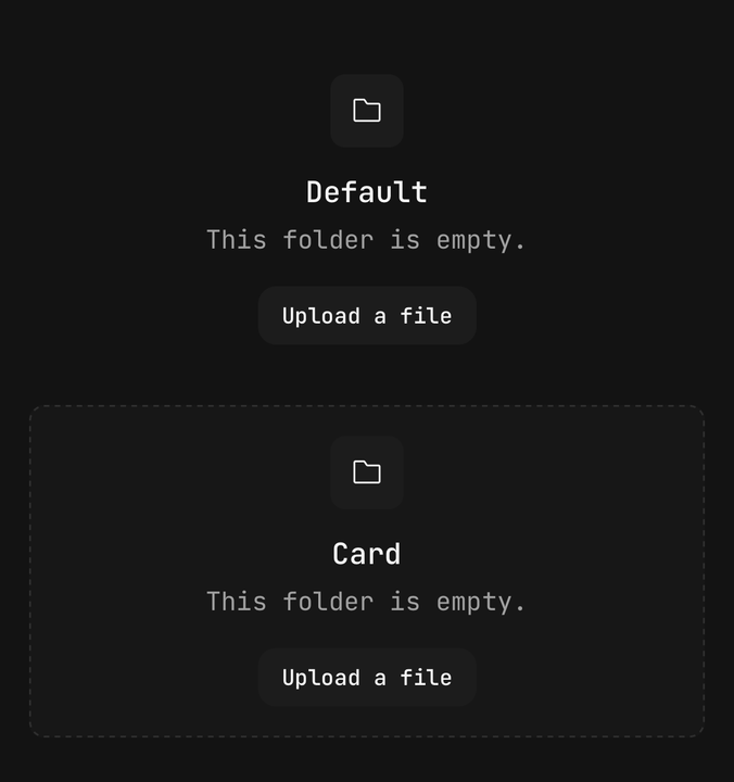
<EmptyState>…</EmptyState>
<EmptyState variant="card">…</EmptyState>
Sizes
One axis drives the padding, both gaps, the media box, the glyph and both type scales.
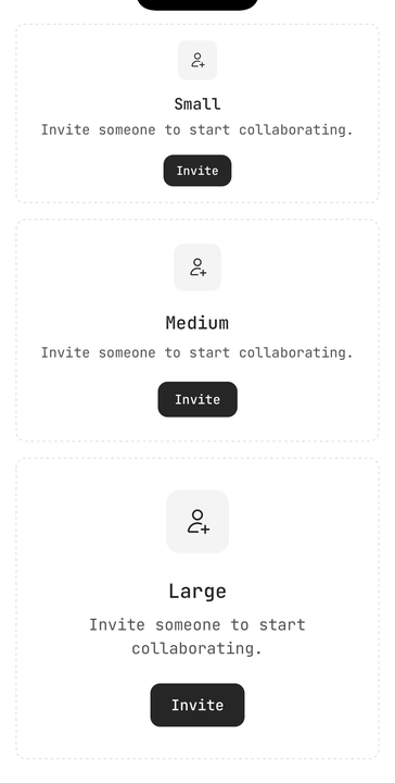
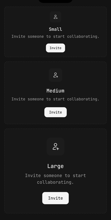
<EmptyState size="sm">…</EmptyState>
<EmptyState size="md">…</EmptyState>
<EmptyState size="lg">…</EmptyState>
Media
icon tints a rounded box behind the glyph; default draws nothing, for an illustration that sizes
itself.
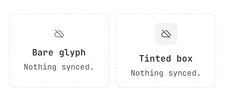
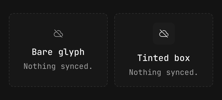
<EmptyState.Media variant="icon">
  <Icon icon={IconCloudOff} />
</EmptyState.Media>
<EmptyState.Media>
  <Image source={illustration} className="size-32" />
</EmptyState.Media>
Actions
The buttons in Content keep their own loading and disabled states.
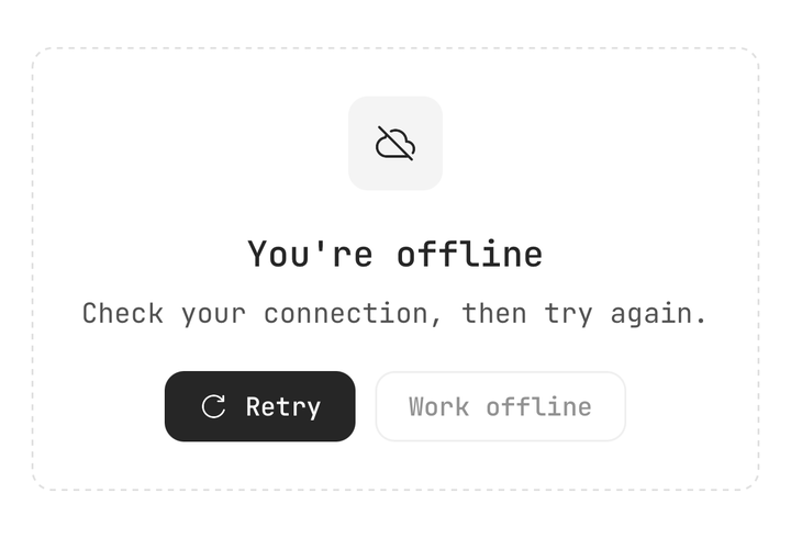
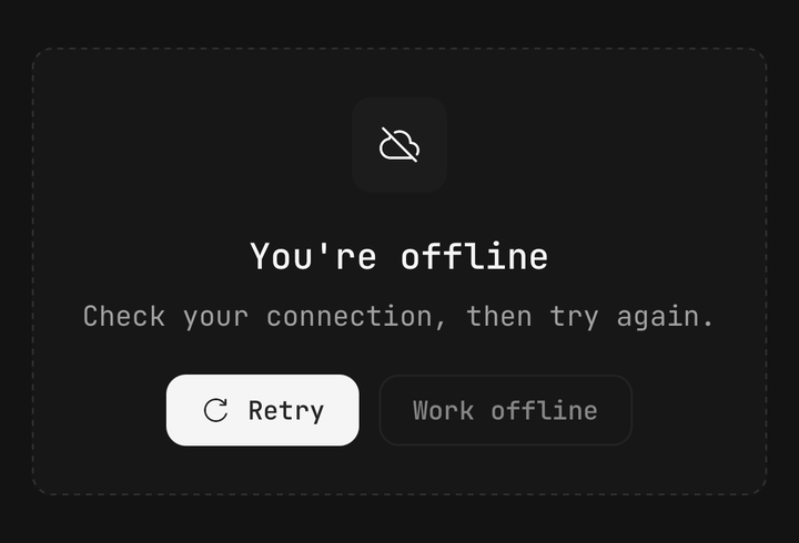
<EmptyState.Content>
  <Button isLoading={isRetrying} onPress={retry}>Retry</Button>
  <Button isDisabled variant="outline">Work offline</Button>
</EmptyState.Content>
In a list
Render it in place of a list that has nothing to show.
items.length === 0 ? (
  <EmptyState variant="card">…</EmptyState>
) : (
  <ListGroup>…</ListGroup>
);
API Reference
EmptyState
Prop
Type
EmptyState.Media
Hidden from screen readers by default — the title already says what the picture shows.
Prop
Type
EmptyState.Header / Content
Header is the centred column holding the media, title and description. Content is the action
row under it, centred and wrapping.
Prop
Type
EmptyState.Title / Description
The two lines of text. Extend React Native's TextProps; Title is announced as a header.
Prop
Type