Calendar
A month grid for picking a day, several days or a range — with no date library and no time zone.
Installation
Calendar ships with the library — install it once, then import:
import { Calendar } from "@delacour/react-native-ui/calendar";Or copy the source into your project, to own and edit it:
bunx delacour@latest add calendarUsage
import { Calendar, type CalendarDate } from "@/components/ui/calendar";
import { useState } from "react";
import { View } from "react-native";

export default function Example() {
  const [day, setDay] = useState<CalendarDate | null>(null);

  return (
    <View className="flex-1 justify-center p-4">
      <Calendar selected={day} onSelect={setDay} />
    </View>
  );
}
A day is a CalendarDate — { year, month, day }, with month running 1 to 12. It has no time
zone, so nothing can shift it by a day on the way to a server. A tap on the selected day clears it.
Swipe the grid sideways or tap the arrows to page. Tap the caption to jump: once for the months of the year, twice for a list of years. The grid always draws six weeks, so the calendar's height never changes while paging — not even through a February that fits in four.
Range
mode="range" takes two taps and draws one band between them, rounded only at its ends. The second
tap can come before the first — the earlier day is always the start. A tap on a complete range
begins a new one.
const [stay, setStay] = useState<CalendarDateRange>({ start: null, end: null });

<Calendar mode="range" minDate={today()} selected={stay} onSelect={setStay} />
onSelect fires on both taps — once with only a start, once complete — so the screen can say
"Pick a check-out day" in between. formatDateRange writes either shape as text.
Multiple
mode="multiple" toggles days in and out. The value is sorted earliest first, with no duplicates.
const [days, setDays] = useState<readonly CalendarDate[]>([]);

<Calendar mode="multiple" selected={days} onSelect={setDays} />
Bounds and disabled days
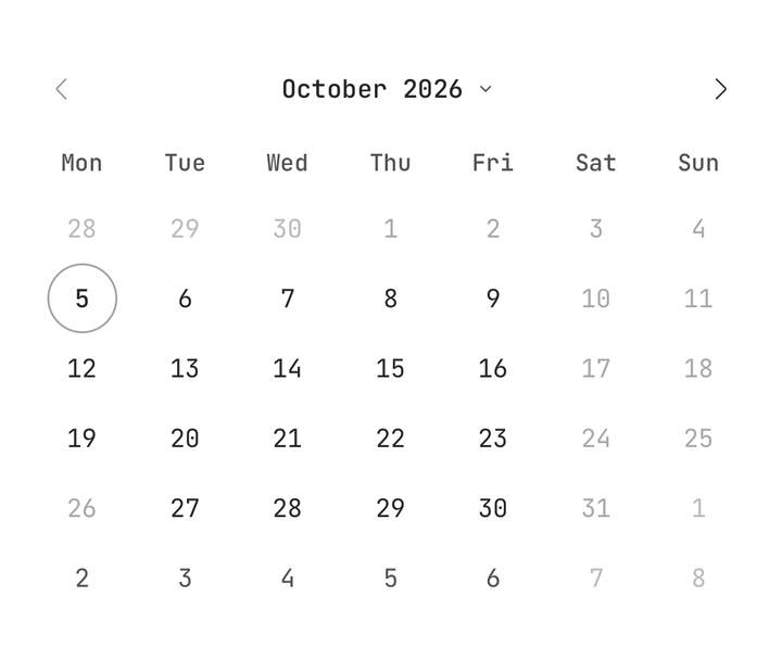
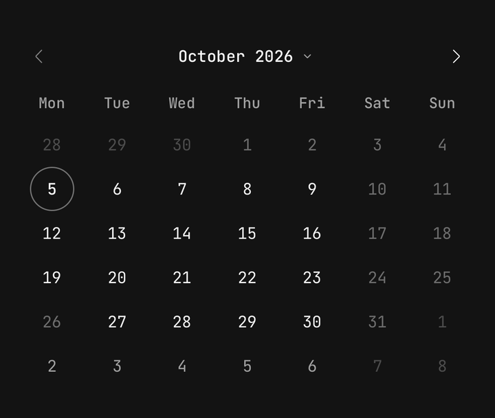
minDate and maxDate are inclusive. Days outside them cannot be picked, and the arrows stop at
their months. disabled takes further matchers; a day any of them matches is disabled.
<Calendar
  minDate={today()}
  maxDate={{ year: 2026, month: 12, day: 31 }}
  disabled={[
    { type: "weekday", days: [0, 6] },
    { type: "date", date: { year: 2026, month: 12, day: 25 } },
    { type: "span", from: { year: 2026, month: 11, day: 2 }, to: { year: 2026, month: 11, day: 6 } },
    { type: "predicate", test: (date) => date.day === 13 },
  ]}
/>
A span with a null end is open on that side. A range that would swallow a disabled day starts
again from the tapped day instead.
startMonth and endMonth set how far paging and the jump views reach, separately from what can
be picked. Omitted, they are minDate's and maxDate's months.
Controlled month
The visible month works controlled or uncontrolled, like the selection. The day of month is
ignored, and onMonthChange is always handed the first of the month.
const [month, setMonth] = useState<CalendarDate>({ year: 2026, month: 10, day: 1 });

<Calendar month={month} onMonthChange={setMonth} />
<Button onPress={() => setMonth(startOfMonth(today()))}>Today</Button>
Caption layouts
captionLayout="picker", the default, makes the caption a button that opens the month and year
views. "label" makes it plain text, for a calendar that only pages.
<Calendar captionLayout="label" />Sizes and variants
size sets the cell height on the input scale — sm is 36, md 44, lg 52 points. variant
picks the selection's fill: primary is solid, secondary soft.
<Calendar size="sm" variant="secondary" />
<Calendar size="lg" />
isBordered draws the calendar on a Surface card. Off — the default — it sits bare, the way a
sheet or a Card embeds it without a second frame inside its own.
Custom day content
Calendar.Grid's renderDay draws each cell. Give Calendar.Day a function child and it is
handed the day's state and the class the number is drawn with, so extra content can take the
selected colour with it.
<Calendar mode="range" size="lg">
  <Calendar.Header />
  <Calendar.Weekdays />
  <Calendar.Grid
    renderDay={(cell) => (
      <Calendar.Day date={cell.date}>
        {({ date, labelClassName }) => (
          <View className="items-center">
            <Text className={labelClassName}>{date.day}</Text>
            <Text className={cn(labelClassName, "text-[10px] leading-3")}>{priceOf(date)}</Text>
          </View>
        )}
      </Calendar.Day>
    )}
  />
</Calendar>
The parts can be rearranged too — both arrows on the right, say:
<Calendar>
  <Calendar.Header>
    <Calendar.Caption />
    <Calendar.Nav direction="prev" />
    <Calendar.Nav direction="next" />
  </Calendar.Header>
  <Calendar.Weekdays format="narrow" />
  <Calendar.Grid />
</Calendar>
Locale and week start
Month and weekday names come from Intl, in locale or the device's own. The first column is the
locale's first day of the week — Sunday in the United States, Monday in New Zealand, Saturday in
Egypt. weekStartsOn overrides it with a weekday number, 0 for Sunday.
<Calendar locale="en-US" />
<Calendar locale="de-DE" weekStartsOn={0} />
In a field
Inside a Field, the calendar takes isInvalid and isDisabled with nothing said at the call
site, and the field's label names the grid for a screen reader. An invalid calendar tints its
selection destructive.
<Field isInvalid={day === null}>
  <Field.Label>Delivery day</Field.Label>
  <Calendar minDate={today()} selected={day} onSelect={setDay} />
  <Field.Error>Pick a day for the delivery.</Field.Error>
</Field>
isReadOnly shows the selection and ignores taps on days; paging still works.
Accessibility
- Each day is a button named by its full date — "Monday 5 October 2026" — with today and a range's
ends as a hint, and
selectedanddisabledas accessibility state. - Weekday columns show a short name and are announced by the full one.
- The caption carries increment and decrement actions: swipe up or down on it with VoiceOver or TalkBack to move a month. Each new month is announced.
- The whole cell is the target. At
mdandlga cell is at least 44 points tall.
Date helpers
@/components/ui/calendar exports everything needed to work with a CalendarDate, so no date
library is needed:
| Helper | Does |
|---|---|
today() | Today, from the device's local clock |
toDate(d) / fromDate(date) | To and from a native Date, by local fields |
serialiseDate(d) / parseDate(s) | To and from an ISO YYYY-MM-DD string; parseDate is strict and returns null on anything else |
compareDates, isSameDay, isSameMonth, isBetween | Comparison, by calendar fields |
addDays, addMonths, addYears, startOfMonth, clampDate | Arithmetic. addMonths clamps the day: 31 January plus a month is the end of February |
daysInMonth, isLeapYear, weekdayOf, isValidDate | Facts about a date |
formatDate(d, { style, locale }) | "short", "medium", "long" or "full", through Intl. Never throws on an unknown locale |
formatMonthYear, formatDateRange | The caption, and a range as one string |
isDateDisabled(d, { minDate, maxDate, disabled }) | The same test the calendar runs |
API Reference
Anatomy
| Part | What it is |
|---|---|
Calendar | Owns the selection, the visible month and the view |
Calendar.Header | The row above the grid. Defaults to the arrows either side of the caption |
Calendar.Nav | A paging arrow that disables itself at the bound it points at |
Calendar.Caption | The month and year — a label, or the button that opens the jump views |
Calendar.Weekdays | The weekday names, in column order |
Calendar.Grid | The six weeks, the swipe that pages them, and the jump views over them |
Calendar.Day | One day. Give it children for custom content |
Calendar.Picker | The month and year views. The grid hosts it |
Calendar
Prop
Type
Calendar.Nav
Prop
Type
Calendar.Weekdays
Prop
Type
Calendar.Grid
Prop
Type
Calendar.Day
Prop
Type
useCalendar
Reads the enclosing calendar from a custom part: visibleMonth, view, goPrev, goNext,
goToMonth, canGoPrev, canGoNext, select, isDateSelected, isDateDisabled, rangeRole,
today, locale, weekStartsOn, size and variant. Throws outside a <Calendar>.