Collapsible
One section of content, shown and hidden by its own trigger.
Installation
Collapsible ships with the library — install it once, then import:
import { Collapsible } from "@delacour/react-native-ui/collapsible";Or copy the source into your project, to own and edit it:
bunx delacour@latest add collapsibleUsage
import { Collapsible } from "@/components/ui/collapsible";
import { Text } from "@/components/ui/text";
import { View } from "react-native";

export default function Example() {
  return (
    <View className="flex-1 justify-center p-4">
      <Collapsible>
        <Collapsible.Trigger>
          <Collapsible.Title>What is included</Collapsible.Title>
          <Collapsible.Description>Pro plan, billed yearly</Collapsible.Description>
        </Collapsible.Trigger>
        <Collapsible.Content>
          <Text.Paragraph>Unlimited projects, 100 GB of storage and priority email support.</Text.Paragraph>
        </Collapsible.Content>
      </Collapsible>
    </View>
  );
}
Variants
The same four surfaces as Accordion and ListGroup.
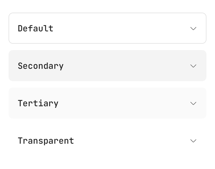
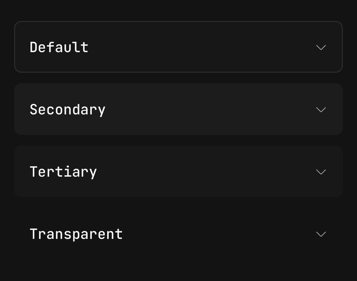
<Collapsible variant="secondary">…</Collapsible>
<Collapsible variant="tertiary">…</Collapsible>
<Collapsible variant="transparent">…</Collapsible>
Sizes
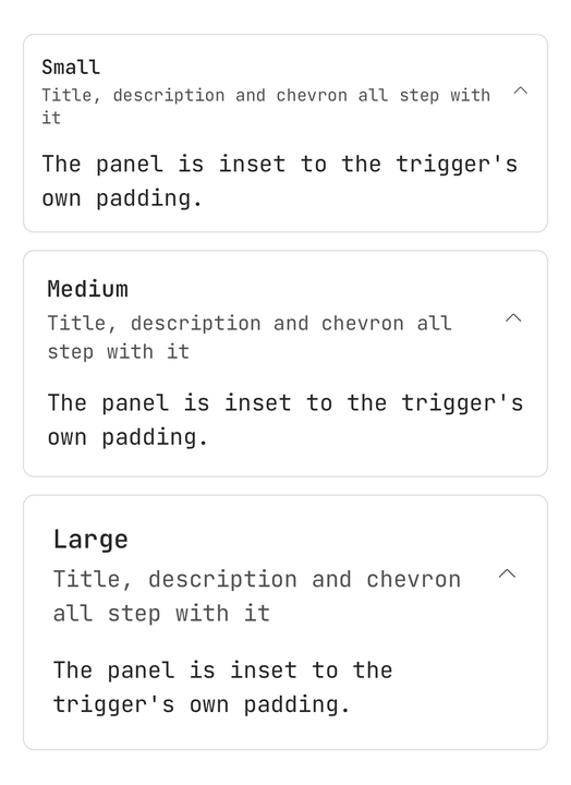
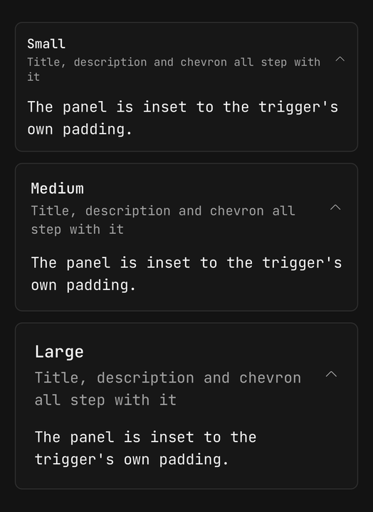
<Collapsible size="sm">…</Collapsible>
<Collapsible size="md">…</Collapsible>
<Collapsible size="lg">…</Collapsible>
Controlled
Pass isOpen and onOpenChange to own the state; leave them off, or set defaultOpen, and it holds its own.
const [isOpen, setOpen] = useState(false);

<Collapsible isOpen={isOpen} onOpenChange={setOpen}>…</Collapsible>
Disabled
isDisabled stops the trigger in both directions, so an open section stays open.
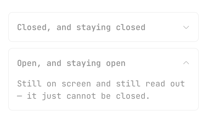
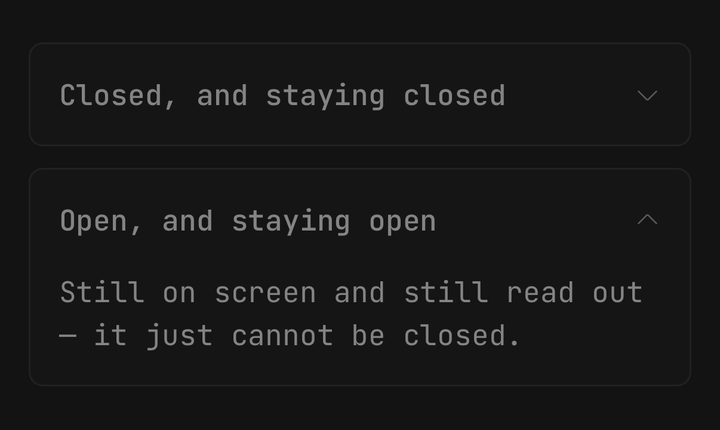
<Collapsible defaultOpen isDisabled>…</Collapsible>Custom indicator
Hand the indicator a function of the open state, and set isAnimated={false} when the glyph itself carries the change.
<Collapsible.Trigger>
  <Collapsible.Title>Two-year warranty</Collapsible.Title>
  <Collapsible.Indicator isAnimated={false}>
    {({ isOpen }) => <Icon icon={isOpen ? IconMinusSmall : IconPlusSmall} />}
  </Collapsible.Indicator>
</Collapsible.Trigger>
Order summary
The panel's height is measured and animated, so whatever sits below it follows it down.
<Collapsible>
  <Collapsible.Trigger>
    <Icon icon={IconReceiptBill} />
    <Collapsible.Title>Order summary</Collapsible.Title>
    <Collapsible.Description>3 items · $346.00</Collapsible.Description>
  </Collapsible.Trigger>
  <Collapsible.Content className="gap-3">…</Collapsible.Content>
</Collapsible>
API Reference
Anatomy
| Part | What it is |
|---|---|
Collapsible | The surface. Owns the open state and the shared axes |
Collapsible.Trigger | The row that opens the section. A Pressable, so it inherits the whole vocabulary |
Collapsible.Title | The trigger's primary line. Bare string children become one automatically |
Collapsible.Description | The trigger's secondary line, stacked under the title |
Collapsible.Indicator | The glyph that turns as the panel opens. Composed in when a trigger holds none |
Collapsible.Content | The measured, clipped panel. Mounts on first open and stays mounted |
CollapsibleProps
Prop
Type
Collapsible.Trigger
Prop
Type
Collapsible.Indicator
Prop
Type
Collapsible.Content
Prop
Type