StackCard
A deck taken one card at a time by throwing the top one off — one decision per card.
Installation
StackCard ships with the library — install it once, then import:
import { StackCard } from "@delacour/react-native-ui/stack-card";Or copy the source into your project, to own and edit it:
bunx delacour@latest add stack-cardUsage
import { IconCheckmark2, IconCrossSmall } from "@/lib/icons/central";
import { StackCard } from "@/components/ui/stack-card";
import { Text } from "@/components/ui/text";
import { View } from "react-native";

const PEOPLE = [
  { id: "aria", name: "Aria Whitlock" },
  { id: "tomasi", name: "Tomasi Fifita" },
  { id: "rawiri", name: "Rawiri Kemp" },
];

export default function Example() {
  return (
    <View className="flex-1 justify-center p-4">
      <StackCard className="h-[460px]" onSwipe={(direction, index) => console.log(PEOPLE[index].name, direction)}>
        <StackCard.Stamp color="success" direction="right">Keep</StackCard.Stamp>
        <StackCard.Stamp color="destructive" direction="left">Skip</StackCard.Stamp>
        {PEOPLE.map((person) => (
          <StackCard.Card className="items-center justify-center" key={person.id}>
            <Text variant="header">{person.name}</Text>
          </StackCard.Card>
        ))}
        <StackCard.Empty>All caught up</StackCard.Empty>
        <StackCard.Actions>
          <StackCard.Action action="left" icon={IconCrossSmall} label="Skip" />
          <StackCard.Action action="right" icon={IconCheckmark2} label="Keep" />
        </StackCard.Actions>
      </StackCard>
    </View>
  );
}
When to use it
A queue where each item gets one decision and is then gone: a review queue, flashcards, suggestions. The gesture is the answer. It shows one card at a time, so it is wrong for anything the reader must compare or skim — browsing wants a carousel, and one row's actions want a swipe row.
Anatomy
<StackCard>
  <StackCard.Stamp direction="right" />
  <StackCard.Card />
  <StackCard.Empty />
  <StackCard.Actions>
    <StackCard.Action action="left" />
    <StackCard.Action action="undo" />
    <StackCard.Action action="right" />
  </StackCard.Actions>
</StackCard>
The root sorts its children by type, in any order: stamps, the cards in order, the empty state and
the actions row. Anything that is not a Stamp, Empty or Actions is a card, so a card wrapped in
a component of your own still counts. Give the root a height — the pile takes whatever the actions
row leaves.
Throwing
A drag past threshold (a fraction of the card's width or height, default 0.3) throws the card;
a shorter one springs back. Velocity counts, so a flick throws from a short drag and a flick back
cancels a long one. The card tilts as it moves, the stamps fade in as it leans their way, and the
card behind slides into place on the same progress — so when the top card leaves, nothing jumps.
onSwipe(direction, index) fires first, then onIndexChange. A direction the deck does not allow
still gives a little under the finger and returns, so the card reads as "not that way" rather than
frozen.
Directions
directions defaults to left and right. A horizontal-only deck lets vertical drags through, so it
can sit inside a vertical ScrollView.
<StackCard
  directions={["left", "right", "up", "down"]}
  directionLabels={{ left: "Later", right: "Now", up: "Delegate", down: "Drop" }}
>
  <StackCard.Stamp color="info" direction="up">Delegate</StackCard.Stamp>
  …
</StackCard>
A deck that throws all four ways claims both axes. Do not nest it in a scroller.
Layouts
layout draws the cards behind the top: stack steps each one down and smaller, fan turns them
about the bottom centre, flat hides them. depth (0–4, default 2) is how many are drawn.
<StackCard depth={3} layout="fan">…</StackCard>Undo
StackCard.Action action="undo", the ref's undo() or useStackCard().undo brings the last card
back from the side it left. onSwipe is not called for an undo.
function Finished() {
  const { count, canUndo } = useStackCard();
  return <Text>{canUndo ? `All ${count} done — undo to go back` : `All ${count} done`}</Text>;
}

<StackCard>
  …
  <StackCard.Empty>
    <Finished />
  </StackCard.Empty>
</StackCard>
Controlled, and declining a throw
index with onIndexChange puts the deck in your hands. A controlled deck that leaves index
where it was declines the throw, and the card flies back in from the side it left. That is how a
confirm step is built: decline, ask, and on yes throw again through the ref and accept it.
const deck = useRef<StackCardHandle>(null);
const thrown = useRef<StackCardDirection>("right");
const confirmed = useRef(false);
const [index, setIndex] = useState(0);

<StackCard
  index={index}
  onSwipe={(direction) => { thrown.current = direction; }}
  onIndexChange={(next) => {
    if (next > index && thrown.current === "left" && !confirmed.current) return askFirst();
    confirmed.current = false;
    setIndex(next);
  }}
  ref={deck}
>
  …
</StackCard>

// on "yes"
confirmed.current = true;
deck.current?.swipe("left");
Setting index from outside — a refill — clears the undo history. onEmpty fires once, when the
last card leaves.
Long decks
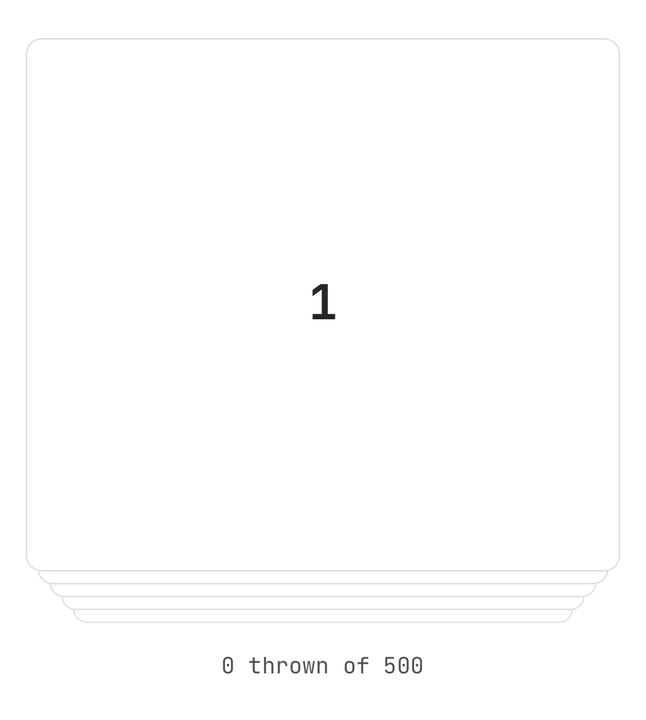
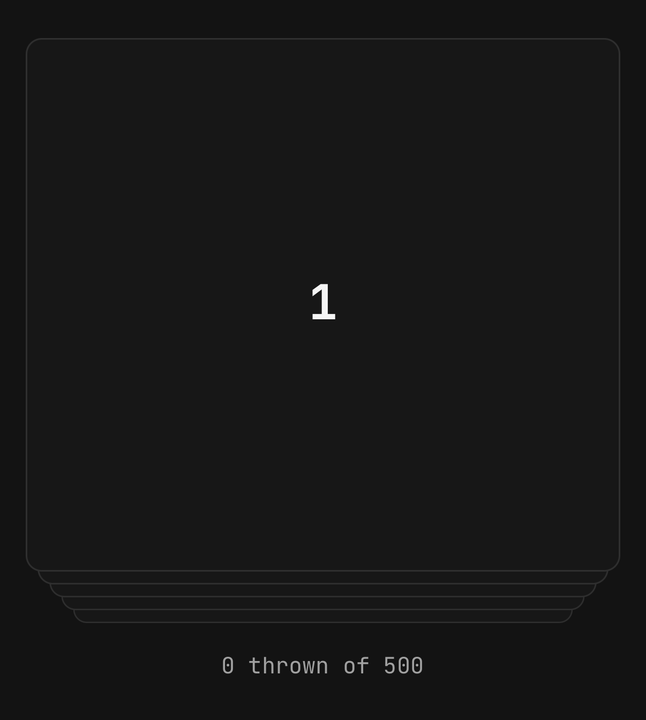
Only a window around the top card is mounted: one behind for undo, the depth drawn, and one more
that fades in. A deck of five hundred costs what a deck of five does.
Haptics
A tick when a drag first crosses the threshold — the cue to let go — re-armed each time it crosses
back, and a medium knock on a throw. This defaults to "selection", unlike the rest of the
library; haptic={false} silences both.
Accessibility
The top card is one accessible element with a custom action for each allowed direction, named by
directionLabels ("Swipe left" and so on by default), plus "Undo" while there is a card to bring
back. Every card behind it is hidden from assistive technology. Because the top card is one element,
a control inside it is not separately reachable — put the deck's controls in StackCard.Actions,
whose buttons carry the same labels. Stamps are hidden; the actions say the same thing in words.
Under Reduce Motion a card leaves by fading rather than flying, and the pile swaps without stepping. Which card is on top is the information, so that is kept.
API Reference
StackCard
Extends ViewProps, except children.
Prop
Type
StackCard.Card
One card: the card fill, a hairline and the card corner, filling the pile. Extends ViewProps.
Prop
Type
StackCard.Stamp
A bordered label drawn on the top card, on the side it answers for, fading in as the card leans that
way. Extends ViewProps.
Prop
Type
StackCard.Empty
Shown centred in the pile once every card has gone. Bare text is wrapped in a muted paragraph.
Extends ViewProps.
StackCard.Actions
A centred row under the pile. Extends ViewProps.
StackCard.Action
A round button that answers for the top card. A direction's glyph takes its stamp's colour.
Prop
Type
useStackCard
Returns { index, count, swipe, undo, canUndo } for a custom control inside the deck. Throws outside
a <StackCard>.