ListGroup
A surface grouping related rows, with dividers inserted for you.
import { ListGroup } from "@delacour/native-ui/list-group";
import { Icon } from "@delacour/native-ui/icon";import { IconBell, IconGlobe } from "@delacour/native-ui/icons/central";import { ListGroup } from "@delacour/native-ui/list-group";import { Spinner } from "@delacour/native-ui/spinner";import { Text } from "@delacour/native-ui/text";import type { ReactElement } from "react";import { View } from "react-native";export function Demo(): ReactElement { return ( <ListGroup> <ListGroup.Item testID="row-language"> <ListGroup.ItemPrefix> <Icon icon={IconGlobe} /> </ListGroup.ItemPrefix> <ListGroup.ItemContent> <ListGroup.ItemTitle>Language</ListGroup.ItemTitle> </ListGroup.ItemContent> <ListGroup.ItemSuffix> <Text.Caption>English</Text.Caption> </ListGroup.ItemSuffix> </ListGroup.Item> <ListGroup.Item testID="row-notifications"> <ListGroup.ItemPrefix> <Icon icon={IconBell} /> </ListGroup.ItemPrefix> <ListGroup.ItemContent> <ListGroup.ItemTitle>Notifications</ListGroup.ItemTitle> </ListGroup.ItemContent> <ListGroup.ItemSuffix> <View className="h-6 w-6 items-center justify-center rounded-full bg-danger"> <Text className="font-bold text-danger-foreground text-xs">7</Text> </View> </ListGroup.ItemSuffix> </ListGroup.Item> <ListGroup.Item testID="row-syncing"> <ListGroup.ItemContent> <ListGroup.ItemTitle>Syncing</ListGroup.ItemTitle> </ListGroup.ItemContent> <ListGroup.ItemSuffix> <Spinner color="muted-foreground" size="sm" /> </ListGroup.ItemSuffix> </ListGroup.Item> <ListGroup.Item testID="row-chevron"> <ListGroup.ItemContent> <ListGroup.ItemTitle>Custom chevron</ListGroup.ItemTitle> <ListGroup.ItemDescription>iconProps tunes the default glyph</ListGroup.ItemDescription> </ListGroup.ItemContent> <ListGroup.ItemSuffix iconProps={{ color: "danger", size: 22 }} /> </ListGroup.Item> </ListGroup> );}<ListGroup>
<ListGroup.Item onPress={openProfile}>
<ListGroup.ItemPrefix><Icon icon={IconUser} /></ListGroup.ItemPrefix>
<ListGroup.ItemContent>
<ListGroup.ItemTitle>Profile</ListGroup.ItemTitle>
<ListGroup.ItemDescription>Name, photo and handle</ListGroup.ItemDescription>
</ListGroup.ItemContent>
<ListGroup.ItemSuffix />
</ListGroup.Item>
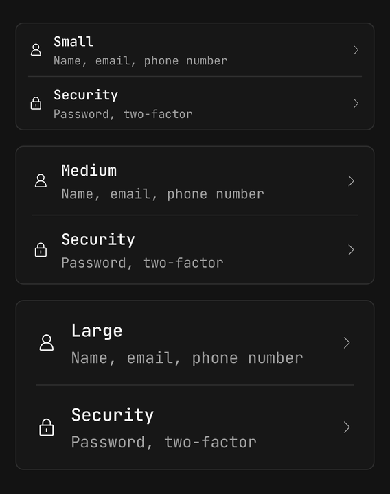
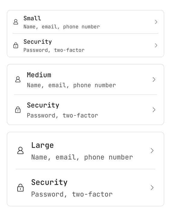
</ListGroup>Variants: default, secondary, tertiary, transparent. Sizes: sm, md, lg.
Size is not decoration — it drives the row metrics, the title and description type scale, both icon sizes and the divider inset. Those five numbers live in one axis rather than five magic values.
Dividers are inserted, not written out

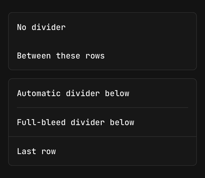
import { ListGroup } from "@delacour/native-ui/list-group";import { Separator } from "@delacour/native-ui/separator";import type { ReactElement } from "react";import { View } from "react-native";export function Demo(): ReactElement { return ( <View className="gap-4"> <ListGroup isDivided={false}> <ListGroup.Item>No divider</ListGroup.Item> <ListGroup.Item>Between these rows</ListGroup.Item> </ListGroup> <ListGroup> <ListGroup.Item>Automatic divider below</ListGroup.Item> <ListGroup.Item>Full-bleed divider below</ListGroup.Item> <Separator /> <ListGroup.Item>Last row</ListGroup.Item> </ListGroup> </View> );}The root walks its children and puts a Separator between adjacent ones, inset to line up with the
rows' padding.
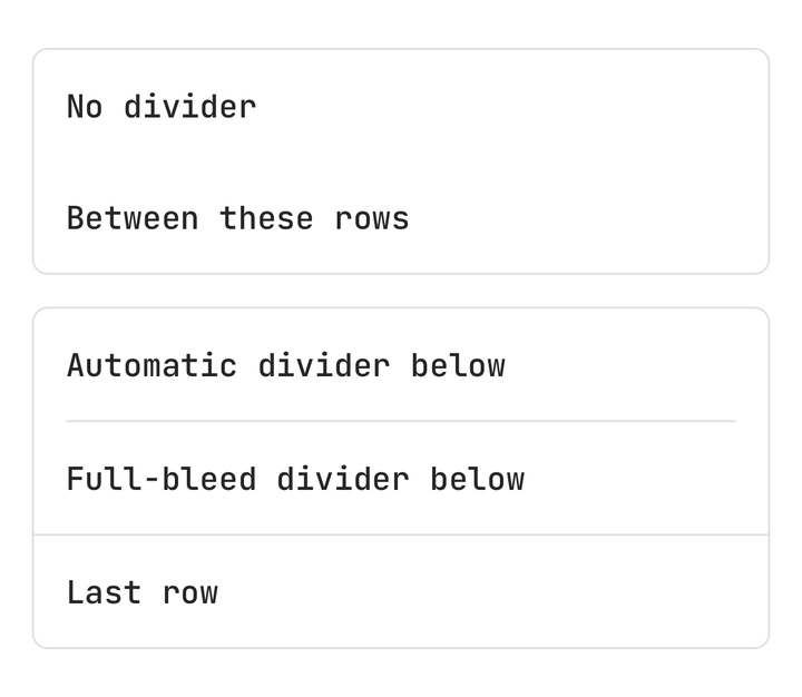
A Separator placed by hand suppresses the automatic one on either side of it, so you can make one
gap full-bleed without turning the feature off. isDivided={false} turns it off entirely.
Children.toArray drops the nulls a conditional child leaves behind, so a row rendered only some
of the time does not strand a divider.
The root clips. overflow-hidden is load-bearing: a pressed row fades to the edge of its own box,
and the first and last rows would square off the group's corners without it.
A row is a Pressable
ListGroupItemProps extends PressableProps, so feedback, haptic, pressedScale and the rest
are inherited rather than restated. Only the default differs: fade, because a full-bleed row that
scales reads as the whole card flexing rather than as one row responding.
Slots are flat

import { LIST_GROUP_VARIANTS, ListGroup } from "@delacour/native-ui/list-group";import type { ReactElement } from "react";import { View } from "react-native";export function Demo(): ReactElement { return ( <View className="gap-4"> {LIST_GROUP_VARIANTS.map((variant) => ( <ListGroup key={variant} variant={variant}> <ListGroup.Item testID={`row-${variant}`}> <ListGroup.ItemContent> <ListGroup.ItemTitle>{variant}</ListGroup.ItemTitle> <ListGroup.ItemDescription>Surface for the {variant} variant</ListGroup.ItemDescription> </ListGroup.ItemContent> <ListGroup.ItemSuffix /> </ListGroup.Item> <ListGroup.Item> <ListGroup.ItemContent> <ListGroup.ItemTitle>Second row</ListGroup.ItemTitle> </ListGroup.ItemContent> <ListGroup.ItemSuffix /> </ListGroup.Item> </ListGroup> ))} </View> );}
import { Icon } from "@delacour/native-ui/icon";import { IconLock, IconUser } from "@delacour/native-ui/icons/central";import { LIST_GROUP_SIZES, ListGroup } from "@delacour/native-ui/list-group";import type { ReactElement } from "react";import { View } from "react-native";export function Demo(): ReactElement { return ( <View className="gap-4"> {LIST_GROUP_SIZES.map((size) => ( <ListGroup key={size} size={size}> <ListGroup.Item testID={`row-${size}`}> <ListGroup.ItemPrefix> <Icon icon={IconUser} /> </ListGroup.ItemPrefix> <ListGroup.ItemContent> <ListGroup.ItemTitle>size {size}</ListGroup.ItemTitle> <ListGroup.ItemDescription>Name, email, phone number</ListGroup.ItemDescription> </ListGroup.ItemContent> <ListGroup.ItemSuffix /> </ListGroup.Item> <ListGroup.Item> <ListGroup.ItemPrefix> <Icon icon={IconLock} /> </ListGroup.ItemPrefix> <ListGroup.ItemContent> <ListGroup.ItemTitle>Security</ListGroup.ItemTitle> <ListGroup.ItemDescription>Password, two-factor</ListGroup.ItemDescription> </ListGroup.ItemContent> <ListGroup.ItemSuffix /> </ListGroup.Item> </ListGroup> ))} </View> );}ListGroup.ItemPrefix, never ListGroup.Item.Prefix — the keys are deliberately flat, and the
displayNames match (DelacourUI.ListGroup.ItemPrefix).
ItemPrefix wraps its subtree in an IconDefaultsProvider, so a bare <Icon> needs nothing said.
ItemSuffix draws a chevron when it has no children of its own; iconProps tunes that glyph and is
ignored once it does.
String children are wrapped in an ItemContent around an ItemTitle automatically.
Title colour goes on the title. The item slot carries no text-* — a row is a View and cannot
cascade colour to a Text. The tests assert this.
API
Prop
Type
ListGroup.Item
A row. A Pressable, so feedback, haptic and the rest are inherited — only the default
differs: fade, because a full-bleed row that scales reads as the whole card flexing.
Prop
Type
ListGroup.ItemPrefix / ItemContent / ItemSuffix
The row's three regions. ItemPrefix wraps its subtree in icon defaults, so a bare Icon needs
nothing said at the call site. ItemSuffix draws a chevron when it has no children of its own.
Prop
Type
ListGroup.ItemTitle / ItemDescription
The row's two lines of text. Extend React Native's TextProps.
Prop
Type
Title colour goes on the title, never on the row. A row is a View, and a React Native View does
not cascade colour to a Text descendant the way a DOM element would — so the item slot carries
no text-* at all. The variants tests assert it.