ToggleButton
A button that stays pressed — alone, or in a group choosing one option or several.
Installation
ToggleButton ships with the library — install it once, then import:
import { ToggleButton } from "@delacour/react-native-ui/toggle-button";Or copy the source into your project, to own and edit it:
bunx delacour@latest add toggle-buttonUsage
import { ToggleButton } from "@/components/ui/toggle-button";
import { useState } from "react";
import { View } from "react-native";

export default function Example() {
  const [isFollowing, setIsFollowing] = useState(false);

  return (
    <View className="flex-1 items-center justify-center p-4">
      <ToggleButton isSelected={isFollowing} onSelected={setIsFollowing}>
        {isFollowing ? "Following" : "Follow"}
      </ToggleButton>
    </View>
  );
}
Anatomy
<ToggleButton.Group>
  <ToggleButton value="bold">
    <Icon icon={IconBold} />
    <ToggleButton.Label>Bold</ToggleButton.Label>
  </ToggleButton>
</ToggleButton.Group>
A toggle is a Button. Each state draws with one of the button's
own variants, so the fill, the label colour and the colour of a composed Icon change together, and
the sizes, haptic, feedback and isLoading are the button's too.
Variants
default is a quiet fill that takes the action colour when pressed; outline is a bordered button
that fills; ghost is bare until pressed.
<ToggleButton variant="default">Default</ToggleButton>
<ToggleButton variant="outline">Outline</ToggleButton>
<ToggleButton variant="ghost">Ghost</ToggleButton>| Variant | Off | On |
|---|---|---|
default | secondary | primary |
outline | outline | primary |
ghost | ghost | secondary |
Sizes
The button's steps. A square icon-* size holds a single glyph — give it an accessibilityLabel,
since there is no text for a screen reader to fall back on.
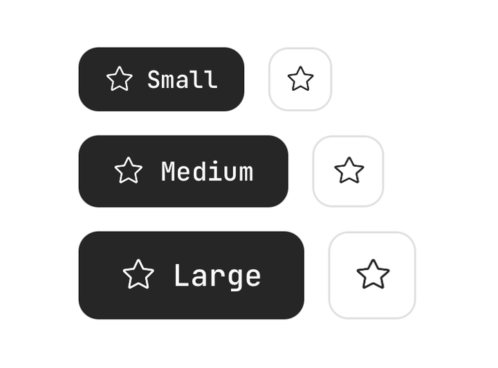
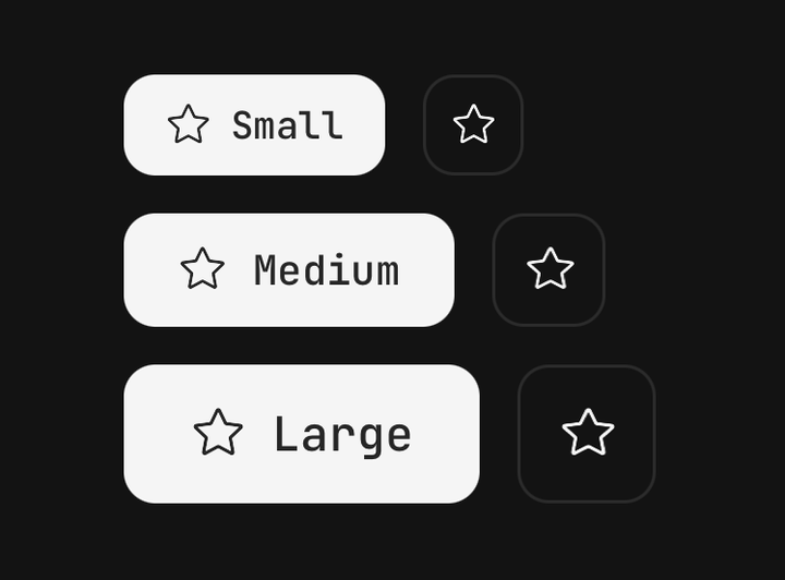
<ToggleButton size="sm">Small</ToggleButton>
<ToggleButton size="md">Medium</ToggleButton>
<ToggleButton size="lg">Large</ToggleButton>
<ToggleButton accessibilityLabel="Star" size="icon-md">
  <Icon icon={IconStar} />
</ToggleButton>
Controlled and uncontrolled
isSelected with onSelected puts the state in your hands; defaultSelected lets the toggle hold
its own. Children may be a function of the state, for content that changes with it.
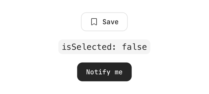
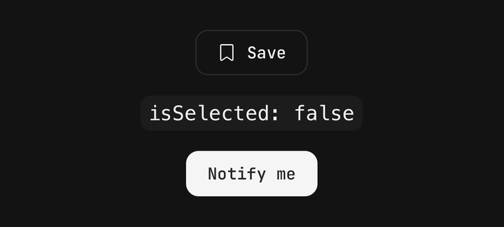
const [isSaved, setIsSaved] = useState(false);

<ToggleButton isSelected={isSaved} onSelected={setIsSaved} variant="outline">
  {({ isSelected }) => (
    <>
      <Icon icon={isSelected ? IconBookmarkCheck : IconBookmark} />
      <ToggleButton.Label>{isSelected ? "Saved" : "Save"}</ToggleButton.Label>
    </>
  )}
</ToggleButton>

<ToggleButton defaultSelected>Notify me</ToggleButton>
Disabled and loading
isDisabled fades the toggle in either state. isLoading keeps full contrast, blocks presses and
announces the toggle as busy — the shape for a toggle whose change is a request.
<ToggleButton isDisabled>Disabled</ToggleButton>
<ToggleButton isLoading={isSaving} isSelected={isFollowing} onSelected={follow}>
  {isFollowing ? "Following" : "Follow"}
</ToggleButton>
Multiple selection
ToggleButton.Group holds one array of its members' values. The default multiple mode is a set
of independent marks — bold and italic — and onSelected fires with the whole new list.
const [marks, setMarks] = useState<string[]>(["bold"]);

<ToggleButton.Group selected={marks} onSelected={setMarks} size="icon-md" variant="outline">
  <ToggleButton accessibilityLabel="Bold" value="bold">
    <Icon icon={IconBold} />
  </ToggleButton>
  <ToggleButton accessibilityLabel="Italic" value="italic">
    <Icon icon={IconItalic} />
  </ToggleButton>
  <ToggleButton accessibilityLabel="Underline" value="underline">
    <Icon icon={IconUnderline} />
  </ToggleButton>
</ToggleButton.Group>
Single selection
selectionMode="single" is an either-or choice: picking one clears the last, and a re-press of the
current one clears it too. isSelectionRequired keeps an answer on the board, so that re-press does
nothing — and onSelected is never called for a press that changes nothing.
<ToggleButton.Group
  accessibilityLabel="Text alignment"
  isSelectionRequired
  selected={alignment}
  onSelected={setAlignment}
  selectionMode="single"
  size="icon-md"
>
  <ToggleButton accessibilityLabel="Align left" value="left">
    <Icon icon={IconAlignmentLeft} />
  </ToggleButton>
  <ToggleButton accessibilityLabel="Align centre" value="center">
    <Icon icon={IconAlignmentCenter} />
  </ToggleButton>
</ToggleButton.Group>
For a run that fills its parent, put className="w-full" on the group and className="flex-1" on
each toggle.
Layouts
attached, the default, is a Button.Group: the toggles join
into one run with shared corners and a hairline seam, run either way with orientation, and take a
Button.Group.Separator between two members. detached spaces them apart and wraps, for a row of
filters.
<ToggleButton.Group layout="detached" selected={statuses} onSelected={setStatuses} size="sm" variant="outline">
  <ToggleButton value="open">Open</ToggleButton>
  <ToggleButton value="review">In review</ToggleButton>
  <ToggleButton value="done">Done</ToggleButton>
</ToggleButton.Group>
The group's variant, size, isDisabled and haptic are defaults, not overrides: one option can
disable itself inside a live group. An attached group owns the size step outright — controls of
different heights do not join — while a square member stays square.
Inside a group, a toggle's value is required — the group tracks selection by it. A toggle without
one renders but can never be selected, and warns in development.
Accessibility
The state is announced, not only drawn. A toggle on its own, or in a multiple group, is a
togglebutton with accessibilityState.checked — read out as on or off. A member of a single
group is a radio with accessibilityState.selected, inside a radiogroup. The toggle keeps its
role, state and press handler: a caller's onPress still runs, first, but cannot pull the announced
state away from the drawn one.
API Reference
ToggleButton
Extends the Button's props, except variant,
accessibilityRole and accessibilityState, which the toggle owns.
Prop
Type
ToggleButton.Group
Owns the selection for the toggles inside it. Extends ViewProps.
Prop
Type
ToggleButton.Label
The toggle's text, coloured for the state it is in. Extends React Native's TextProps.
Prop
Type
useToggleButton
Returns { isSelected, isDisabled, variant, size } for a custom child that changes with the toggle.
Throws outside a <ToggleButton>.