Text

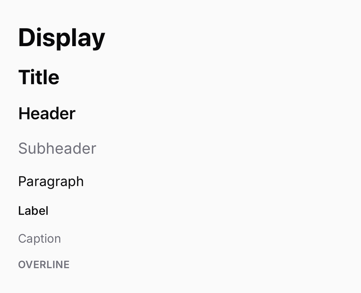
The type scale, and the one component that reproduces React Native's text inheritance through classNames.
import { Text } from "@delacour/native-ui/text";
<Text.Title>Settings</Text.Title>
<Text.Paragraph>Manage how the app behaves on this device.</Text.Paragraph>

Presets

Type scale
Type scale
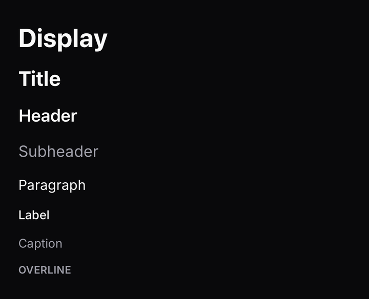
import { Text } from "@delacour/native-ui/text";import type { ReactElement } from "react";import { View } from "react-native";export function Demo(): ReactElement {	return (		<View className="gap-3">			<Text.Display>Display</Text.Display>			<Text.Title>Title</Text.Title>			<Text.Header>Header</Text.Header>			<Text.Subheader>Subheader</Text.Subheader>			<Text.Paragraph>Paragraph</Text.Paragraph>			<Text.Label>Label</Text.Label>			<Text.Caption>Caption</Text.Caption>			<Text.Overline>Overline</Text.Overline>		</View>	);}
Inline presets
Inline presets
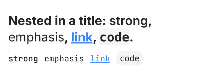
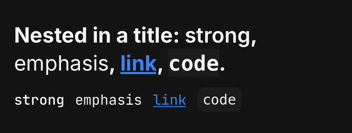
import { Text } from "@delacour/native-ui/text";import type { ReactElement } from "react";import { View } from "react-native";export function Demo(): ReactElement {	return (		<View className="gap-3">			<Text.Title>				Nested in a title: <Text.Strong>strong</Text.Strong>, <Text.Emphasis>emphasis</Text.Emphasis>,{" "}				<Text.Link>link</Text.Link>, <Text.Code>code</Text.Code>.			</Text.Title>			<View className="flex-row flex-wrap items-center gap-3">				<Text.Strong>strong</Text.Strong>				<Text.Emphasis>emphasis</Text.Emphasis>				<Text.Link>link</Text.Link>				<Text.Code>code</Text.Code>			</View>		</View>	);}

Eight block presets, largest first.

PresetTreatmentUse for
Text.Display30pt bold, announced as a headingA screen's one hero line
Text.Title24pt bold, announced as a headingA screen or card title
Text.Header20pt semibold, announced as a headingA section heading
Text.Subheader18pt mutedThe secondary line under a title — not a fourth heading level
Text.Paragraph16ptA block of prose. The same treatment a bare <Text> renders
Text.Label14pt mediumA control label or compact UI string
Text.Caption14pt on the muted tokenSupporting copy
Text.Overline12pt semibold, uppercase, mutedAn eyebrow above a section

Four inline presets, which emit only a delta and inherit everything else.

PresetTreatment
Text.StrongEmphasis by weight
Text.EmphasisEmphasis by slant
Text.LinkA tappable run on the info token. Takes onPress
Text.CodeMonospaced. Padded only when it stands alone

Inheritance

Nesting
Nesting
import { Text } from "@delacour/native-ui/text";import type { ReactElement } from "react";import { View } from "react-native";export function Demo(): ReactElement {	return (		<View className="gap-3">			<Text.Title>				Total <Text color="muted">USD</Text>			</Text.Title>			<Text.Paragraph>				One <Text>level</Text>, then{" "}				<Text weight="bold">					two <Text color="danger">levels</Text>				</Text>{" "}				deep.			</Text.Paragraph>		</View>	);}

Every Text publishes its resolved class to its subtree, and merges the one it inherited.

<Text.Paragraph>
  Sign in with <Text.Strong>your work account</Text.Strong> to continue.
</Text.Paragraph>

Text.Strong comes out at the paragraph's size and colour with only the weight changed — it emits a weight and nothing else.

Natively a nested <Text> inherits the parent's style object and overrides only the keys it sets. Uniwind compiles each className independently, so the parent's resolved class has to be threaded through a context and beaten per-axis instead. The merge order, weakest first:

  1. TEXT_BASE_CLASS
  2. the inherited class
  3. this text's named axes
  4. the caller's className

The correctness property

For every class this resolver can produce, a nested Text with no props of its own resolves to exactly its parent's string — at any depth. The tests assert it across the whole matrix.

Anything can publish into the cascade

A Button wraps its children in a TextClassProvider carrying the label's treatment, so a bare <Text> composed into one needs nothing at the call site.

import { useTextClass } from "@delacour/native-ui/text";

const inherited = useTextClass();

Publish a treatment only where one covers the whole subtree. A ListGroup row (title + description), a navbar (title + subtitle) and Screen.Error (title + message) each carry two, and one provider cannot serve both — so their parts keep per-part classes.

Axes

<Text size="lg" weight="semibold" color="muted" align="center" transform="uppercase">
  Heads up
</Text>

Each axis beats the variant's own value and anything inherited. Omit an axis and it falls through to the enclosing text.

textVariants has no defaultVariants, and must not gain any. An axis the caller did not name has to emit nothing so it falls through — that fall-through is the whole feature. A default would emit from inside the same call, ahead of the inherited class in the merge, and every nested Text would snap back to it. The fallback lives in TEXT_BASE_CLASS instead.

Colour

Colour
Colour
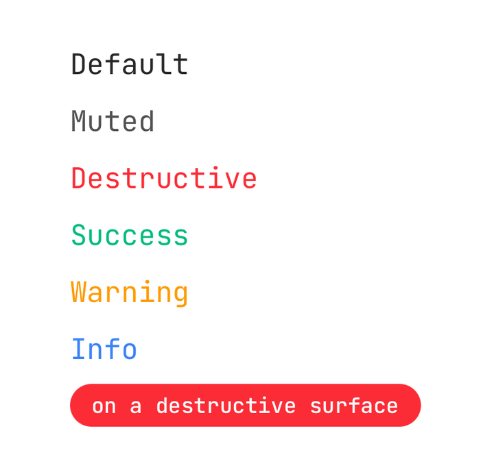
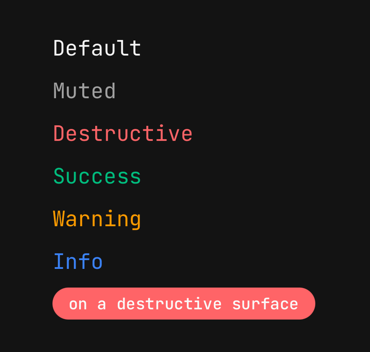
import { TEXT_COLORS, Text } from "@delacour/native-ui/text";import type { ReactElement } from "react";import { View } from "react-native";export function Demo(): ReactElement {	return (		<View className="gap-2">			{TEXT_COLORS.map((color) => (				<Text color={color} key={color}>					color {color}				</Text>			))}			<View className="self-start rounded-full bg-danger px-3 py-1">				<Text className="font-semibold text-danger-foreground text-xs">on a danger surface</Text>			</View>		</View>	);}

color is page-level only — there is no -foreground family here.

<Text color="danger">Could not save</Text>

X-foreground means "content drawn on an X surface", and mapping a surface variant to its foreground is each surface component's job (BUTTON_FOREGROUND_TOKEN, LIST_GROUP_FOREGROUND_TOKEN). A second copy of that map here could drift from it. Text on a coloured surface writes the utility in a className.

Font scaling

allowFontScaling is left at React Native's default. maxFontSizeMultiplier defaults to TEXT_MAX_FONT_SIZE_MULTIPLIER — the cap exists for the fixed-height chrome, where h-button-* and h-navbar-row cannot grow and an uncapped multiplier would clip a label rather than enlarge it. Both stay overridable per call site.

Gotchas

Truncation
Truncation
import { Text } from "@delacour/native-ui/text";import type { ReactElement } from "react";import { View } from "react-native";const LOREM =	"A nested Text adopts the treatment around it and overrides only the axes it names, which is what React Native does natively with a nested Text's style.";export function Demo(): ReactElement {	return (		<View className="gap-3">			<Text.Paragraph numberOfLines={1}>{LOREM}</Text.Paragraph>			<Text.Paragraph numberOfLines={2}>{LOREM}</Text.Paragraph>		</View>	);}

A nested Text.Code cannot be padded

A nested <Text> is laid out by the platform's text engine — an NSAttributedString run on iOS, a Span on Android — and both ignore padding, margin and border radius on an inner <Text>. Only the background survives. The pill treatment applies to the standalone case only; a code block is a View you wrap around it.

align is left / center / right

Never start / end. React Native's textAlign accepts auto | left | right | center | justify and nothing else, so Tailwind's logical-property utilities resolve to a value RN rejects.

An arbitrary font size must be a length

Write text-[17px] or text-(length:--x). A bare text-[var(--x)] is ambiguous to tailwind-merge, which files it under colour — so it will not override the inherited size.

No asChild

Slot throws on a non-element child and a Text's child is usually a string, so it would be unusable in the shape people would reach for. There is also nothing to donate — useTextClass() hands the class over directly.

Performance

Text renders Animated.Text, so animated text styles work anywhere with no opt-in — at the cost of a Reanimated wrapper per text node. If a long list ever profiles badly, the escape hatch is <Animated.Text className={useTextClass()} style={…} /> in app code; the cascade is on context, so it inherits correctly. Measure first.

API

TextProps

Animated.Text's props, minus className, plus:

Prop

Type

useTextClass()

Returns the resolved class of the nearest enclosing Text or TextClassProvider.

Prop

Type

Exported constants

import {
  TEXT_VARIANTS,
  TEXT_INLINE_VARIANTS,
  TEXT_SIZES,
  TEXT_WEIGHTS,
  TEXT_COLORS,
  TEXT_ALIGNS,
  TEXT_TRANSFORMS,
  TEXT_BASE_CLASS,
  TEXT_MAX_FONT_SIZE_MULTIPLIER,
  textVariants,
  resolveTextClass,
} from "@delacour/native-ui/text";

TEXT_VARIANTS is ordered — block presets first, largest first — and the tests read that order to assert the type scale descends. A new block role goes in at its step, not on the end.

On this page