Field
A form field's layout, and the one place its state is written down.
Installation
Field ships with the library — install it once, then import:
import { Field } from "@delacour/react-native-ui/field";Or copy the source into your project, to own and edit it:
bunx delacour@latest add fieldUsage
import { Field } from "@/components/ui/field";
import { Input } from "@/components/ui/input";
import { useState } from "react";
import { View } from "react-native";

export default function Example() {
  const [email, setEmail] = useState("");

  return (
    <View className="flex-1 justify-center p-4">
      <Field>
        <Field.Label>Email</Field.Label>
        <Input value={email} onChangeText={setEmail} />
        <Field.Description>We only use this to send receipts.</Field.Description>
      </Field>
    </View>
  );
}
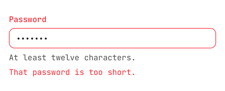
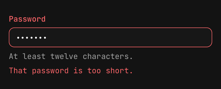
The four parts together — a label, the control, a description and an error:
States
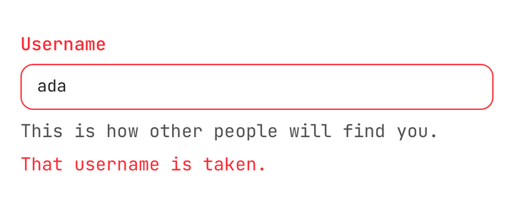
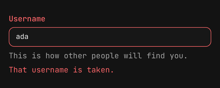
isInvalid and isDisabled live on the Field and reach the control inside it.
<Field isInvalid>
  <Field.Label>Email</Field.Label>
  <Input value={email} onChangeText={setEmail} />
  <Field.Error>{error}</Field.Error>
</Field>
The label turns destructive, and so does the Input — with nothing said on the input itself. A control
opts out explicitly: <Input isInvalid={false} />.
Orientation
Use orientation to stack the label over the control or put them side by side, with
Field.Content grouping a label and its description as one block.
<Field orientation="horizontal">
  <Field.Content>
    <Field.Label>Accept the terms</Field.Label>
    <Field.Description>You can withdraw consent at any time.</Field.Description>
  </Field.Content>
  <Checkbox isChecked={accepted} onCheckedChange={setAccepted} />
</Field>
Once a control inside offers a press, the field becomes a Pressable and the whole row drives it —
tapping the label, or the description under it, ticks the checkbox.
Sets and groups
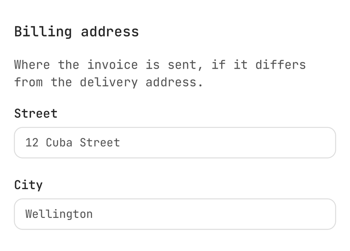
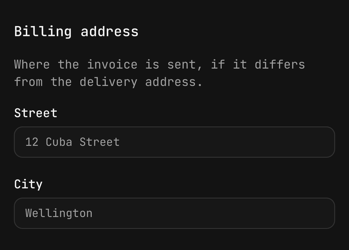
Use Field.Set for a named section of a form and Field.Group for the fields under it.
<Field.Set>
  <Field.Legend>Notifications</Field.Legend>
  <Field.Description>Choose what reaches you, and how.</Field.Description>

  <Field.Group>
    <Field orientation="horizontal">
      <Field.Label>Email</Field.Label>
      <Checkbox isChecked={email} onCheckedChange={setEmail} />
    </Field>
    <Field orientation="horizontal">
      <Field.Label>Push</Field.Label>
      <Checkbox isChecked={push} onCheckedChange={setPush} />
    </Field>
  </Field.Group>
</Field.Set>
Field.Legend takes variant="label" for a nested set, so it matches the fields under it rather
than titling them.
Separators
A labelled separator draws two rules with the label between them.
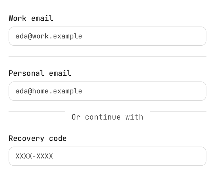
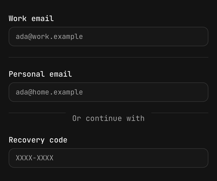
<Field.Separator />
<Field.Separator>or</Field.Separator>
Errors
Field.Error renders nothing when it has no children, so the line removes itself once the value is
fixed.
<Field.Error>{error}</Field.Error>Reading the field's state
Use useField() to read the field from a control inside it, without prop drilling.
import { useField, useFieldContext } from "@delacour/react-native-ui/field";

const { isInvalid, isDisabled, orientation } = useField();
useField() throws outside a <Field>. Use useFieldContext() where the field is optional — as
every control does.
API Reference
Anatomy
Prop
Type
FieldProps
React Native's ViewProps, plus:
Prop
Type
FieldTextProps
TextProps with variant omitted — each part already is one, and naming a second would let a
caller turn a description into a heading and lose the type scale the component exists to keep.
FieldLegendProps
FieldTextProps, plus:
Prop
Type
useField()
Prop
Type
Exports
import {
  FIELD_ORIENTATIONS,
  FIELD_LEGEND_VARIANTS,
  FIELD_TEXT_PARTS,
  fieldVariants,
  resolveFieldTextColor,
  resolveFieldInteractive,
  resolveFieldLabelText,
} from "@delacour/react-native-ui/field";