Build your React Native component library.
Composable, accessible components with thoughtful defaults. Code you can customize, extend and make your own — for iOS and Android, painted from the same design tokens as your web app.
bunx delacour@latest add button switch sliderOr try every component on your phone —join the iOS beta on TestFlight
Theme
This site is wearing one of them.
Every colour, corner and face on this page is a preset from the customiser — the same one that writes your app's theme.css. Try another, or build your own.
Design tokens
Your web theme is already your mobile theme.
Components
What they look like.
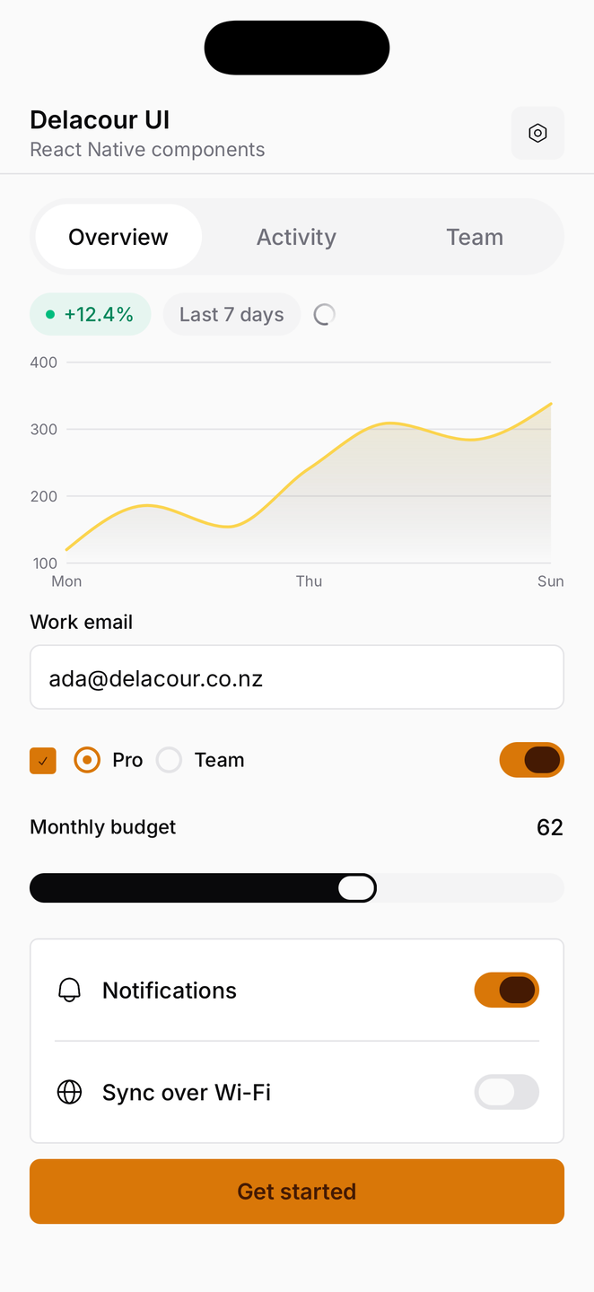
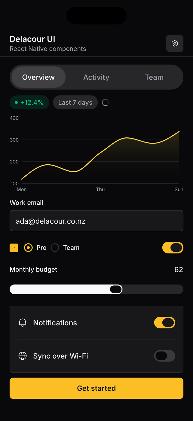
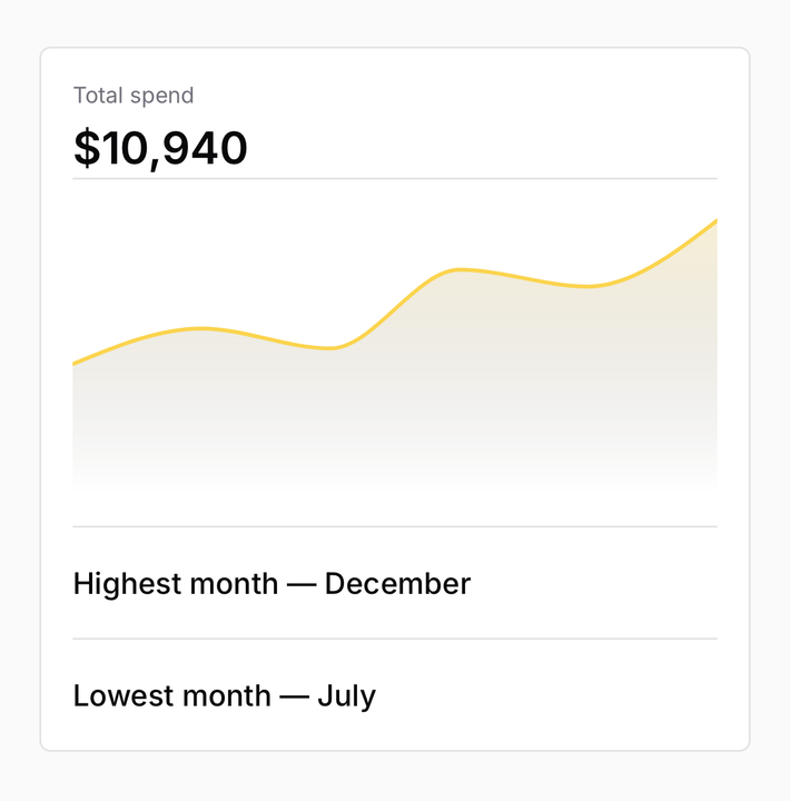
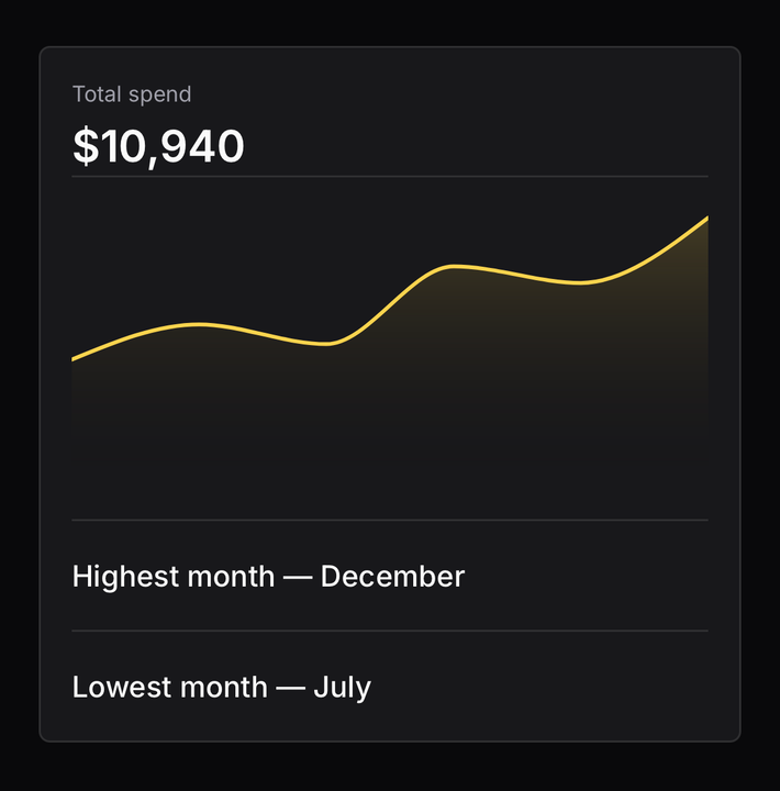
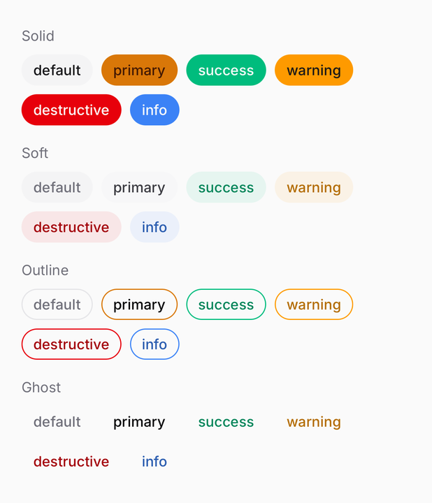
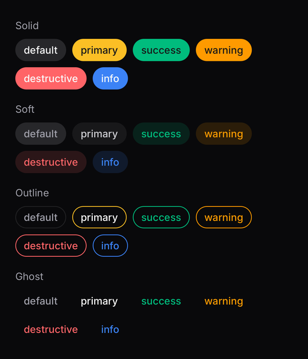
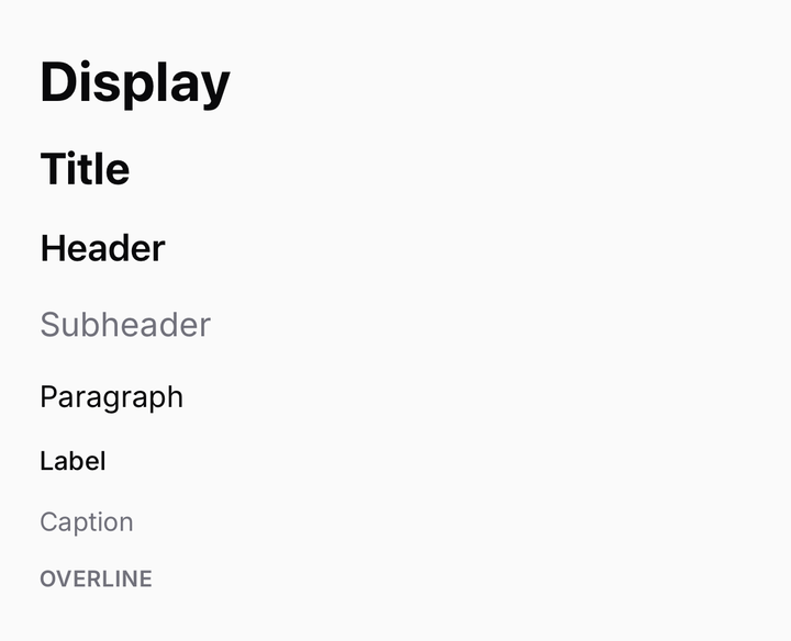
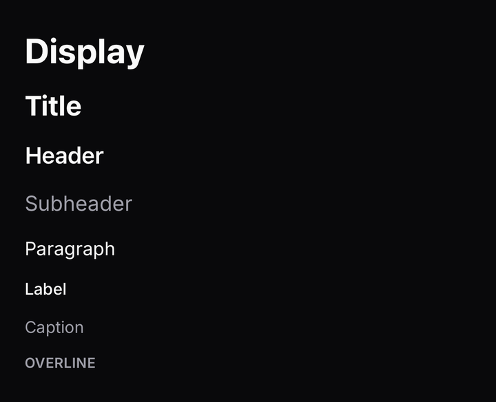
53 components, every one captured on an iPhone in both themes. Toggle the site's theme and the pictures follow.
Design tokens
Your web theme is already your mobile theme.
The palette is shadcn's, in shadcn's shape. Every token your web app already defines — --primary, --muted-foreground, --radius — is the token these components paint from. Copy your globals.css across and the mobile app matches the website from day one: same colours, same corners, same light and dark, and styled composable components before you have written a single one.
/* globals.css — your web app, as shadcn wrote it */:root { --radius: 0.625rem; --background: oklch(1 0 0); --foreground: oklch(0.145 0 0); --primary: oklch(0.205 0 0); --primary-foreground: oklch(0.985 0 0); --muted-foreground: oklch(0.556 0 0);}.dark { --background: oklch(0.145 0 0); --foreground: oklch(0.985 0 0); --primary: oklch(0.922 0 0); --primary-foreground: oklch(0.205 0 0); --muted-foreground: oklch(0.708 0 0);}bunx delacour@latest theme ./globals.css/* theme.css — the same tokens, in the shape Uniwind reads */@layer theme { :root { @variant light { --background: oklch(1 0 0); --primary: oklch(0.205 0 0); --primary-foreground: oklch(0.985 0 0); } @variant dark { --background: oklch(0.145 0 0); --primary: oklch(0.922 0 0); --primary-foreground: oklch(0.205 0 0); } }}import { Button } from "@delacour/react-native-ui/button";import { Text } from "@delacour/react-native-ui/text";<View className="bg-background p-4"> <Text className="text-muted-foreground">Same names. Same palette.</Text> <Button variant="primary" onPress={save}> <Button.Label>Save</Button.Label> </Button></View>;One command, one file
delacour themetakes a path, a URL or stdin — a hand-written theme, ashadcn initoutput or a tweakcn export — and writes the file this library reads.Nothing translated
Components reference the semantic name —
bg-primary,text-muted-foreground— never a raw colour and never adark:prefix. The variable swap is the theme.The rest is derived
The six tokens shadcn has no name for —
success,warning,info,elevated,tertiary,overlay— are built from the ones it does, so your palette drags them along.
Principles
Built the way you would build it yourself.
Uniwind for styling, Reanimated and the Gesture API for motion, Skia for charts. Every decision written down beside the code that makes it.
Composable
Compound parts, not prop bags. A button takes a label and an icon as children, publishes its size and foreground to them, and a bare <Icon> comes out matching the text beside it.
Accessible
Roles, states and labels are wired into every control — a switch announces as a switch, a disabled button reads as disabled, and a separator is hidden from the screen reader that does not need it.
Thoughtful defaults
A loading spinner takes the place of the icon it replaces, so nothing shifts. Sizes index one scale. Corners derive from one radius. Every decision is written down beside the code that makes it.
Yours to own
The CLI copies the component's source into your repository. Change a variant, add one, delete what you do not need — it is your code from the first commit, not a dependency you configure around.
Built for the platform
Reanimated springs, the Gesture API, haptic feedback and Skia charts. A switch you can drag as well as tap. A sheet that follows the finger. Motion that belongs on a phone.
Typed and tested
Every variant resolver is pure TypeScript with no React Native import, so the whole matrix runs under bun test. Granular export subpaths keep the optional native modules genuinely optional.
Theme
This site is wearing one of them.
Every colour, corner and face on this page is a preset from the customiser — the same one that writes your app's theme.css. Try another, or build your own.
- DelacourThe studio's own: graphite, hairlines, JetBrains Mono throughout.DelacourThe studio's own: graphite, hairlines, JetBrains Mono throughout.
- Delacour amberThe studio site: zinc, amber, Inter and Outfit.Delacour amberThe studio site: zinc, amber, Inter and Outfit.
- Library defaultWhat a fresh install ships: Vega, neutral, the platform font.Library defaultWhat a fresh install ships: Vega, neutral, the platform font.
- HarbourStone under blue, Rhea's rounder geometry, Lora headings.HarbourStone under blue, Rhea's rounder geometry, Lora headings.
- GraphiteSquare corners, a green accent, Geist and Geist Mono.GraphiteSquare corners, a green accent, Geist and Geist Mono.
Install
Own the source, or install the package.
The CLI writes each component's files into your project so you can change anything. The package is the same code, versioned, for a team that would rather take updates.
Copy a component's source in
bunx delacour@latest add buttonOr install the package
bun add @delacour/react-native-uiLibrary