Pressable

The Gesture API primitive every pressable in the library is built on.

import { Pressable } from "@delacour/native-ui/pressable";
<Pressable feedback="scale" haptic="selection" onPress={open}>
  <Text>Open</Text>
</Pressable>

Feedback

Named feedback
Named feedback
import { PRESSABLE_FEEDBACKS, Pressable } from "@delacour/native-ui/pressable";import { Text } from "@delacour/native-ui/text";import type { ReactElement } from "react";import { View } from "react-native";export function Demo(): ReactElement {	return (		<View className="gap-3">			{PRESSABLE_FEEDBACKS.map((feedback) => (				<Pressable					className="rounded-xl border border-border bg-card p-4"					feedback={feedback}					key={feedback}					testID={`feedback-${feedback}`}				>					<Text className="font-semibold text-base text-card-foreground">{feedback}</Text>				</Pressable>			))}		</View>	);}
Explicit values
Explicit values
import { Pressable } from "@delacour/native-ui/pressable";import { Text } from "@delacour/native-ui/text";import type { ReactElement } from "react";import { View } from "react-native";const PRESS_STYLES = [	{ label: "scale only", pressedOpacity: 1, pressedScale: 0.94 },	{ label: "fade only", pressedOpacity: 0.5, pressedScale: 1 },	{ label: "both", pressedOpacity: 0.7, pressedScale: 0.97 },	{ label: "neither", pressedOpacity: 1, pressedScale: 1 },] as const;export function Demo(): ReactElement {	return (		<View className="gap-3">			{PRESS_STYLES.map((style) => (				<Pressable					className="rounded-xl border border-border bg-card p-4"					key={style.label}					pressedOpacity={style.pressedOpacity}					pressedScale={style.pressedScale}					testID={`style-${style.label}`}				>					<Text className="font-semibold text-card-foreground text-base">{style.label}</Text>					<Text.Caption>						scale {style.pressedScale}, opacity {style.pressedOpacity}					</Text.Caption>				</Pressable>			))}		</View>	);}

scale, fade, scale-fade, none — the shared vocabulary, defined once. Every pressable in the library resolves through it rather than keeping a private map: Button narrows it, ListGroup.Item forwards it whole.

scale-fade is composed, not spelled out: its scale comes from scale and its opacity from fade, so tuning either single-axis mode carries through.

pressedScale and pressedOpacity win on the axis they name and leave the other to feedback. They are the escape hatch for a value the named modes do not cover — ?? is the merge, so an explicit 0 is a value rather than an absence.

A bare Pressable with no feedback presses to { opacity: 0.9, scale: 0.97 }, which fades less than fade does. That fallback is unnamed on purpose: naming it would either change what a bare pressable has always done, or force scale-fade to fade less than fade.

disabled vs busy

Both block the gesture; only disabled announces the control as disabled. Use busy for a temporary state the component clears itself, so assistive tech reports a control that is momentarily unavailable rather than one that is inert.

Neither applies any opacity — that is the caller's variant's job.

asChild

asChild
asChild
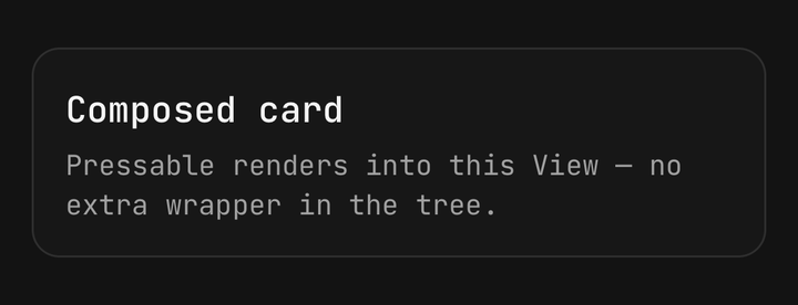
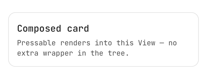
import { Pressable } from "@delacour/native-ui/pressable";import { Text } from "@delacour/native-ui/text";import type { ReactElement } from "react";import { View } from "react-native";export function Demo(): ReactElement {	return (		<Pressable asChild haptic="medium" testID="composed-card">			<View className="gap-1 rounded-xl border border-border bg-card p-4">				<Text className="font-semibold text-card-foreground text-lg">Composed card</Text>				<Text.Caption>Pressable renders into this View — no extra wrapper in the tree.</Text.Caption>			</View>		</Pressable>	);}

Renders into the single child element instead of emitting a View.
Why there is no tv() here

Its values are opacity and scale interpolation targets read by a worklet on the UI thread (1 - pressed.value * (1 - targetOpacity)), not styles. A worklet cannot compile a className, so tv is the wrong tool — a deliberate exception, not an oversight.

Worklets must be self-contained

A worklet cannot rely on a module-scope helper. Factoring a shared clamp into a clampUnit helper — itself marked "worklet" — crashes the UI thread with undefined is not a function: it is not captured into the worklet's closure. No unit test sees it, because on the JS thread the helper resolves perfectly.

Crossing back to JS

Haptics
Haptics
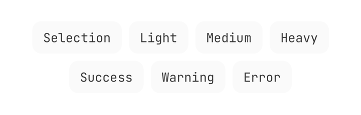
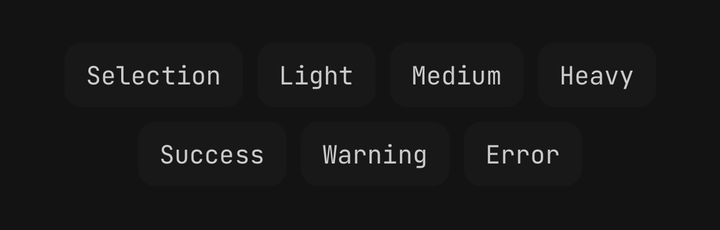
import { Pressable } from "@delacour/native-ui/pressable";import { Text } from "@delacour/native-ui/text";import type { ReactElement } from "react";import { View } from "react-native";const HAPTICS = ["selection", "light", "medium", "heavy", "success", "warning", "error"] as const;export function Demo(): ReactElement {	return (		<View className="flex-row flex-wrap gap-2">			{HAPTICS.map((haptic) => (				<Pressable					className="rounded-lg bg-tertiary px-3 py-2"					haptic={haptic}					key={haptic}					testID={`haptic-${haptic}`}				>					<Text className="text-sm text-tertiary-foreground">{haptic}</Text>				</Pressable>			))}		</View>	);}

Use scheduleOnRN from react-native-worklets, never Reanimated's runOnJS — since Reanimated 4 that is a deprecated shim forwarding to exactly this call.

scheduleOnRN(onPress);          // not runOnJS(onPress)()

A Biome noRestrictedImports rule in @delacour/biome-config fails the build on the deprecated names, so this cannot regress quietly.

Exports

import {
  Pressable,
  type PressableProps,
  type HapticFeedback,
  PRESSABLE_FEEDBACK,
  PRESSABLE_FEEDBACKS,
  PRESSABLE_FEEDBACK_FALLBACK,
  resolvePressedState,
} from "@delacour/native-ui/pressable";

API

Every pressable in the library extends this — Button, ListGroup.Item, Accordion.Trigger, Checkbox and Radio all inherit the vocabulary rather than restating it. ViewProps passes through, minus style.

Prop

Type

Neither disabled nor busy applies any opacity of its own — that is the caller's variant's job. A bare Pressable with no feedback presses to { opacity: 0.9, scale: 0.97 }, which fades less than fade does; the fallback is unnamed on purpose, so naming it could not change what a bare pressable has always done.

On this page