ProgressButton
A button held, not tapped, to confirm — a fill grows from the leading edge and the action fires when it reaches the end.
Installation
ProgressButton ships with the library — install it once, then import:
import { ProgressButton } from "@delacour/react-native-ui/progress-button";Or copy the source into your project, to own and edit it:
bunx delacour@latest add progress-buttonUsage
import { ProgressButton } from "@/components/ui/progress-button";
import { View } from "react-native";

export default function Example() {
  return (
    <View className="flex-1 items-center justify-center p-4">
      <ProgressButton isAutoReset onComplete={() => console.log("erased")} variant="destructive">
        <ProgressButton.Label>Hold to erase</ProgressButton.Label>
      </ProgressButton>
    </View>
  );
}
Anatomy
<ProgressButton onComplete={erase} variant="destructive">
  <Icon icon={IconTrashCan} />
  <ProgressButton.Label>Hold to erase</ProgressButton.Label>
  <ProgressButton.Done />
</ProgressButton>
For an irreversible action that would otherwise need a confirmation dialog — erasing, paying. Two taps in a row are a rhythm a hand falls into; a two-second hold cannot be done by accident or by habit. Nothing fires before the fill completes, and there is no tolerance near the end. Let go early and the fill plays back at the same rate; press again and it resumes from where it is.
ProgressButton.Done is optional. Without one the button draws a tick in the fill's foreground.
Variants
Every variant rests on the same secondary surface and carries its colour in the label and the
fill. The label is drawn twice — once on the surface, once inside the fill — so it stays readable
exactly where the wipe crosses it.
<ProgressButton variant="primary">Hold to confirm</ProgressButton>
<ProgressButton variant="secondary">Hold to archive</ProgressButton>
<ProgressButton variant="destructive">Hold to delete</ProgressButton>
<ProgressButton variant="success">Hold to approve</ProgressButton>| Variant | Resting label | Fill | Label inside the fill |
|---|---|---|---|
primary | primary | primary | primary-foreground |
secondary | secondary-foreground | foreground | background |
destructive | destructive | destructive | destructive-foreground |
success | success | success | success-foreground |
Sizes
The Button's own heights, padding and label steps, so a progress
button sits level with a Button beside it. There is no square icon size: a hold has to say what it
does.
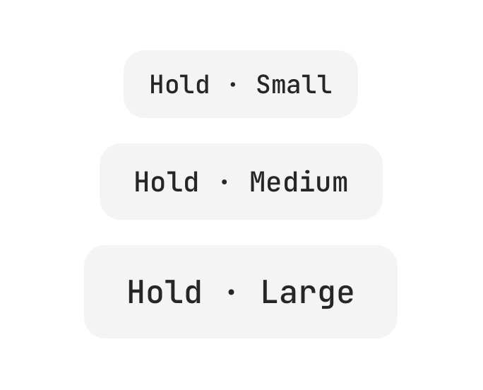
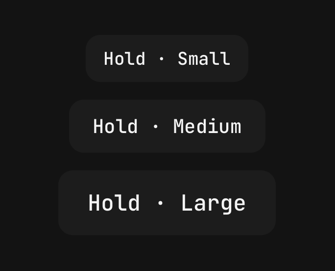
<ProgressButton size="sm">Small</ProgressButton>
<ProgressButton size="md">Medium</ProgressButton>
<ProgressButton size="lg">Large</ProgressButton>
Shape
pill, the default, takes the button's capsule corner, so the wipe's leading edge goes out as a
curve. rounded takes the card's corner, rounded-lg, to sit square with a rounded Button.
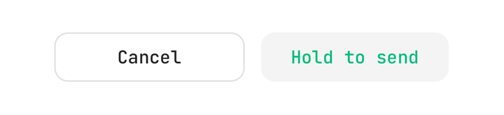
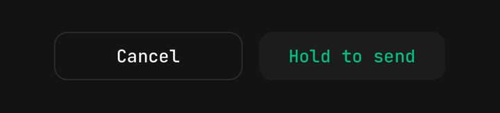
<View className="flex-row gap-3">
  <Button className="flex-1 rounded-lg" variant="outline">
    Cancel
  </Button>
  <ProgressButton className="flex-1" shape="rounded" variant="success">
    Hold to send
  </ProgressButton>
</View>
Hold duration
holdDuration is the time a full hold takes, in milliseconds — 2000 by default, never less
than 200.
<ProgressButton holdDuration={1200}>Hold to check in</ProgressButton>Resetting
Once complete the button is locked: a release does not drain it and further presses are ignored.
isAutoReset rewinds it after autoResetDelay (1000 by default). A rewind travels back; it never
snaps to empty.
<ProgressButton autoResetDelay={1500} isAutoReset>
  Hold to check in
</ProgressButton>
Controlled
isCompleted with onCompletedChange puts the state in your hands. Accept the hold in the same
update — set isCompleted to true — or the fill travels back, read as declined. For async work,
accept at once, show the work in a custom Done, and set isCompleted back to false to rewind
on failure.
const [phase, setPhase] = useState<"idle" | "sending" | "sent">("idle");

<ProgressButton isCompleted={phase !== "idle"} onComplete={submit}>
  <ProgressButton.Label>Hold to submit</ProgressButton.Label>
  <ProgressButton.Done>
    {phase === "sending" ? <Spinner /> : null}
    <ProgressButton.Label>{phase === "sent" ? "Sent" : "Sending"}</ProgressButton.Label>
  </ProgressButton.Done>
</ProgressButton>
Custom done
A ProgressButton.Done you write replaces the default tick. A bare Icon and a
ProgressButton.Label inside it take the fill's foreground.
<ProgressButton isAutoReset size="lg" variant="success">
  <Icon icon={IconCreditCard1} />
  <ProgressButton.Label>Hold to pay</ProgressButton.Label>
  <ProgressButton.Done>
    <Icon icon={IconLock} />
    <ProgressButton.Label>Paid</ProgressButton.Label>
  </ProgressButton.Done>
</ProgressButton>
Disabled
isDisabled fades the button and turns the gesture off, so the fill never starts.
<ProgressButton isDisabled variant="destructive">
  Hold to erase
</ProgressButton>
Haptics
Off by default. haptic plays when the hold takes, and a success knock follows on completion.
<ProgressButton haptic="light" onComplete={erase} variant="destructive">
  Hold to erase
</ProgressButton>
Reduced motion
With Reduce Motion on, the fill advances in five steps instead of sweeping. It stays an indicator, because a control that asks you to wait and shows nothing is broken. The hold still takes its full duration.
Accessibility
The root is a button whose hint, by default, says it has to be held, with
accessibilityState={{ disabled, checked }} — checked once complete. A screen reader cannot hold,
so the button's activate action completes it outright: the hint has already announced what it
does, and refusing would leave the action unreachable. The label inside the fill and the done mark
are hidden from assistive technology, so nothing is read twice.
API Reference
ProgressButton
Extends React Native's ViewProps.
Prop
Type
ProgressButton.Label
The button's text, coloured for the layer it is drawn in. Extends React Native's TextProps.
Prop
Type
ProgressButton.Done
Shown over the full fill on completion. Extends ViewProps.
Prop
Type
useProgressButton
Returns { variant, size, isCompleted, progress } — progress a SharedValue<number> from 0 to
1 — for a custom child that follows the hold. Throws outside a <ProgressButton>.