All Components
Every component in Delacour UI Native, grouped by what it does.
Fifty-three components, each on its own import subpath. There is no package-wide barrel — that is what lets an app skip resolving optional peers it never uses.
Every page carries the same three ways in, and the name is the same in all of them:
bunx delacour@latest add buttonbun add @delacour/react-native-uiThe CLI copies the source into your repository, so you edit button.tsx rather than upgrade a
package. The package installs the same components and you import them from
@delacour/react-native-ui/button. See Installation.
Actions
ButtonA pressable action, with composed icons and a loading state that costs no layout.
ContextMenuThe actions that belong to a piece of content, reached by holding it — with a lifted preview.
MenuA list of actions dropped from the control that opens it — with checkbox, radio and in-place submenu rows.
PressableThe Gesture API primitive every pressable in the library is built on.
SwipeA row that slides aside to reveal actions behind it, with a full swipe that fires the outermost.
StackCardA deck taken one card at a time by throwing the top one off — one decision per card.
SlideButtonA handle dragged across a rail to confirm — for an action a stray tap should never reach.
SelectionModePick several things at once — a long press enters the mode — then act on them from a bar.
ProgressButtonA button held, not tapped, to confirm — the action fires when the fill reaches the end.
ToggleButtonA button that stays pressed — alone, or in a group choosing one option or several.
FabOne primary action floating over the screen, extended with a label or unfolding a dial.
Forms
FieldA form field's layout, and the one place its state is written down.
InputA text field, and the box that can hold content beside it.
TextareaA multiline text field, sized in rows.
LabelA form control's name, with required, invalid and disabled states.
CheckboxA box that is ticked or not — alone, or as one of a group sharing a value list.
ChipAn interactive pill — a filter that toggles, a tag, or a token with a remove control.
RadioOne choice from a set, with a trailing indicator row.
SwitchAn on/off control with a thumb you can drag as well as tap.
CalendarA month grid for picking a day, several days or a range, with no date library and no time zone.
RatingA row of stars that reads or sets a score, in whole or half steps.
SliderA value picked from a range by dragging a handle along a track.
Data display
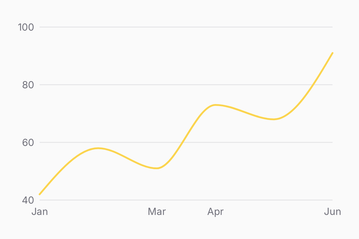
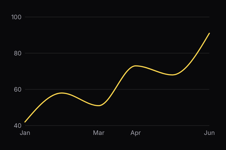
ChartLine, area, bar, scatter, candlestick and pie marks drawn in Skia, coloured from the theme's five-slot series ramp.
KpiOne number, its change coloured by what it means, and a sparkline of how it got there.
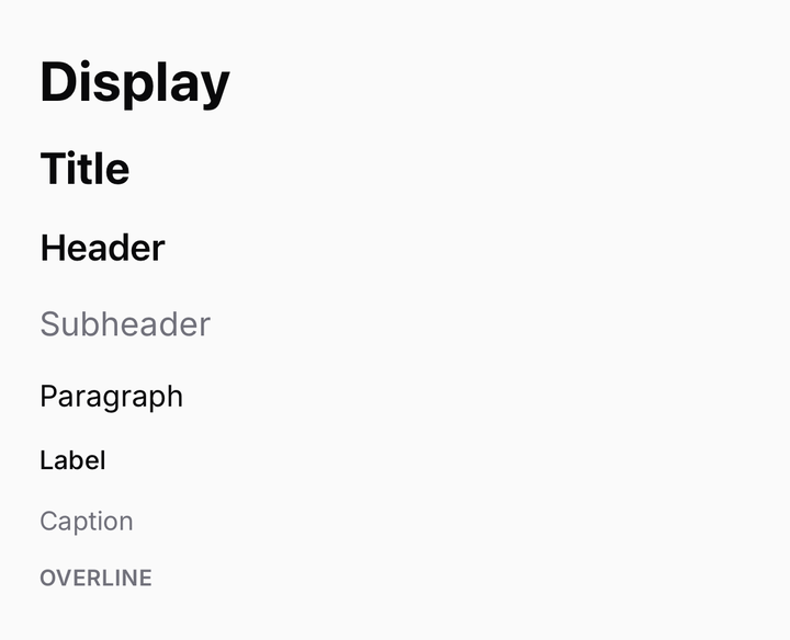
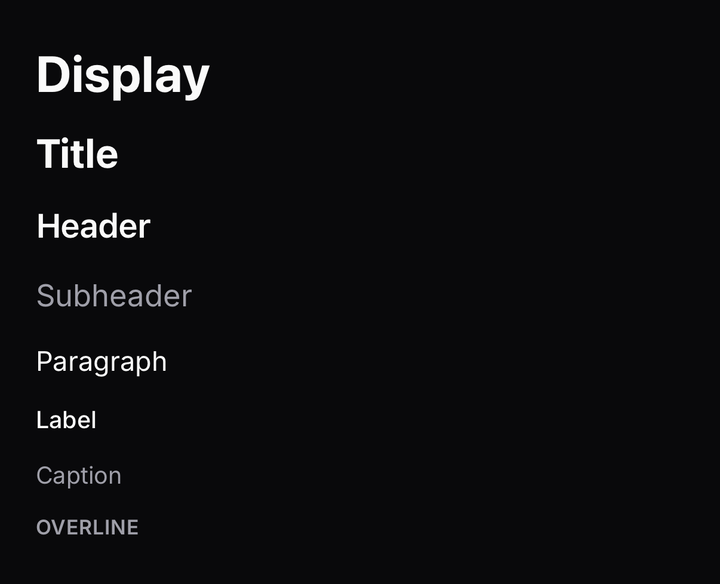
TextThe type scale, and the one component that reproduces React Native's text inheritance.
AvatarA person as a picture, with an initials fallback, a corner badge and a stack.
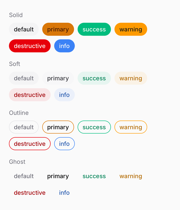
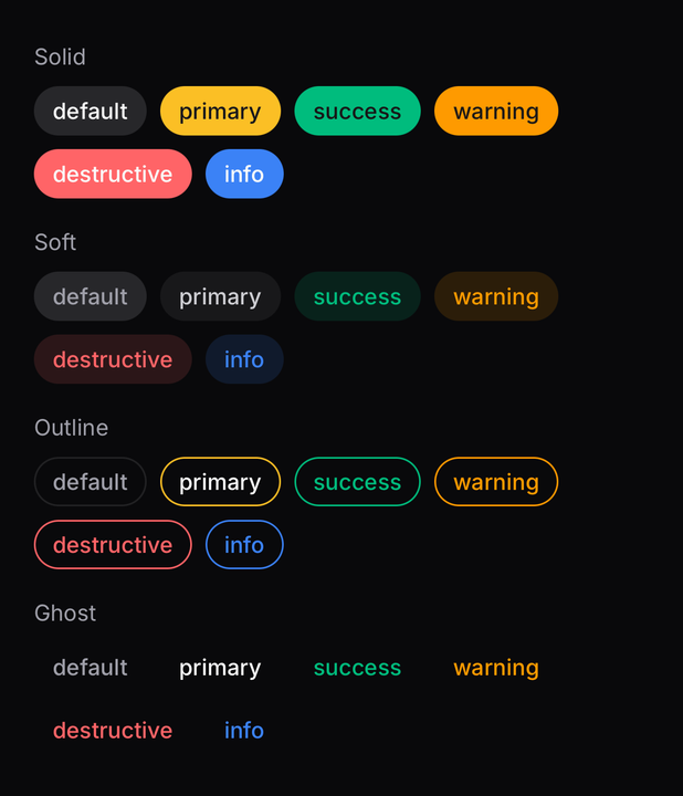
BadgeA compact label for status, category or count.
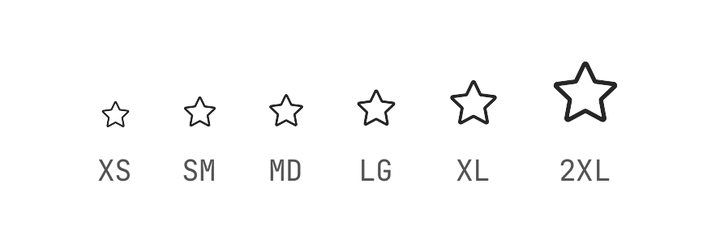
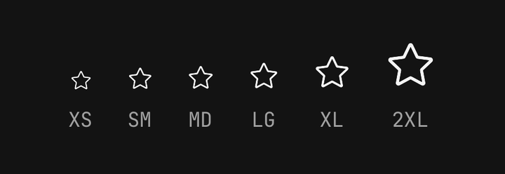
IconCentral Icons, sized and coloured by inheritance.
ItemA row of media, text and actions — standalone, or as a ListGroup row.
ListGroupA surface grouping related rows, with dividers inserted for you.
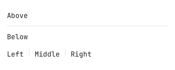
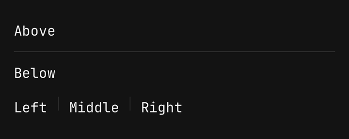
SeparatorA one-pixel rule, hidden from assistive technology.
AccordionSections that expand and collapse, animated from a measured height.
CollapsibleOne section shown and hidden by its own trigger.
Feedback
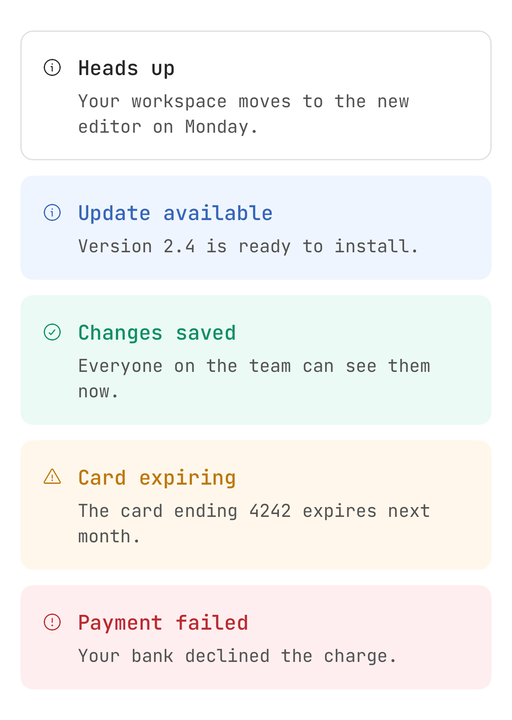
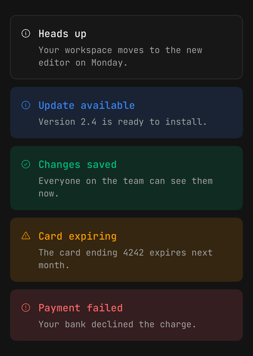
AlertA status message with a glyph picked from its status, a title, a description and an optional action.
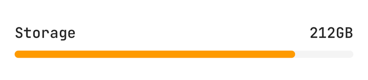
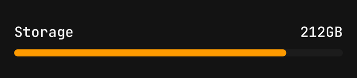
MeterA measurement on a fixed scale, coloured by where it falls.
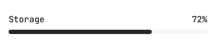
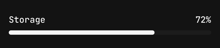
ProgressA bar showing how far a task has got, or that it is under way.
SpinnerAn animated loading indicator that stands in for an icon.
SkeletonA placeholder that shimmers or pulses while content loads.
EmptyStateA placeholder for a list or screen with nothing in it, and the action that fills it.
Overlays
BottomSheetA sheet that rises from the bottom edge — snap points, keyboard, sticky footer, scrollables and steps.
ToastA brief message from anywhere — even outside React — stacked at the edge of the screen, swiped away or gone on its own.
DialogA centred card over a dimmed app that asks for a decision or a short input — confirm, alert dialog, form.
PopoverA small panel anchored to its trigger — flips and shifts to stay on screen, with an arrow that follows.
TooltipA short label on a long press — anchored to its control, gone on its own, never in the way of the next tap.
DrawerA panel that slides in from an edge and swipes back to it — a menu, a filter panel, a notifications tray.
FeedbackA dialog for writing — the field in a recessed well, a send that waits, steps that ease between heights.
Navigation
Layout
Utilities