Item
A row of media, text and actions, for lists and settings — standalone, or as a ListGroup row.
Installation
Item ships with the library — install it once, then import:
import { Item } from "@delacour/react-native-ui/item";Or copy the source into your project, to own and edit it:
bunx delacour@latest add itemUsage
import { Button } from "@/components/ui/button";
import { Icon } from "@/components/ui/icon";
import { Item } from "@/components/ui/item";
import { IconFileText } from "@/lib/icons/central";
import { View } from "react-native";

export default function Example() {
  return (
    <View className="flex-1 justify-center p-4">
      <Item variant="outline">
        <Item.Media variant="icon">
          <Icon icon={IconFileText} />
        </Item.Media>
        <Item.Content>
          <Item.Title>Invoice.pdf</Item.Title>
          <Item.Description>2.4 MB · Updated yesterday</Item.Description>
        </Item.Content>
        <Item.Actions>
          <Button onPress={() => console.log("open")} size="sm" variant="outline">
            <Button.Label>Open</Button.Label>
          </Button>
        </Item.Actions>
      </Item>
    </View>
  );
}
Variants
<Item variant="outline">…</Item>
<Item variant="muted">…</Item>
Sizes
Set once on the item; the media, title and description follow it.
<Item size="sm">…</Item>
<Item size="lg">…</Item>
Media
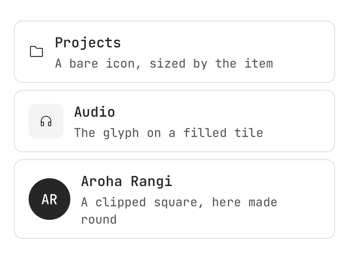
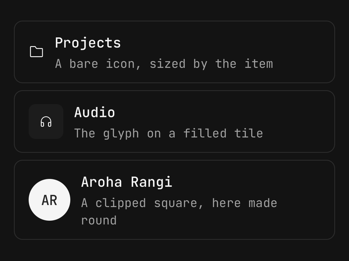
<Item.Media>…</Item.Media>
<Item.Media variant="icon">…</Item.Media>
<Item.Media variant="image">…</Item.Media>
In a ListGroup
An item inside a ListGroup takes the group's size, draws no surface of its own and lines up with the group's dividers.
import { ListGroup } from "@/components/ui/list-group";

<ListGroup>
  <Item onPress={openWifi}>
    <Item.Media>
      <Icon icon={IconWifiFull} />
    </Item.Media>
    <Item.Content>
      <Item.Title>Wi-Fi</Item.Title>
    </Item.Content>
    <Item.Actions>
      <Icon icon={IconChevronRight} />
    </Item.Actions>
  </Item>
</ListGroup>;
Selection
<Item isSelected={plan === "yearly"} onPress={() => setPlan("yearly")}>…</Item>States
<Item isDisabled onPress={openSecurity}>…</Item>
<Item busy={isSyncing} onPress={sync}>…</Item>
Controls in the actions
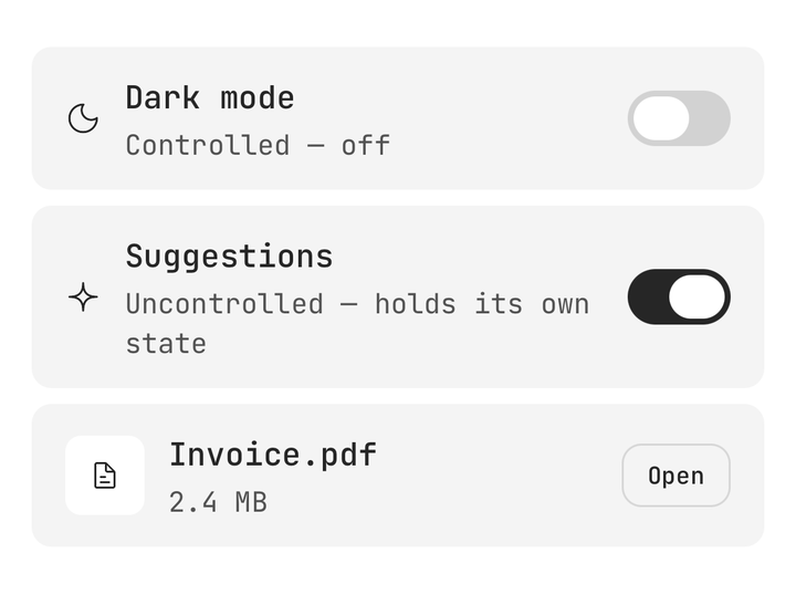
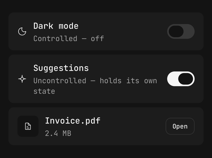
<Item>
  <Item.Content>
    <Item.Title>Dark mode</Item.Title>
  </Item.Content>
  <Item.Actions>
    <Switch accessibilityLabel="Dark mode" isSelected={isDark} onSelectedChange={setIsDark} />
  </Item.Actions>
</Item>
Do not put a control inside an item that has an onPress. A pressable item merges its children into
one accessible element, so VoiceOver cannot reach a button or switch inside it. Leave the item static,
or make the whole row the control with accessibilityRole="switch".
Header and footer
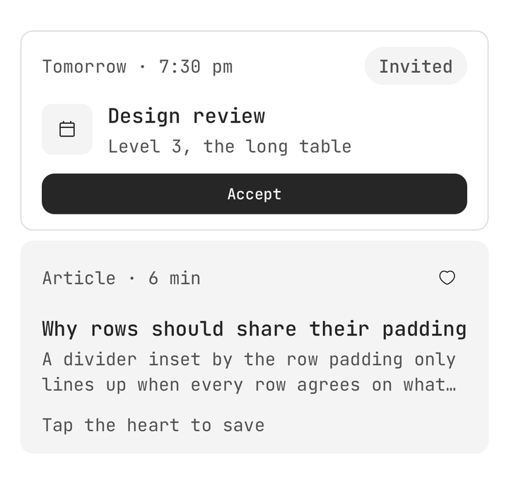
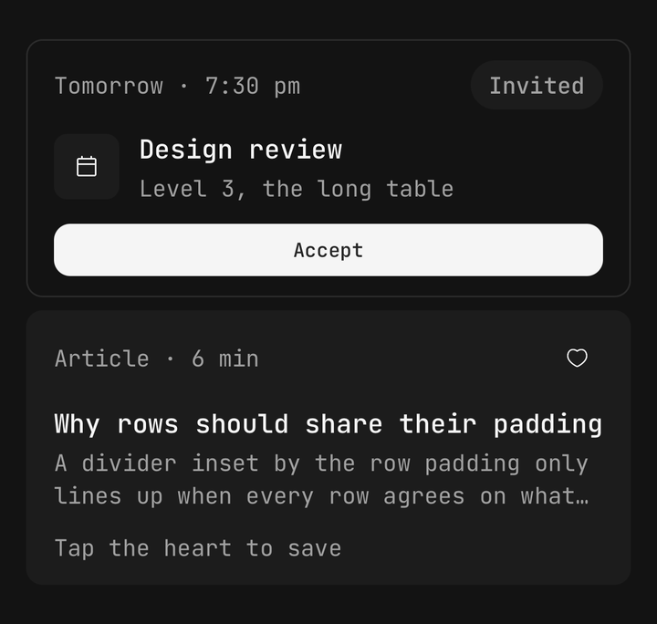
<Item orientation="vertical">
  <Item.Header>…</Item.Header>
  <Item.Content>…</Item.Content>
  <Item.Footer>…</Item.Footer>
</Item>
Carousel
<ScrollView horizontal>
  <Item.Group orientation="horizontal">
    <Item className="w-36" orientation="vertical" variant="outline">…</Item>
  </Item.Group>
</ScrollView>
API Reference
Item
A Pressable when given onPress or onLongPress, so feedback, haptic and busy are
inherited; a plain view without either.
Prop
Type
Item.Media
Prop
Type
Item.Content / Actions / Header / Footer
Extend React Native's ViewProps.
Prop
Type
Item.Title / Description
Extend React Native's TextProps.
Prop
Type
Item.Group
Prop
Type
Item.Separator
A Separator. Takes its orientation and className.