Drawer
A panel that slides in from an edge and covers the app until dismissed — a navigation menu, a filter panel, a notifications tray.
Installation
Drawer ships with the library — install it once, then import:
import { Drawer } from "@delacour/react-native-ui/drawer";Or copy the source into your project, to own and edit it:
bunx delacour@latest add drawerA drawer draws through the overlay foundation, so mount
OverlayProvider once at your app's root, inside DelacourProvider and around
BottomSheetProvider. Without it the drawer draws inline and warns once in development.
Usage
import { Button } from "@/components/ui/button";
import { Drawer } from "@/components/ui/drawer";
import { Text } from "@/components/ui/text";
import { View } from "react-native";

export default function Example() {
  return (
    <View className="flex-1 items-center justify-center p-4">
      <Drawer>
        <Drawer.Trigger asChild>
          <Button variant="outline">Menu</Button>
        </Drawer.Trigger>
        <Drawer.Content side="start">
          <Drawer.Header>
            <Drawer.Title>Harbour Studio</Drawer.Title>
            <Drawer.Description>Signed in as aria@harbour.studio</Drawer.Description>
          </Drawer.Header>
          <Drawer.Body>
            <Text.Paragraph>Your rows go here.</Text.Paragraph>
          </Drawer.Body>
          <Drawer.Footer>
            <Drawer.Close asChild>
              <Button variant="secondary">Sign out</Button>
            </Drawer.Close>
          </Drawer.Footer>
        </Drawer.Content>
      </Drawer>
    </View>
  );
}
Anatomy
<Drawer>
  <Drawer.Trigger />
  <Drawer.Content>
    <Drawer.Header>
      <Drawer.Title />
      <Drawer.Description />
    </Drawer.Header>
    <Drawer.Body />
    <Drawer.Footer />
  </Drawer.Content>
</Drawer>
Drawer.Content renders nothing while the drawer is closed, and stays mounted through its exit.
Drawer.Header writes a ✕ at its trailing edge — pass isCloseHidden to drop it. Drawer.Close
with asChild turns any control into one that closes, which is how a navigation row shuts the menu
as it navigates.
A drawer covers the app rather than pushing it aside. Reach for a BottomSheet instead of a bottom drawer when the content needs snap points, a keyboard or a long list.
Sides
side is start (the default), end, top or bottom. start and end follow the layout
direction: start is the left edge in a left-to-right app and the right edge in a right-to-left
one. The direction comes from I18nManager.isRTL, so a direction style on a wrapper does not
change it.
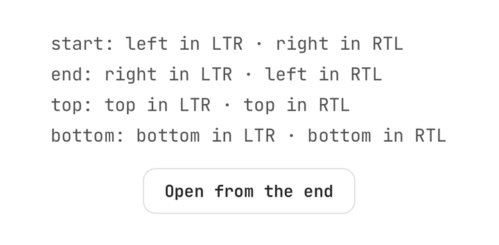
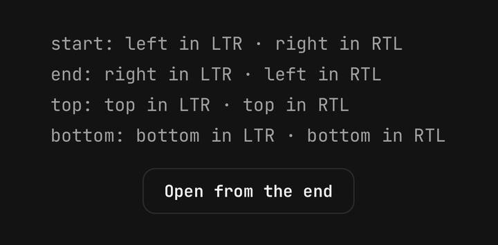
<Drawer.Content side="start">…</Drawer.Content>
<Drawer.Content side="end">…</Drawer.Content>
<Drawer.Content side="top">…</Drawer.Content>
<Drawer.Content side="bottom">…</Drawer.Content>
The panel docks flush to its edge with square corners there, rounds the two corners facing the app, and pads the safe-area insets on every side that meets the screen, so a start drawer clears the status bar and the home indicator.
Sizes
size sets the panel's width for start and end, and its height for top and bottom, as a
fraction of the window with a cap: sm 62% up to 280pt, md 78% up to 320pt (the default), lg 88%
up to 400pt, and full 94% with no cap. A phone always keeps a strip of the app beside the panel to
tap away on. The size measures the content: the safe-area inset on the docked edge — the status bar
above a top drawer, the home indicator below a bottom one — is added on top of it.
<Drawer.Content size="sm">…</Drawer.Content>
<Drawer.Content size="lg">…</Drawer.Content>
<Drawer.Content size="full">…</Drawer.Content>
Swipe to dismiss
Drag the panel back toward its edge to close it. It follows the finger that way and resists the other way. Let go past 40% of the panel, or flick toward the edge, and it carries on from where your finger left it; let go short of that and it eases back. A light haptic marks the moment you cross the threshold. The scrim thins as you drag.
The swipe waits for 10pt of travel along the panel's axis and gives up on the same travel across
it, so a tap reaches the row under the finger and a vertical scroll in a start or end drawer's body
never moves the drawer. A slider inside the panel keeps its own drag. isSwipeDismissible={false}
turns the swipe off.
Drawer.Body scrolls by default; pass isScrollable={false} for a plain column. A top or bottom
drawer's swipe shares the vertical axis with a scroll, so keep that content short.
A filter panel
<Drawer>
  <Drawer.Trigger asChild>
    <Button variant="outline">Filters</Button>
  </Drawer.Trigger>
  <Drawer.Content side="end" size="lg">
    <Drawer.Header>
      <Drawer.Title>Filters</Drawer.Title>
    </Drawer.Header>
    <Drawer.Body isScrollable={false}>
      …chips and a slider…
    </Drawer.Body>
    <Drawer.Footer>
      <Button variant="ghost" onPress={reset}>Reset</Button>
      <Drawer.Close asChild>
        <Button>Show results</Button>
      </Drawer.Close>
    </Drawer.Footer>
  </Drawer.Content>
</Drawer>
Controlled
Pass isOpen and onOpenChange to own the state. A controlled drawer needs no Drawer.Trigger.
onOpenChange fires once per change, whichever way it happened: the trigger, a close, the scrim,
the swipe, Android back or the escape gesture.
const [isOpen, setIsOpen] = useState(false);

<Button onPress={() => setIsOpen(true)}>Share</Button>
<Drawer isOpen={isOpen} onOpenChange={setIsOpen}>
  <Drawer.Content side="bottom" size="sm">…</Drawer.Content>
</Drawer>;
useDrawer() reads the enclosing drawer — and, inside Drawer.Content, the side it opened from and
the edge that resolved to:
function NavRow({ href, title }: { href: string; title: string }) {
  const { close } = useDrawer();
  return <ListGroup.Item onPress={() => { router.push(href); close(); }}>…</ListGroup.Item>;
}
isDismissible={false} turns off the scrim, Android back, the escape gesture and the swipe; only
the drawer's own actions close it.
Over a bottom sheet
A drawer draws in the overlay foundation's modal band, above the navigator's header and every
bottom sheet. Android back closes the drawer before anything beneath it.
Accessibility
The panel is modal to assistive technology and announces itself as a dialog labelled by its
title. Once it has finished entering, focus moves to the title; once it has gone, focus returns to
the trigger if it is still on screen. The iOS escape gesture (a two-finger Z) and Android back close
a dismissible drawer. The scrim is hidden from assistive technology. The header's ✕ is labelled
Close and has 8pt of extra touch area.
Under Reduce Motion the panel fades in and out instead of sliding. The swipe still works — it moves with your finger rather than animating on its own.
API Reference
Drawer
Prop
Type
Drawer.Trigger
Takes Pressable's props. With asChild it hands its press to the single child — a Button, say —
which then opens the drawer before running its own onPress.
Drawer.Content
Extends React Native's ViewProps.
Prop
Type
Drawer.Header
Extends React Native's ViewProps.
Prop
Type
Drawer.Title, Drawer.Description
Take Text's props. The title is a Text.Header, the description a muted Text.Paragraph.
Drawer.Body
With isScrollable (the default) it takes ScrollView's props plus className and
contentContainerClassName; with isScrollable={false} it takes ViewProps and className.
Drawer.Footer
Takes React Native's ViewProps and className.
Drawer.Close
Takes Pressable's props. Without children it is a ✕; with asChild it hands its press to the
single child. Either way it closes the drawer, then calls your onPress.
Prop
Type
useDrawer
Reads the enclosing drawer. Throws outside a Drawer.
Prop
Type
Tooltip
A short label naming the control under the finger — opened by a long press, gone on its own, and never in the way of the next tap.
Feedback
A dialog for writing — "What should we fix first?", a bug report, a one-question survey — with the field in a recessed well and the actions on the band around it.