Surface
A rounded container on the theme's fill ladder, stepping to the next fill as it nests.
Installation
Surface ships with the library — install it once, then import:
import { Surface } from "@delacour/react-native-ui/surface";Or copy the source into your project, to own and edit it:
bunx delacour@latest add surfaceUsage
import { Surface } from "@/components/ui/surface";
import { Text } from "@/components/ui/text";
import { View } from "react-native";

export default function Example() {
  return (
    <View className="flex-1 justify-center p-4">
      <Surface className="gap-3">
        <Text.Label>Account</Text.Label>
        <Surface>
          <Text.Caption>Signed in as sam@example.com</Text.Caption>
        </Surface>
      </Surface>
    </View>
  );
}
Variants
default is the card, hairlined so it holds its edge on the page; transparent paints nothing.
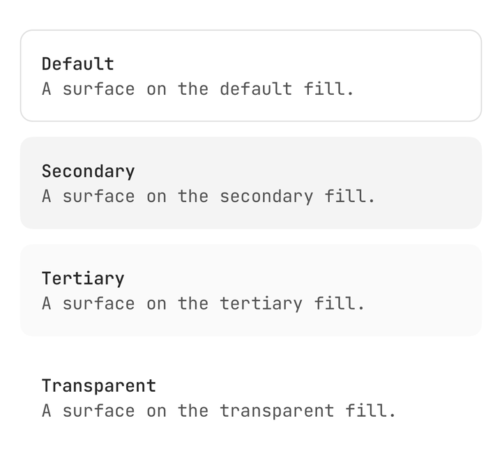
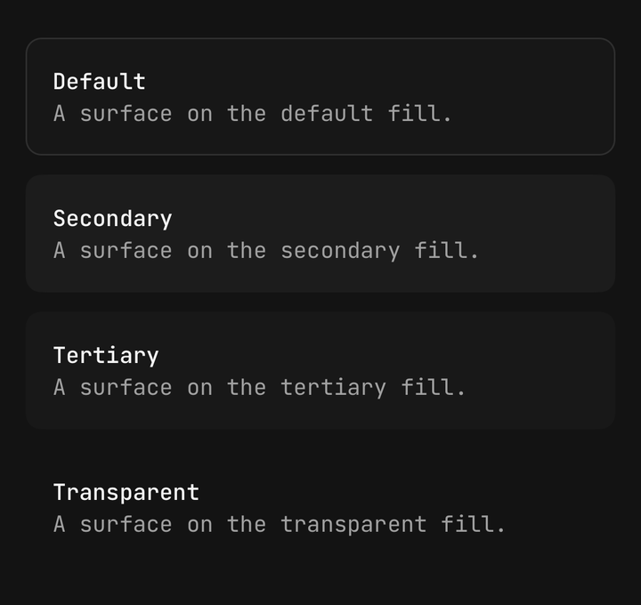
<Surface variant="secondary">…</Surface>
<Surface variant="tertiary">…</Surface>
<Surface variant="transparent">…</Surface>
Padding
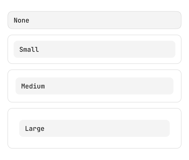
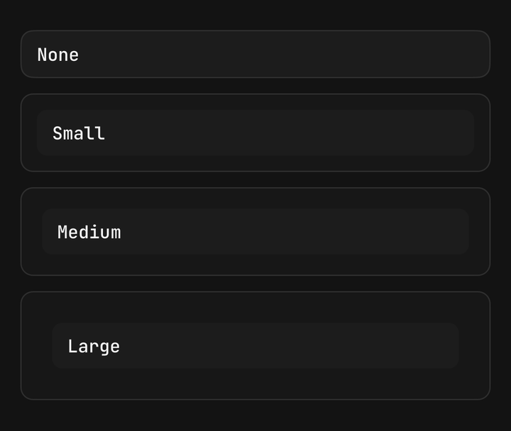
<Surface padding="none">…</Surface>
<Surface padding="sm">…</Surface>
<Surface padding="lg">…</Surface>
Nesting
A surface that names no variant steps to the next fill from the one it sits in, so it never vanishes into its parent.
<Surface>
  <Surface>
    <Surface>…</Surface>
  </Surface>
</Surface>
Transparent
A transparent surface passes the plane beneath it through, so a surface inside it still steps from the card.
<Surface>
  <Surface variant="transparent">
    <Surface>…</Surface>
  </Surface>
</Surface>
Bleed
padding="none" clips, so content bled to the edge takes the surface's corner with it.
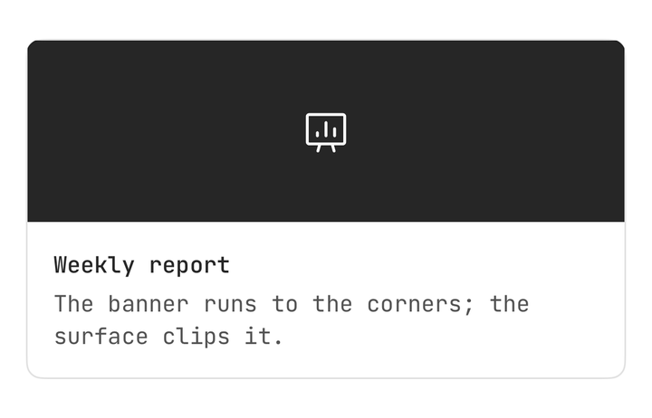
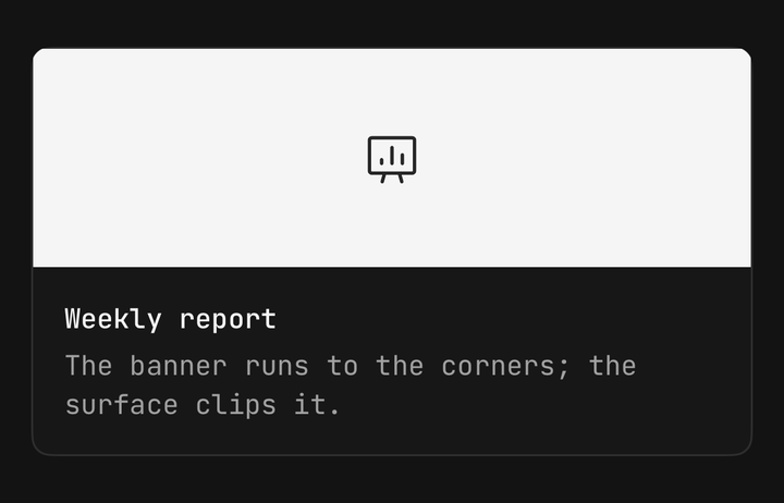
<Surface padding="none">
  <Image className="h-28 w-full" source={cover} />
  <View className="p-4">…</View>
</Surface>
Composition
<Surface className="gap-4" padding="lg">
  <Text.Header>Security</Text.Header>
  <Surface className="flex-row items-center gap-3" padding="sm">
    <Text.Label className="flex-1">Two-factor authentication</Text.Label>
    <Switch isSelected={isTwoFactor} onSelectedChange={setTwoFactor} />
  </Surface>
</Surface>
API Reference
Surface
Extends React Native's ViewProps.
Prop
Type
useSurface
Reads the enclosing surface's fill, for a custom child that has to match it. Throws outside a Surface.
Prop
Type
A surface does not colour its text. A React Native View does not cascade colour to a Text
descendant, so a text-* class on a Surface does nothing — put it on the Text.