Radio
One choice from a set, with a trailing indicator row.
Installation
Radio ships with the library — install it once, then import:
import { Radio } from "@delacour/react-native-ui/radio";Or copy the source into your project, to own and edit it:
bunx delacour@latest add radioUsage
import { Radio } from "@/components/ui/radio";
import { useState } from "react";
import { View } from "react-native";

export default function Example() {
  const [plan, setPlan] = useState<string | null>("monthly");

  return (
    <View className="flex-1 items-center justify-center p-4">
      <Radio.Group accessibilityLabel="Plan" selected={plan} onSelected={setPlan}>
        <Radio value="monthly">
          <Radio.Label>Monthly</Radio.Label>
        </Radio>
        <Radio value="annual">
          <Radio.Label>Annual</Radio.Label>
        </Radio>
      </Radio.Group>
    </View>
  );
}
Variants
secondary fills the ring; primary leaves it hollow.
<Radio variant="primary" value="monthly">Monthly</Radio>
<Radio variant="secondary" value="annual">Annual</Radio>
Sizes
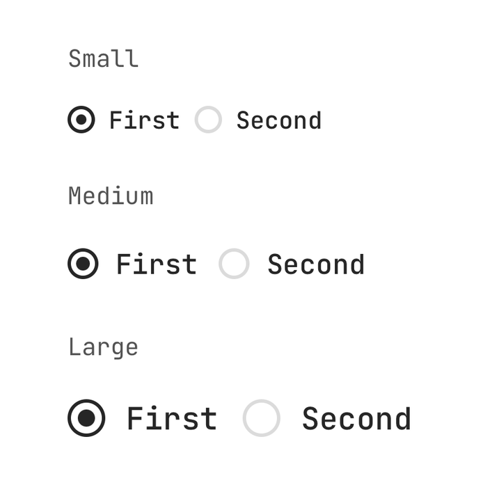
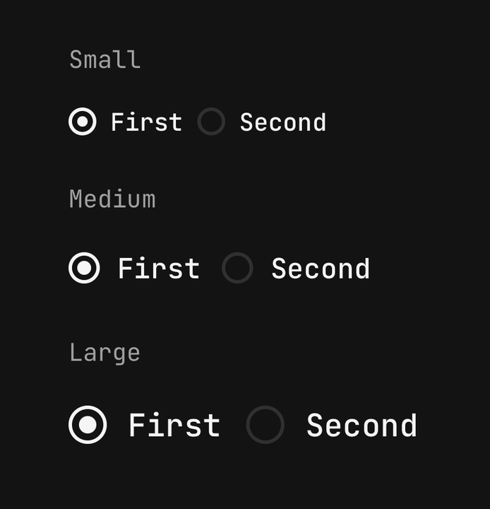
<Radio size="sm" value="sm">Small</Radio>
<Radio size="md" value="md">Medium</Radio>
<Radio size="lg" value="lg">Large</Radio>
Descriptions
There is no Radio.Description — compose a Text.Caption inside the row and it stays within the
one tap target and inside the accessible name.
<Radio value="standard">
  <View className="min-w-0 shrink gap-0.5">
    <Radio.Label>Standard</Radio.Label>
    <Text.Caption>Arrives in three to five days.</Text.Caption>
  </View>
</Radio>
Trailing indicator
Write a Radio.Indicator last and the row spreads to push the ring to the far edge.
<Radio value="standard">
  <View className="min-w-0 shrink gap-0.5">
    <Radio.Label>Standard delivery</Radio.Label>
    <Text.Caption>Arrives in three to five days.</Text.Caption>
  </View>
  <Radio.Indicator />
</Radio>
Inside a field
The group names no state of its own — isInvalid and isDisabled reach every ring from the
enclosing Field.
<Field isInvalid={plan === undefined}>
  <Field.Label>Plan</Field.Label>
  <Radio.Group accessibilityLabel="Plan" onSelected={setPlan} selected={plan ?? null}>
    <Radio value="free">Free</Radio>
    <Radio value="pro">Pro</Radio>
  </Radio.Group>
  <Field.Error>Pick a plan to continue.</Field.Error>
</Field>
Reading the radio's state
Use useRadio() to read the settled state from a custom child, and useRadioGroup() for the
group's own.
import { useRadio, useRadioGroup } from "@delacour/react-native-ui/radio";API Reference
Anatomy
| Part | What it is |
|---|---|
Radio | One option. A Pressable that selects its value in the enclosing group |
Radio.Label | The option's text, inside the tap target |
Radio.Indicator | The dot. Accepts custom children to replace the default glyph |
Radio.Group | Owns the selected value and the shared axes |
Radio
A radio is a Pressable, so feedback, haptic and the rest are inherited — see
Pressable. The shared axes resolve
group ?? own ?? field ?? default.
Prop
Type
Radio.Group
Owns which radio is selected. Extends ViewProps.
Prop
Type
A group renders no legend, and React Native has no aria-labelledby to tie it to a Field.Label
above it — so pass accessibilityLabel or the group is announced without a name.
Radio.Indicator
The dot. Composed in when a radio holds none of its own; write it out to restyle it or to replace the glyph entirely.
Prop
Type
Radio.Label
The radio's text, wired as its accessible name. Extends React Native's TextProps.
Prop
Type
Exports
import {
  Radio,
  type RadioProps,
  RADIO_VARIANTS,
  RADIO_SIZES,
  RADIO_ORIENTATIONS,
  RADIO_DOT_SPRING,
  RADIO_DEFAULT_SIZE,
  RADIO_DEFAULT_VARIANT,
  RADIO_LABEL_TEXT_SIZE,
} from "@delacour/react-native-ui/radio";