Fab
One primary action floating over the screen, extended with a label or unfolding a dial.
Installation
Fab ships with the library — install it once, then import:
import { Fab } from "@delacour/react-native-ui/fab";Or copy the source into your project, to own and edit it:
bunx delacour@latest add fabUsage
import { Fab } from "@/components/ui/fab";
import { Icon } from "@/components/ui/icon";
import { Text } from "@/components/ui/text";
import { IconPlusLarge } from "@/lib/icons/central";
import { useState } from "react";
import { ScrollView, View } from "react-native";

export default function Example() {
  const [notes, setNotes] = useState(["Groceries", "Garden plan"]);

  return (
    <View className="flex-1 bg-background">
      <ScrollView contentContainerClassName="p-4 pb-28">
        {notes.map((note) => (
          <Text className="py-3" key={note}>
            {note}
          </Text>
        ))}
      </ScrollView>
      <Fab
        accessibilityLabel="New note"
        onPress={() => setNotes((current) => [...current, `Note ${current.length + 1}`])}
        placement="bottom-end"
      >
        <Icon icon={IconPlusLarge} />
      </Fab>
    </View>
  );
}
Anatomy
<Fab accessibilityLabel="New note" placement="bottom-end">
  <Icon icon={IconPlusLarge} />
</Fab>

<Fab isExtended>
  <Icon icon={IconPencil} />
  <Fab.Label>Write</Fab.Label>
</Fab>

<Fab.Group accessibilityLabel="Add something" icon={IconPlusLarge}>
  <Fab.Action icon={IconImages1} label="Photo" onPress={addPhoto} />
</Fab.Group>
A Fab composes its icon the way a Button does, and a bare
<Icon /> inside it takes the fab's size and foreground. Fab.Group and Fab.Action take an
icon prop instead, because they draw and turn the glyph themselves.
Placement
placement pins the fab to the bottom of its nearest positioned ancestor; without it the fab sits
in flow like any other view.
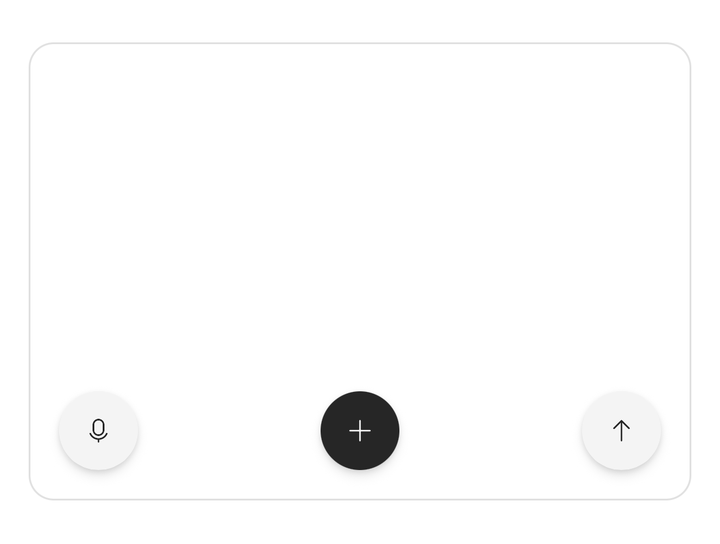
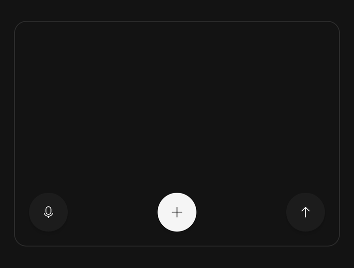
<Fab accessibilityLabel="Record" placement="bottom-start">…</Fab>
<Fab accessibilityLabel="Add" placement="bottom-center">…</Fab>
<Fab accessibilityLabel="Send" offset={24} placement="bottom-end">…</Fab>
A pinned fab covers the bottom of your list. Pad the scroll content's bottom by the fab's height
plus its offset — pb-28 clears a medium fab — or the last row can never scroll out from under it.
Safe area
A pinned fab adds the bottom safe-area inset to offset. Turn that off with
isSafeAreaAware={false} when the fab sits in a box that already clears the home indicator, such
as above a tab bar.
<Fab accessibilityLabel="Compose" isSafeAreaAware={false} placement="bottom-end">…</Fab>Sizes
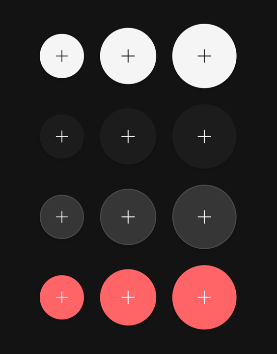
sm, md and lg are 44, 56 and 64pt, from the fab's own size tokens.
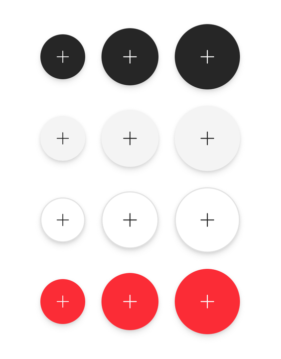
<Fab accessibilityLabel="Add" size="sm">…</Fab>
<Fab accessibilityLabel="Add" size="md">…</Fab>
<Fab accessibilityLabel="Add" size="lg">…</Fab>
Variants
primary is the default; secondary, surface and destructive paint the circle with the
matching token.
<Fab accessibilityLabel="Add" variant="primary">…</Fab>
<Fab accessibilityLabel="Add" variant="secondary">…</Fab>
<Fab accessibilityLabel="Add" variant="surface">…</Fab>
<Fab accessibilityLabel="Delete" variant="destructive">…</Fab>
Extended
isExtended makes a stadium with a Fab.Label beside the icon, and the label names the button.
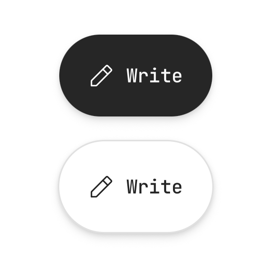
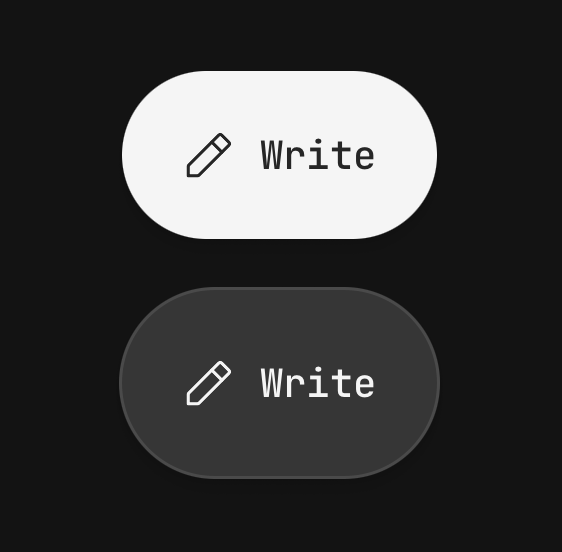
<Fab isExtended placement="bottom-end" onPress={write}>
  <Icon icon={IconPencil} />
  <Fab.Label>Write</Fab.Label>
</Fab>
Speed dial
Fab.Group unfolds a dial of related actions over a scrim; pressing an action runs it and closes
the dial.
<Fab.Group accessibilityLabel="Add something" icon={IconPlusLarge}>
  <Fab.Action icon={IconImages1} label="Photo" onPress={addPhoto} />
  <Fab.Action icon={IconPaperclip1} label="Attachment" onPress={attach} />
  <Fab.Action icon={IconTrashCan} isDestructive label="Empty drafts" onPress={emptyDrafts} />
</Fab.Group>
Fab.Group covers its parent with the scrim, so write it in the screen's root container, beside the
scroll view rather than inside its content.
Controlled dial
isOpen with onOpenChange hands the dial's state to the screen; label extends the trigger
while it is closed.
const [isOpen, setIsOpen] = useState(false);

<Fab.Group
  accessibilityLabel="Create"
  icon={IconPlusLarge}
  isOpen={isOpen}
  label="Create"
  onOpenChange={setIsOpen}
>
  <Fab.Action icon={IconNoteText} label="Note" onPress={newNote} />
</Fab.Group>
Accessibility
Every fab and action is a button. A round fab has no text to read, so give it an
accessibilityLabel — it warns in development without one. The group trigger announces whether
the dial is expanded, the open dial is modal, and Android's back button closes it.
API Reference
Fab
Extends the Pressable's props, except disabled and busy.
Prop
Type
Fab.Label
The extended fab's text. Extends React Native's TextProps.
Prop
Type
Fab.Group
A trigger, a scrim and a dial of Fab.Actions. Extends ViewProps.
Prop
Type
Fab.Action
One entry in the dial: a small round button and a label chip.
Prop
Type
useFab
Returns { size, variant, isExtended, isDisabled } for a custom child of a Fab. Throws outside one.