Slider
A value picked from a range by dragging a handle along a track.
Installation
Slider ships with the library — install it once, then import:
import { Slider } from "@delacour/react-native-ui/slider";Or copy the source into your project, to own and edit it:
bunx delacour@latest add sliderUsage
import { Slider } from "@/components/ui/slider";
import { useState } from "react";
import { View } from "react-native";

export default function Example() {
  const [volume, setVolume] = useState<number | number[]>(40);

  return (
    <View className="flex-1 justify-center p-4">
      <Slider value={volume} onChange={setVolume}>
        <Slider.Output />
        <Slider.Track>
          <Slider.Fill />
          <Slider.Thumb />
        </Slider.Track>
      </Slider>
    </View>
  );
}
Colours
color paints the fill, the capsule and the knob — never the groove.
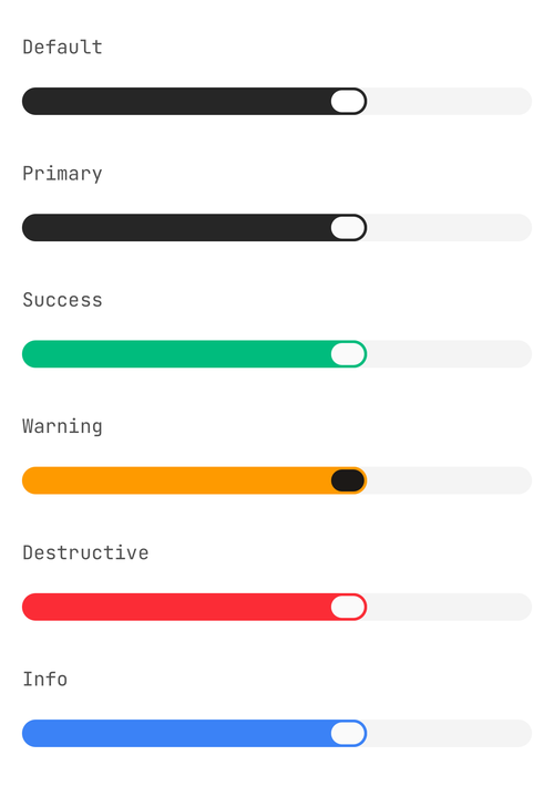
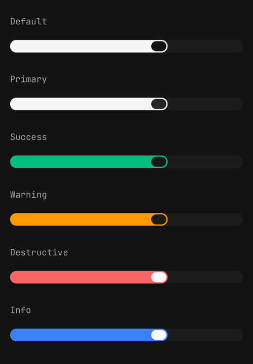
<Slider color="default" />
<Slider color="primary" />
<Slider color="success" />
<Slider color="warning" />
<Slider color="destructive" />
<Slider color="info" />
Sizes
One axis drives the groove's thickness, the thumb's diameter and the readout's type step.
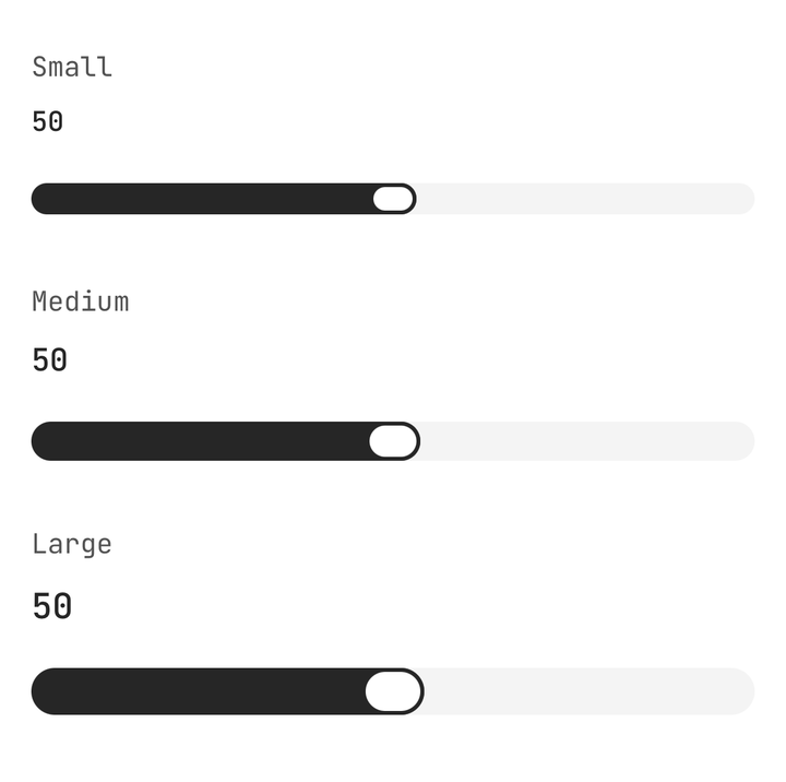
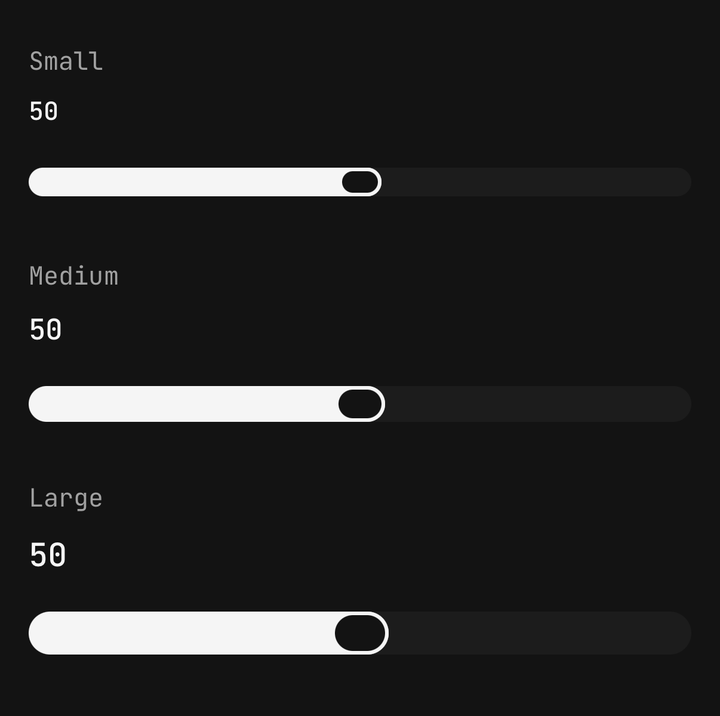
<Slider size="sm" />
<Slider size="md" />
<Slider size="lg" />
Ranges
Pass an array and the slider becomes a range, one thumb per entry.
<Slider value={[20, 80]} onChange={setRange}>
  <Slider.Track>
    {({ values }) => (
      <>
        <Slider.Fill />
        {values.map((_, index) => (
          <Slider.Thumb index={index} key={index} />
        ))}
      </>
    )}
  </Slider.Track>
</Slider>
Which shape you speak is locked on first render. A slider that silently started reporting an array to a caller holding a number would be a bug with no error attached, so a flip warns once in development and the slider keeps following you.
Vertical
orientation="vertical" counts up from the bottom.
<View className="h-48">
  <Slider orientation="vertical" value={volume} onChange={setVolume}>
    <Slider.Track>
      <Slider.Fill />
      <Slider.Thumb />
    </Slider.Track>
  </Slider>
</View>
A vertical slider needs a definite height
It fills whatever it is given, so a wrapper with h-48 or flex-1 is not optional.
Accessibility
Each thumb is an adjustable with a value, and its name comes from the Field.Label a row
away. A lone thumb reads the label — "Volume, 40". A range's two thumbs read the label plus the end
each holds — "Price range, minimum" and "Price range, maximum" — and with no label at all they
still read "Minimum" and "Maximum", because two thumbs announcing the same bare number are
indistinguishable.
<Field>
  <Field.Label>Price range</Field.Label>
  <Slider value={range} onChange={setRange}>
    <Slider.Track>
      {({ values }) => (
        <>
          <Slider.Fill />
          {values.map((_, index) => (
            <Slider.Thumb index={index} key={index} />
          ))}
        </>
      )}
    </Slider.Track>
  </Slider>
</Field>
An accessibilityLabel on a thumb names that thumb yourself, and wins outright:
<Slider.Thumb accessibilityLabel="Lowest price" index={0} />
<Slider.Thumb accessibilityLabel="Highest price" index={1} />
A Text.Label sitting beside the slider does not name it — React Native has no <label for>. Only
a Field.Label reaches the thumb, and only when its children are a plain string. A slider with
neither reads its value alone.
A VoiceOver or TalkBack swipe steps the value by step, or by a tenth of the range when the slider
is continuous.
Inside a scroll view
<ScrollView delaysContentTouches={false}>
  <Slider value={volume} onChange={setVolume}>…</Slider>
</ScrollView>
On iOS the slider feels late until the scrollable sets delaysContentTouches={false}. That is a
prop at your call site, not something the component can set.
API Reference
Anatomy
| Part | What it is |
|---|---|
Slider | Owns the value, the gesture and the axes |
Slider.Output | The current value, formatted. Give it a function to label it yourself |
Slider.Track | The groove the thumbs run along, and the surface the drag is claimed on. Takes a render function for a range |
Slider.Fill | The painted part of the groove, from the minimum — or between two thumbs |
Slider.Thumb | The grab handle. index picks which value it drives in a range |
Slider
Prop
Type
Slider.Thumb
Prop
Type