Alert
A status message with a glyph picked from its status, a title, a description and an optional action.
Installation
Alert ships with the library — install it once, then import:
import { Alert } from "@delacour/react-native-ui/alert";Or copy the source into your project, to own and edit it:
bunx delacour@latest add alertUsage
import { Alert } from "@/components/ui/alert";
import { View } from "react-native";

export default function Example() {
  return (
    <View className="flex-1 justify-center p-4">
      <Alert status="warning">
        <Alert.Indicator />
        <Alert.Content>
          <Alert.Title>Card expiring</Alert.Title>
          <Alert.Description>The card ending 4242 expires next month.</Alert.Description>
        </Alert.Content>
      </Alert>
    </View>
  );
}
Anatomy
<Alert>
  <Alert.Indicator />
  <Alert.Content>
    <Alert.Title />
    <Alert.Description />
    <Alert.Action />
  </Alert.Content>
  <Alert.CloseButton />
</Alert>
Alert.CloseButton is composed in for you when isDismissible is set. Omit Alert.Indicator for a
text-only alert, and Alert.Description for a one-liner.
Statuses
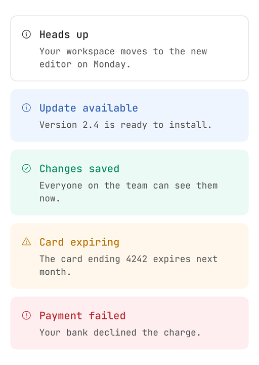
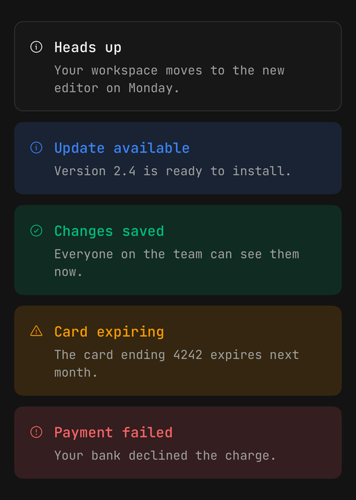
status picks the glyph and colours it and the title from one token. The description stays muted
whatever the status, so a long explanation never shouts. warning and destructive differ in
shape as well as colour.
<Alert status="info">…</Alert>
<Alert status="success">…</Alert>
<Alert status="warning">…</Alert>
<Alert status="destructive">…</Alert>
Surface variant
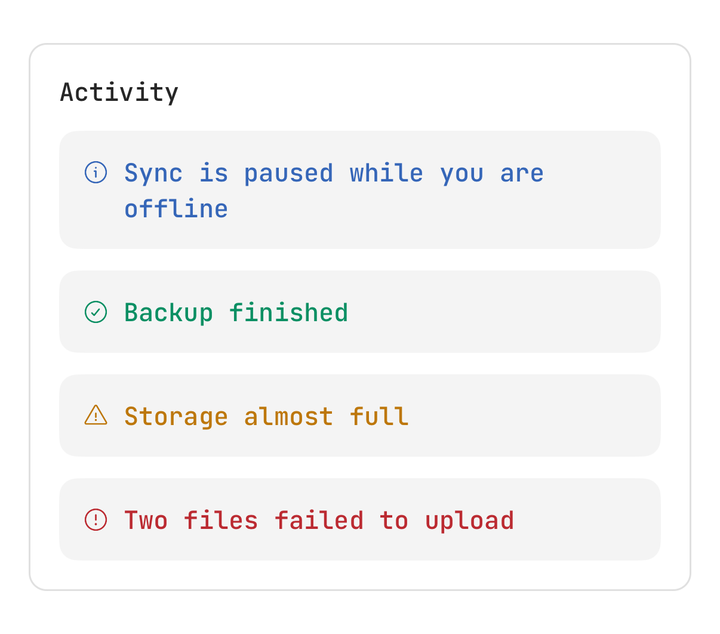
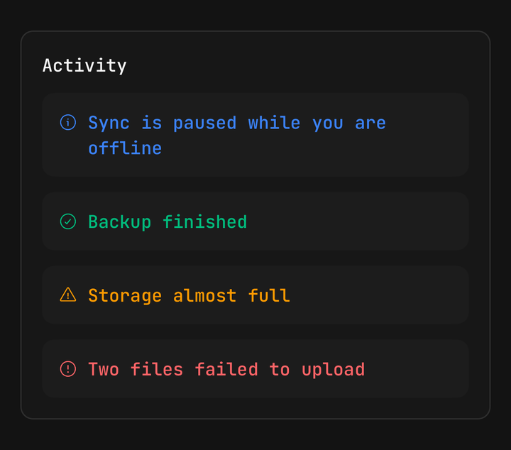
soft, the default, washes the alert in its status's soft fill. surface keeps a neutral fill and
lets the glyph and title carry the colour. An alert is built on Surface,
so an untinted one steps off whatever it sits in — inside a card, it never vanishes into the card.
<Surface className="gap-3">
  <Alert size="sm" status="warning" variant="surface">
    <Alert.Indicator />
    <Alert.Content>
      <Alert.Title>Storage almost full</Alert.Title>
    </Alert.Content>
  </Alert>
</Surface>
Sizes
A size moves the padding, the gap, the type and the glyph together.
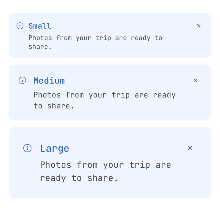
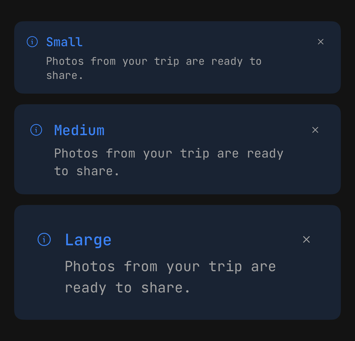
<Alert size="sm">…</Alert>
<Alert size="md">…</Alert>
<Alert size="lg">…</Alert>
Dismissing
isDismissible adds a close control. Left uncontrolled, the alert hides itself when it is pressed;
pass isOpen and onOpenChange to own that state.
const [isOpen, setOpen] = useState(true);

<Alert isDismissible isOpen={isOpen} onOpenChange={setOpen} status="warning">
  <Alert.Indicator />
  <Alert.Content>
    <Alert.Title>Scheduled maintenance</Alert.Title>
  </Alert.Content>
</Alert>;
Actions
Alert.Action is a wrapping row under the description. The buttons in it are yours — the alert
styles none of them. useAlert().dismiss closes the alert from inside.
function GotIt() {
  const { dismiss } = useAlert();
  return <Button onPress={dismiss} size="sm" variant="outline">Got it</Button>;
}

<Alert status="destructive">
  <Alert.Indicator />
  <Alert.Content>
    <Alert.Title>Sync failed</Alert.Title>
    <Alert.Description>We couldn't reach the server.</Alert.Description>
    <Alert.Action>
      <Button isLoading={isRetrying} onPress={retry} size="sm" variant="destructive">
        Try again
      </Button>
      <GotIt />
    </Alert.Action>
  </Alert.Content>
</Alert>;
Custom indicator
Children replace the status glyph and inherit its size and colour, so a Spinner needs nothing else.
<Alert status="info">
  <Alert.Indicator>
    <Spinner />
  </Alert.Indicator>
  <Alert.Content>
    <Alert.Title>Syncing your library</Alert.Title>
  </Alert.Content>
</Alert>
Composition
<Surface className="gap-4" padding="lg">
  <Text.Header>Order summary</Text.Header>
  <Alert status="destructive">
    <Alert.Indicator />
    <Alert.Content>
      <Alert.Title>Card declined</Alert.Title>
      <Alert.Description>Your bank declined the charge on the card ending 4242.</Alert.Description>
      <Alert.Action>
        <Button isLoading={isRetrying} onPress={retry} size="sm">Try again</Button>
        <Button size="sm" variant="outline">Use another card</Button>
      </Alert.Action>
    </Alert.Content>
  </Alert>
</Surface>
Accessibility
The root is announced as an alert, and on Android as a live region — assertive for warning and
destructive, polite otherwise. The indicator is hidden from assistive technology, since the title
already says what happened. The close control is labelled Dismiss; change it with
closeAccessibilityLabel.
API Reference
Alert
Extends Surface's props, less variant and padding.
Prop
Type
Alert.Indicator
Prop
Type
Alert.Title, Alert.Description
Take Text's props. The title is coloured by the status; the description is always muted.
Alert.Content, Alert.Action
Take React Native's ViewProps. Content takes the remaining width; Action is a wrapping row.
Alert.CloseButton
Takes Pressable's props. Pressing it dismisses the alert, then calls your onPress.
useAlert
Reads the enclosing alert. Throws outside an Alert.
Prop
Type