Steps
A stepper for multi-step flows — completed, current and upcoming steps joined by a line.
Installation
Steps ships with the library — install it once, then import:
import { Steps } from "@delacour/react-native-ui/steps";Or copy the source into your project, to own and edit it:
bunx delacour@latest add stepsUsage
import { Steps } from "@/components/ui/steps";
import { useState } from "react";
import { View } from "react-native";

export default function Example() {
  const [step, setStep] = useState(1);

  return (
    <View className="flex-1 justify-center p-4">
      <Steps value={step} onValueChange={setStep}>
        <Steps.Item step={0}>Account</Steps.Item>
        <Steps.Item step={1}>Shipping</Steps.Item>
        <Steps.Item step={2}>Payment</Steps.Item>
      </Steps>
    </View>
  );
}
Vertical
Titles sit beside their indicators, with a description underneath.
<Steps orientation="vertical" defaultValue={2}>
  <Steps.Item step={0}>
    <Steps.Title>Order placed</Steps.Title>
    <Steps.Description>We have your order and your payment.</Steps.Description>
  </Steps.Item>
  <Steps.Item step={1}>
    <Steps.Title>Packed</Steps.Title>
    <Steps.Description>Your items are boxed and labelled.</Steps.Description>
  </Steps.Item>
</Steps>
Variants
primary rings the current step; secondary fills every indicator.
<Steps variant="primary" defaultValue={1}>…</Steps>
<Steps variant="secondary" defaultValue={1}>…</Steps>
Sizes
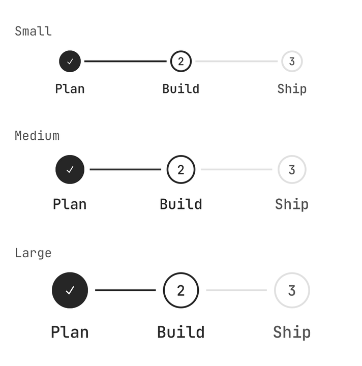
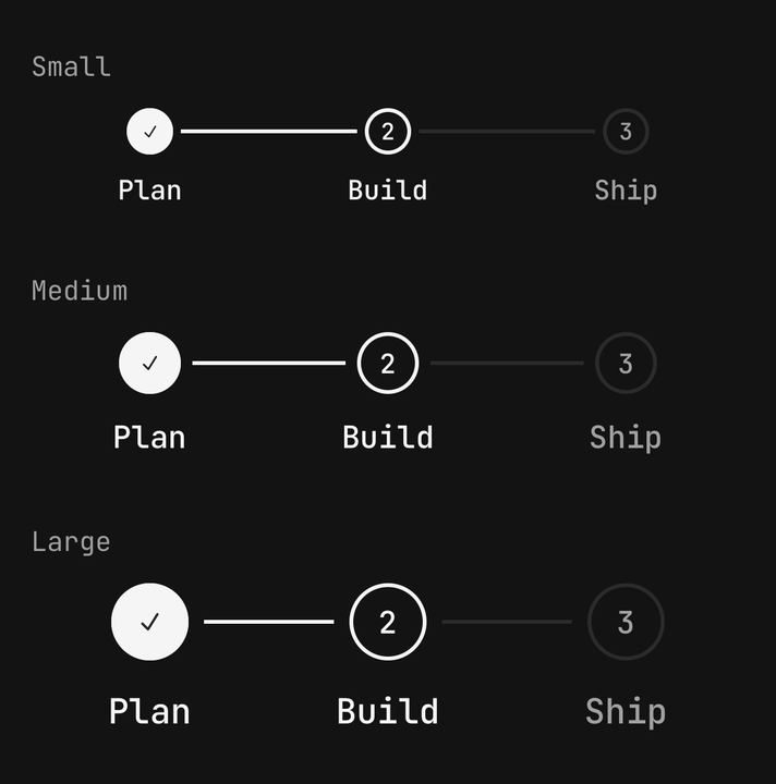
<Steps size="sm">…</Steps>
<Steps size="md">…</Steps>
<Steps size="lg">…</Steps>
States
A step can be loading, invalid or disabled, and completed overrides whether it reads as done.
<Steps.Item step={1} isLoading>Verify email</Steps.Item>
<Steps.Item step={1} isInvalid>Verify email</Steps.Item>
<Steps.Item step={2} completed={false}>Add-ons</Steps.Item>
<Steps.Item step={3} isDisabled>Confirm</Steps.Item>
Linear
isLinear closes the steps ahead of the value, so only your own button moves forward.
<Steps isLinear value={step} onValueChange={setStep}>
  <Steps.Item step={0}>Profile</Steps.Item>
  <Steps.Item step={1}>Team</Steps.Item>
  <Steps.Item step={2}>Billing</Steps.Item>
</Steps>
Read-only
A controlled value with no onValueChange is a progress display whose steps are not buttons.
<Steps value={stage}>
  <Steps.Item step={0}>Uploaded</Steps.Item>
  <Steps.Item step={1} isLoading={stage === 1}>Processing</Steps.Item>
  <Steps.Item step={2}>Published</Steps.Item>
</Steps>
Custom indicator
Steps.Indicator takes a render function of the step's state, and an Icon inside inherits its size and colour.
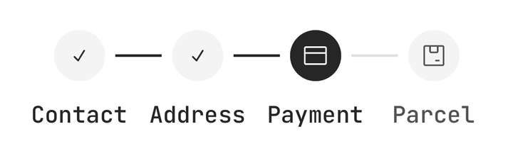
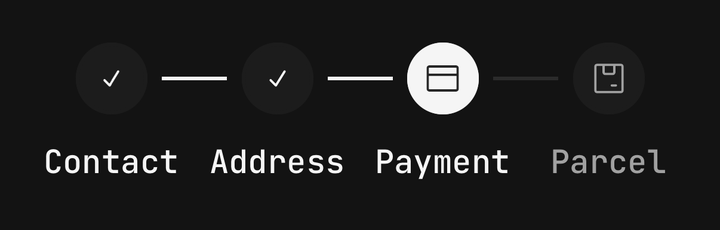
<Steps.Item step={0}>
  <Steps.Indicator>
    {({ status }) => <Icon icon={status === "completed" ? IconCheckmark1Small : IconPeople} />}
  </Steps.Indicator>
  <Steps.Title>Contact</Steps.Title>
</Steps.Item>
Panels
Put a step's form in a Steps.Panel — it renders below the title, outside the tap target, so its
controls stay reachable by a screen reader.
<Steps isLinear orientation="vertical" value={step} onValueChange={setStep}>
  <Steps.Item step={0}>
    <Steps.Title>Contact</Steps.Title>
    {step === 0 ? (
      <Steps.Panel className="gap-3 pt-3">
        <Input placeholder="you@example.com" value={email} onChangeText={setEmail} />
        <Button onPress={() => setStep(1)}>Continue</Button>
      </Steps.Panel>
    ) : null}
  </Steps.Item>
  <Steps.Item step={1}>Delivery</Steps.Item>
</Steps>
A form written directly inside Steps.Item, rather than in a Steps.Panel, merges into the step's
single accessibility element — VoiceOver cannot focus its fields.
Reading the stepper's state
Use useSteps() for the stepper's value and count, and useStepsItem() for one step's settled state.
import { useSteps, useStepsItem } from "@delacour/react-native-ui/steps";API Reference
Anatomy
| Part | What it is |
|---|---|
Steps | Owns the value and the shared axes, and counts its items to draw the connectors |
Steps.Item | One step. A Pressable holding the indicator, title and description |
Steps.Indicator | The circle — number, check, cross or spinner. Composed in automatically |
Steps.Title | The step's name, and its accessible name. Bare text in an item becomes one |
Steps.Description | An optional line of supporting text |
Steps.Panel | Content below the title, outside the tap target |
Steps
Extends ViewProps. Steps are zero-based; the indicator draws them one-based.
Prop
Type
The connectors are drawn from a count of the Steps.Items that are direct children. Render them
directly or from a .map() — an item behind a wrapper component is not counted, and no line is drawn.
Steps.Item
A step is a Pressable, so feedback, haptic and the rest are inherited — see
Pressable. className styles the step's outer box; every
other prop reaches the pressable.
Prop
Type
Steps.Indicator
Prop
Type
Steps.Title and Steps.Description
Both extend React Native's TextProps and take their size step from the stepper's.
Prop
Type
Steps.Panel
Extends ViewProps.
Prop
Type
Exports
import {
  Steps,
  type StepsProps,
  STEPS_VARIANTS,
  STEPS_SIZES,
  STEPS_ORIENTATIONS,
  STEP_STATUSES,
  useSteps,
  useStepsItem,
} from "@delacour/react-native-ui/steps";