Badge
A compact label for status, category or count.
Installation
Badge ships with the library — install it once, then import:
import { Badge } from "@delacour/react-native-ui/badge";Or copy the source into your project, to own and edit it:
bunx delacour@latest add badgeUsage
import { Badge } from "@/components/ui/badge";
import { View } from "react-native";

export default function Example() {
  return (
    <View className="flex-1 items-center justify-center p-4">
      <Badge color="success">Active</Badge>
    </View>
  );
}
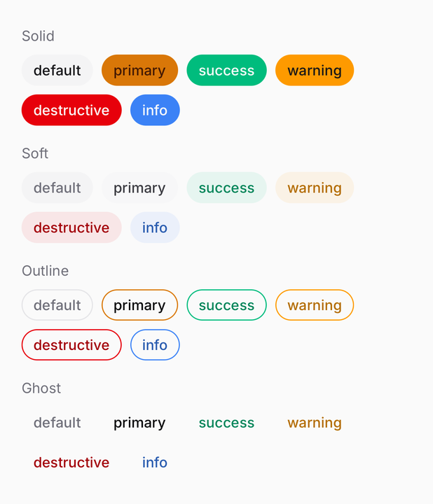
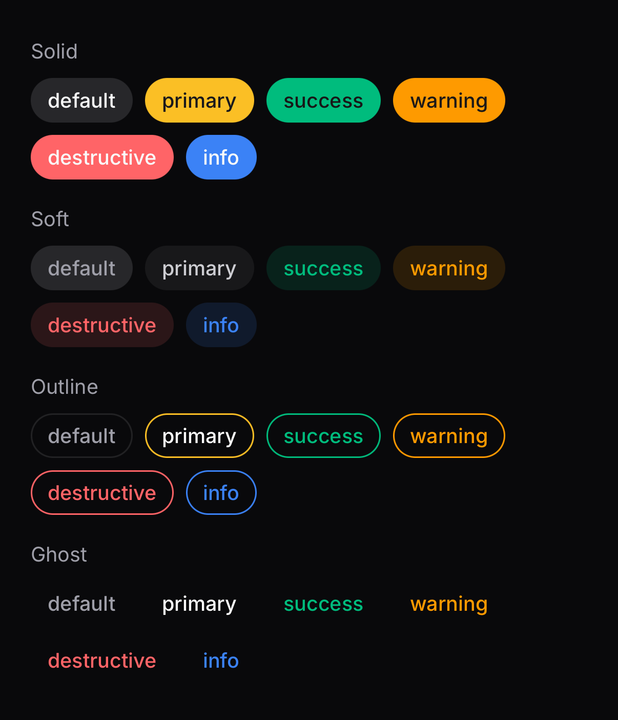
Variants and colours
variant says how the surface is painted; color says what it means.
<Badge variant="solid">Default</Badge>
<Badge variant="soft" color="success">Active</Badge>
<Badge variant="outline" color="warning">Pending</Badge>
<Badge variant="ghost" color="destructive">Failed</Badge>
Sizes
A size sets padding and the label's type scale, never a height, so the badge grows with OS font scaling instead of clipping.
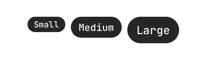
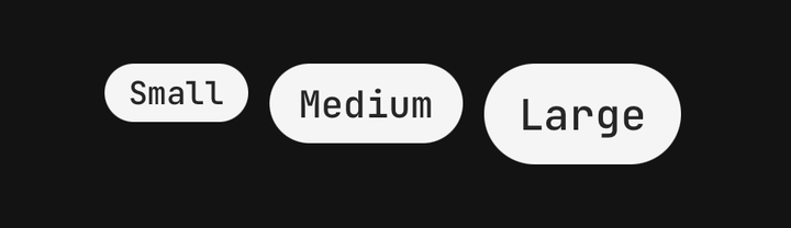
<Badge size="sm">Small</Badge>
<Badge size="md">Medium</Badge>
<Badge size="lg">Large</Badge>
Icons
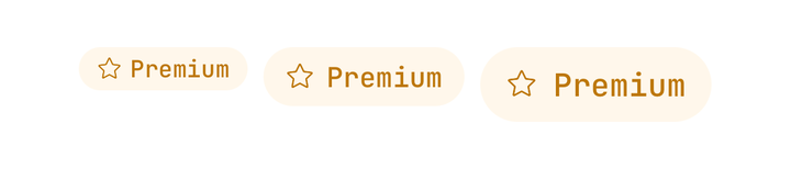
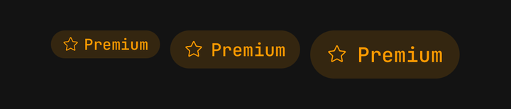
Icons are composed, not passed as props — put an Icon in the children, before or after the label.
import { Icon } from "@delacour/react-native-ui/icon";
import { IconStar } from "@delacour/react-native-ui/icons/central";

<Badge variant="soft" color="warning">
  <Icon icon={IconStar} />
  <Badge.Label>Premium</Badge.Label>
</Badge>;
The badge publishes its icon size and its variant's foreground token to the subtree, so a bare
<Icon> or <Text> comes out right with nothing said at the call site.
Trailing icons
<Badge color="success">
  <Badge.Label>Verified</Badge.Label>
  <Icon icon={IconCheckmark1Small} />
</Badge>
Start and end content
Use Badge.StartContent or Badge.EndContent for leading and trailing content that is not an
Icon.
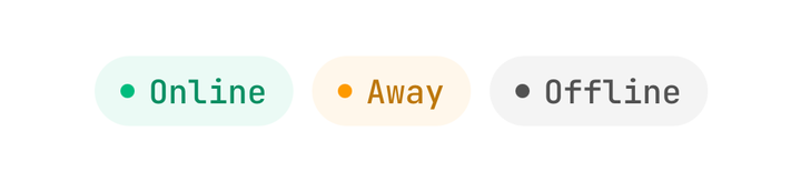
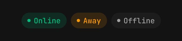
<Badge variant="soft" color="success">
  <Badge.StartContent>
    <View className="size-1.5 rounded-full bg-success" />
  </Badge.StartContent>
  <Badge.Label>Online</Badge.Label>
</Badge>
Pressable badges
With no onPress and no onLongPress the root is a plain View; supply either and it becomes a
Pressable.
<Badge onPress={filterByTag}>Design</Badge>Dismissing
<Badge onClose={remove}>Design</Badge>onClose composes a Badge.CloseButton in at the end. Its tap is claimed by the inner detector, so
it never also fires the badge's onPress. Reach for the part by hand only to place it somewhere
other than last.
API Reference
BadgeProps
A badge is a Pressable, so feedback, haptic, onPress and the rest are inherited rather than
restated — see Pressable. asChild, busy and disabled are
withheld: use isDisabled, which the parts read through context.
Prop
Type
Badge.Label
The badge's text. Picks its colour and type scale from the badge's variant, colour and size.
Extends React Native's TextProps.
Prop
Type
Badge.CloseButton
The dismiss pressable. Defaults its accessibilityLabel to "Remove" and its feedback to
fade. Extends PressableProps.
Prop
Type
Badge.StartContent / Badge.EndContent
Centred wrappers for leading and trailing content that is not an Icon. An Icon needs neither —
it inherits the badge's icon size and its colour from the subtree.
Prop
Type