Screen
A screen's frame — pinned chrome, a content region, and whatever scrolls between them.
Installation
Screen ships with the library — install it once, then import:
import { Screen } from "@delacour/react-native-ui/screen";Or copy the source into your project, to own and edit it:
bunx delacour@latest add screenUsage
import { Button } from "@/components/ui/button";
import { Screen } from "@/components/ui/screen";
import { Text } from "@/components/ui/text";
import { useRouter } from "expo-router";

export default function Example() {
  const router = useRouter();

  function save() {
    console.log("saved");
  }

  return (
    <Screen>
      <Screen.Navbar>
        <Screen.Navbar.BackButton onPress={router.back} />
        <Screen.Navbar.Title>Settings</Screen.Navbar.Title>
      </Screen.Navbar>

      <Screen.ScrollArea contentContainerClassName="gap-4 p-4">
        <Text.Header>Notifications</Text.Header>
        <Text.Paragraph>Choose which alerts reach this device.</Text.Paragraph>
      </Screen.ScrollArea>

      <Screen.Footer>
        <Button onPress={save}>Save</Button>
      </Screen.Footer>
    </Screen>
  );
}
The navbar and footer measure themselves into a Reanimated context and every scrollable reserves exactly that, so no screen carries a hand-tuned padding number.
Placement
overlay floats the chrome over the content, which insets itself to match; static puts it in the
flow and paints an opaque surface.
<Screen.Navbar placement="static">…</Screen.Navbar>
<Screen.Footer placement="overlay">…</Screen.Footer>
Borders
Both hairlines are drawn at rest; fadeBorderOnScroll opts into a scroll-linked ramp instead — the
navbar's brightens as you leave the top, the footer's fades out as the content runs out.
<Screen.Navbar fadeBorderOnScroll>…</Screen.Navbar>
<Screen.Footer fadeBorderOnScroll>…</Screen.Footer>
Chat lists
Screen.ChatList is a discriminated union on variant: legend takes chronological oldest-first
data and LegendList's own renderItem, flat is an inverted FlatList with newest-first data and
React Native's.
<Screen.ChatList
  composerBaseHeight={56}
  data={messages}
  renderItem={renderMessage}
  variant="legend"
/>
Seed a chat list with composerBaseHeight
The footer publishes its real height a commit or two after the list's first layout, and the list has already scrolled to the end by then. Without the seed the newest message hides under the composer — intermittently, which is the worst kind of wrong.
Loading and error
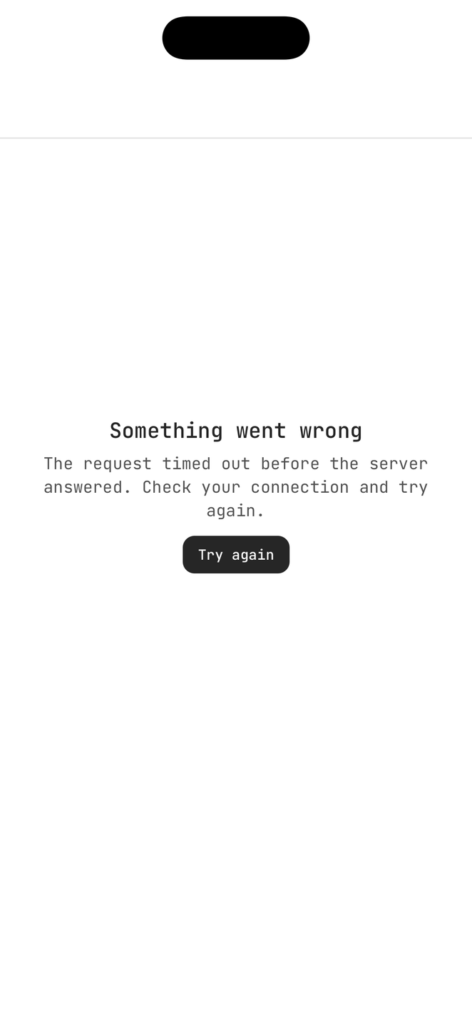
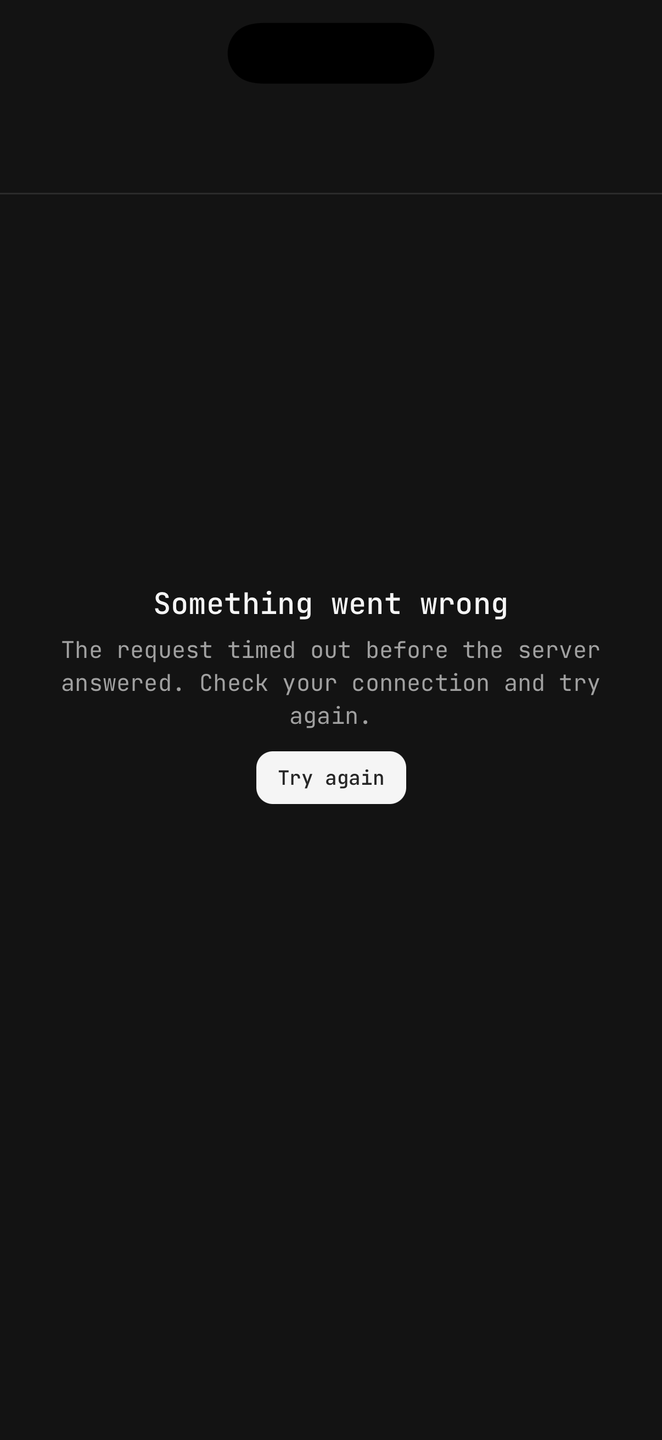
Whole-screen states, each with its own navbar so a back gesture still works.
<Screen.Loading title="Loading" />

<Screen.Error message="That project no longer exists." onBack={router.back} title="Not found">
  <Button onPress={retry}>Try again</Button>
</Screen.Error>
API Reference
Requirements
The app must mount DelacourProvider at its root. Screen
reads the safe-area and keyboard providers, and <KeyboardStateSync /> is what keeps the keyboard's
shared values honest between screens — without it a screen renders "keyboard open" over a keyboard
that is not there.
@legendapp/list is an optional peer, so an app that never imports Screen never resolves it.
Parts
| Part | What it is |
|---|---|
Screen.Navbar | Pinned top chrome. Compound: .Title, .Subtitle, .BackButton |
Screen.Content | The content region between the chrome |
Screen.View | A non-scrolling body |
Screen.Header | A scrolling header inside the content region |
Screen.Footer | Pinned bottom chrome, keyboard-aware |
Screen.ScrollArea | A ScrollView with the reserves applied |
Screen.FlatList / .SectionList / .LegendList | Virtualised lists, same reserves |
Screen.ChatList | An inverted or oldest-first chat list |
Screen.Loading / Screen.Error | Whole-screen states |
Screen
The root. It renders a View and passes ViewProps through.
Prop
Type
Shared shapes
Three prop shapes are shared between parts rather than restated, which is why the tables below are short.
Prop
Type
Screen.Navbar
Pinned chrome at the top. Publishes its measured height, which is what everything below it clears.
Prop
Type
Screen.Footer
Pinned chrome at the bottom, and the part that rides the keyboard.
Prop
Type
Screen.Content / Screen.Header / Screen.View
Content and Header take ScreenInsetProps; View is a plain ViewProps box that clears the
chrome without scrolling.
Prop
Type
The scrollables
Screen.ScrollArea, Screen.FlatList, Screen.SectionList, Screen.LegendList and
Screen.ChatList each extend their underlying list's own props plus ScreenScrollableProps. They
insert the navbar and footer spacers for you, so content clears the chrome without a manual
contentContainerStyle.
Prop
Type
Screen.Error / Screen.Loading
Whole-screen states, each with its own navbar so a back gesture still works.
Prop
Type
Screen.NavbarBackButton
A Pressable, so the vocabulary is inherited. onPress is required — this library takes no
navigation dependency, so the app wires router.back() itself. There is no Navbar.Action either:
a navbar action is <Button size="icon-sm" variant="secondary">.
Prop
Type
Screen.NavbarTitle / NavbarSubtitle / NavbarBackground / FooterBackground
The two text parts are Text presets and take its props. The two background parts take ViewProps
and exist for a surface that has to sit behind the chrome rather than inside it — reach for
backgroundClassName on the navbar first.
Prop
Type