Avatar
A person as a picture, with an initials fallback, a corner badge and a stack.
Installation
Avatar ships with the library — install it once, then import:
import { Avatar } from "@delacour/react-native-ui/avatar";Or copy the source into your project, to own and edit it:
bunx delacour@latest add avatarUsage
import { Avatar } from "@/components/ui/avatar";
import { View } from "react-native";

export default function Example() {
  return (
    <View className="flex-1 items-center justify-center p-4">
      <Avatar name="Aria Whitlock" source={{ uri: "https://i.pravatar.cc/160?img=16" }} />
    </View>
  );
}
Image and fallbacks
The initials show while the image loads, and in its place if it fails, so a dead URL never leaves an empty circle.
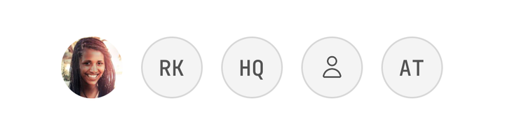

<Avatar name="Aria Whitlock" source={{ uri: user.avatarUrl }} />
<Avatar name="Rawiri Kemp" />
<Avatar fallback="HQ" name="Harbour Studio" />
<Avatar />
Sizes
A size is a fixed edge — 32, 40, 48 and 64 points.


<Avatar name="Priya Natarajan" size="sm" />
<Avatar name="Tomasi Fifita" size="md" />
<Avatar name="Kenji Moriyama" size="lg" />
<Avatar name="Lena Varga" size="xl" />
Variants and colours
variant and color paint the fallback, on the six colours Badge takes.
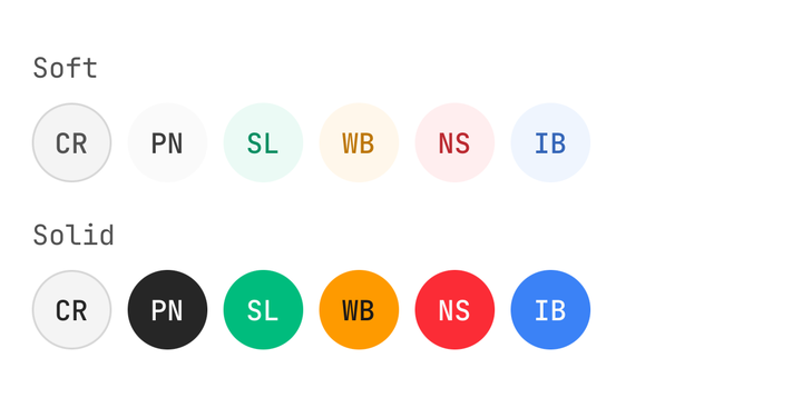
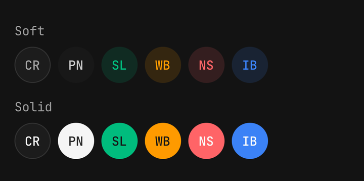
<Avatar name="Priya Natarajan" variant="soft" color="primary" />
<Avatar name="Saskia Lund" variant="solid" color="success" />
Presence
An empty Avatar.Badge is a presence dot; say the status in the avatar's own label.
<Avatar accessibilityLabel="Aria Whitlock, online" name="Aria Whitlock" source={photo}>
  <Avatar.Badge color="success" placement="bottom-right" />
</Avatar>
Unread count
Given children, Avatar.Badge only pins them to the corner.
import { Badge } from "@/components/ui/badge";

<Avatar name="Rawiri Kemp" source={photo}>
  <Avatar.Badge>
    <Badge color="destructive" size="sm">3</Badge>
  </Avatar.Badge>
</Avatar>;
Pressable avatars
With no onPress and no onLongPress the root is a plain View; supply either and it becomes a Pressable.
<Avatar name="Rawiri Kemp" onPress={openProfile} />Group
max caps the faces, not the row, and total counts people who were never passed as children.
<Avatar.Group max={3} total={40}>
  <Avatar name="Aria Whitlock" source={aria} />
  <Avatar name="Rawiri Kemp" source={rawiri} />
  <Avatar name="Kenji Moriyama" />
</Avatar.Group>
Overlap
overlap defaults to a third of the edge; 0 closes the stack into a plain row.
<Avatar.Group overlap={0} size="sm">…</Avatar.Group>API Reference
AvatarProps
A pressable avatar is a Pressable, so feedback, haptic, onPress and the rest are inherited rather than
restated — see Pressable. asChild, busy and disabled are withheld: use
isDisabled.
Prop
Type
Avatar.Badge
An overlay pinned to a corner, outside the clipped circle. Empty, it draws a presence dot. Extends ViewProps.
Prop
Type
Avatar.Group
A row of overlapping avatars, first on top, with the people who did not fit counted at the end. Extends ViewProps.
Prop
Type