Kpi
One number, its change coloured by what it means, and a sparkline of how it got there.
Installation
Kpi ships with the library — install it once, then import:
import { Kpi } from "@delacour/react-native-ui/kpi";Or copy the source into your project, to own and edit it:
bunx delacour@latest add kpiUsage
import { Kpi } from "@/components/ui/kpi";
import { View } from "react-native";

const revenue = [31.2, 33.8, 32.9, 36.4, 35.1, 38.7, 41.2, 40.3, 43.9, 48.1];

export default function Example() {
  return (
    <View className="flex-1 justify-center p-4">
      <Kpi>
        <Kpi.Header>
          <Kpi.Title>Revenue</Kpi.Title>
        </Kpi.Header>
        <Kpi.Content>
          <Kpi.Stat>
            <Kpi.Value>$48,120</Kpi.Value>
            <Kpi.Trend caption="vs last month" value={7.8} />
          </Kpi.Stat>
          <Kpi.Sparkline data={revenue} />
        </Kpi.Content>
      </Kpi>
    </View>
  );
}
Anatomy
<Kpi colorIndex={1} goodDirection="up">
  <Kpi.Header>
    <Kpi.Icon />
    <Kpi.Title />
    <Kpi.Action />
  </Kpi.Header>
  <Kpi.Content layout="below">
    <Kpi.Stat>
      <Kpi.Value />
      <Kpi.Trend />
    </Kpi.Stat>
    <Kpi.Sparkline />
  </Kpi.Content>
  <Kpi.Footer />
</Kpi>

<Kpi.Group orientation="horizontal" separated>…</Kpi.Group>
A Kpi is a Card: it takes the card's four fills and three sizes, and
the header and content sit on the card's own inset, so the number lines up with the footer beneath it.
Kpi.Stat holds the value and its change together — they are one fact in two lines, and the card's gap is
for the space between facts.
Which way is good
Colour comes from what the movement means, not from its sign. A fall in churn, refunds or latency is good
news, and is drawn as good news — say so once on the card with goodDirection and every trend inside
follows. "none" is for a number that is neither, like a headcount.
<Kpi goodDirection="up">
  <Kpi.Trend value={7.8} />
</Kpi>

<Kpi goodDirection="down">
  <Kpi.Trend value={-8.4} />
</Kpi>

<Kpi goodDirection="none">
  <Kpi.Trend value={2.2} />
</Kpi>
The sign is the direction, so there is no direction prop to keep in step with the value. A movement no
larger than threshold counts as none, and a value that is not finite — a change against a zero baseline
— is flat rather than news of either kind.
Trend variants
text is a line of colour under the number. badge puts a pill round it, with an arrow that says the
direction again in a shape — for a card busy enough that a bare line of colour is lost in it.
<Kpi.Trend caption="vs last month" value={12.4} />
<Kpi.Trend value={-3.1} variant="badge" />
<Kpi.Trend format={(value) => `+${value} users`} value={120} />
The default prints one decimal place with an explicit sign and a typographic minus, so a column of changes lines up on the sign. A screen reader hears one string — "Up 7.8 percent, vs last month".
Sizes
The card's sm, md and lg. One axis moves the inset, the value's scale, the change and the
sparkline's height together.
<Kpi size="sm">…</Kpi>
<Kpi size="lg">…</Kpi>
Inline
layout="inline" sets the sparkline in a fixed 128pt column beside the number, unfilled. A stack of cards
has labels of every length, and a fixed column keeps the shapes lined up down the right-hand edge.
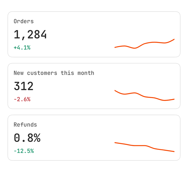
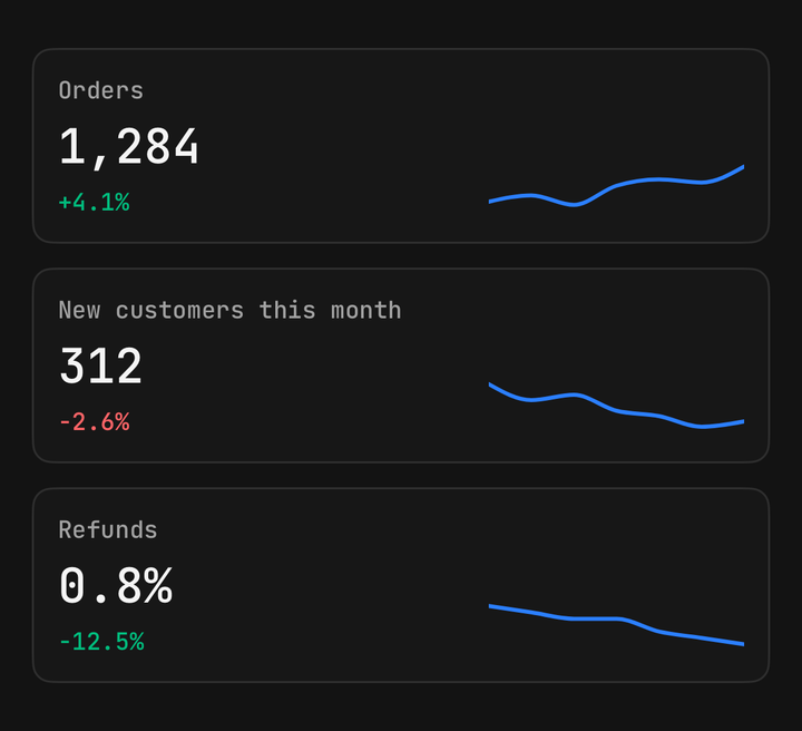
<Kpi size="sm">
  <Kpi.Content layout="inline">
    <Kpi.Stat>
      <Kpi.Title>Orders</Kpi.Title>
      <Kpi.Value>1,284</Kpi.Value>
      <Kpi.Trend value={4.1} />
    </Kpi.Stat>
    <Kpi.Sparkline data={orders} />
  </Kpi.Content>
</Kpi>
Sparkline
A Chart line with no grid, no axes and no padding, in the card's series colour — colorIndex on the
card picks the slot of the theme's ramp, and Kpi.Icon takes the same one. It takes a bare list of numbers,
or rows with an xKey and a yKey. Its y bounds are the data's own, padded a tenth each way, so the peak
and trough are never drawn half off the frame.
<Kpi.Sparkline data={[3, 4, 3.6, 5, 4.8, 6]} />
<Kpi.Sparkline data={rows} xKey="day" yKey="visits" />
<Kpi.Sparkline colorIndex={4} data={values} filled={false} strokeWidth={1.5} />
Scrub
Hold the sparkline and drag. A dot rides the line and the KPI's activeIndex follows the finger, going
back to null when it lets go. useKpi() reads it, so a part of your own prints the scrubbed point in
place of the latest.
function ScrubbedValue() {
  const { activeIndex } = useKpi();
  return <Kpi.Value>{format(values[activeIndex ?? values.length - 1])}</Kpi.Value>;
}

<Kpi>
  <Kpi.Content>
    <Kpi.Stat>
      <ScrubbedValue />
    </Kpi.Stat>
    <Kpi.Sparkline data={values} />
  </Kpi.Content>
</Kpi>
It is controllable like any other state: pass activeIndex and onActiveIndexChange to hold it yourself,
or defaultActiveIndex to seed it. interactive={false} turns the scrub off — for a sparkline inside a
Pressable, say.
const [activeIndex, setActiveIndex] = useState<number | null>(null);

<Kpi activeIndex={activeIndex} onActiveIndexChange={setActiveIndex}>…</Kpi>
Loading
isLoading swaps the value, the change and the sparkline for placeholders of their own size and marks the
card busy, so nothing jumps when the data lands.
<Kpi isLoading={isFetching}>…</Kpi>Groups
Kpi.Group lays several metrics out in a row or a column. In a row each takes an equal share of the width.
separated sets them on one surface with a rule between each — one panel rather than several that happen
to sit side by side.
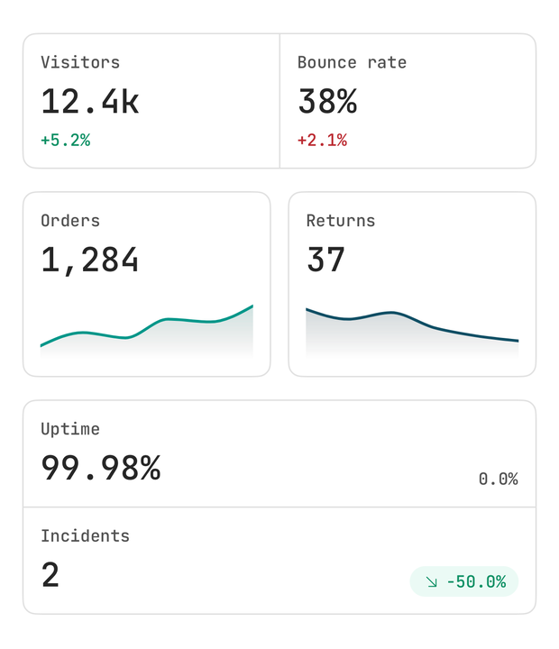
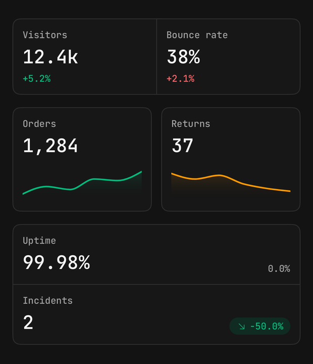
<Kpi.Group orientation="horizontal" separated>
  <Kpi size="sm">…</Kpi>
  <Kpi goodDirection="down" size="sm">…</Kpi>
</Kpi.Group>
Composition
A KPI is layout, like the card it is built on. One that selects is a Pressable around it, which keeps the
role and the haptic at the call site that knows what the press means.
<Pressable
  accessibilityRole="radio"
  accessibilityState={{ checked: isSelected }}
  haptic="selection"
  onPress={() => setMetric("revenue")}
>
  <Kpi className={isSelected ? "border-primary" : undefined} size="sm">
    <Kpi.Content layout="inline">
      <Kpi.Stat>
        <Kpi.Title>Revenue</Kpi.Title>
        <Kpi.Value>$48,120</Kpi.Value>
        <Kpi.Trend value={7.8} />
      </Kpi.Stat>
      <Kpi.Sparkline data={revenue} interactive={false} />
    </Kpi.Content>
  </Kpi>
</Pressable>
API Reference
Kpi
Extends Card's props.
Prop
Type
Kpi.Header
The top row — an icon, the title, and an action pushed to the end. Extends ViewProps.
Kpi.Icon
A square tinted in the series colour. An unstyled Icon inside takes that colour and a size to match.
Extends ViewProps.
Kpi.Title
The metric's name, muted, on one line. Extends Text's props.
Kpi.Action
The header's trailing end — a menu, a filter, a link. Extends ViewProps.
Kpi.Content
Extends ViewProps.
Prop
Type
Kpi.Stat
The value and its change, stacked as one fact. Extends ViewProps.
Kpi.Value
The number, formatted by you, on one line. Extends Text's props.
Kpi.Trend
Extends ViewProps.
Prop
Type
Kpi.Sparkline
Prop
Type
Kpi.Footer
Card.Footer, with bare text set as a muted caption. variant="band" sets it into the card.
Kpi.Group
Extends ViewProps.
Prop
Type
useKpi
Reads the enclosing KPI, for a part of your own. Throws outside a Kpi.
Prop
Type