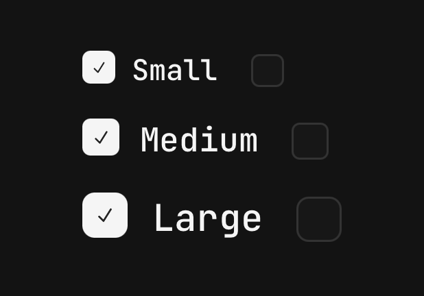
Checkbox
A box that is ticked or not — alone, or as one of a group sharing a value list.
import { Checkbox } from "@delacour/native-ui/checkbox";
import { CHECKBOX_COLORS, Checkbox } from "@delacour/native-ui/checkbox";import { type ReactElement, useState } from "react";import { View } from "react-native";/** * One colour, ticked and not, side by side. * * Built from the exported `as const` array rather than written out, so a colour * added to `CHECKBOX_COLORS` appears here with no edit. */function ColorRow({ color }: { color: (typeof CHECKBOX_COLORS)[number] }): ReactElement { const [isChecked, setChecked] = useState(true); return ( <View className="flex-row items-center gap-4"> <Checkbox color={color} isChecked={isChecked} onCheckedChange={setChecked} testID={`checkbox-${color}`}> <Checkbox.Label>{color}</Checkbox.Label> </Checkbox> <Checkbox color={color} defaultChecked={false} /> </View> );}export function Demo(): ReactElement { return ( <View className="gap-3"> {CHECKBOX_COLORS.map((color) => ( <ColorRow color={color} key={color} /> ))} </View> );}<Checkbox checked={accepted} onCheckedChange={setAccepted}>
<Checkbox.Label>Accept the terms</Checkbox.Label>
</Checkbox>Colours: default, primary, success, warning, danger, info. Sizes: sm, md,
lg. Alignment: start, end.
There is no variant axis: a checkbox has one shape, and a second way to paint it would be a
second thing to keep in step with the radio beside it.
The root draws the box
<Checkbox /> on its own is a complete control. Anything composed inside lands beside the box
and shares its tap target — which is exactly why Checkbox.Label exists next to Field.Label.
Field.Label names a control from a row away; this one is inside the pressable, so tapping the
words toggles the box.
Use Field.Label in a horizontal Field, and Checkbox.Label everywhere else.
Groups

import { Checkbox } from "@delacour/native-ui/checkbox";import { Text } from "@delacour/native-ui/text";import { type ReactElement, useState } from "react";import { View } from "react-native";const CHANNELS = [ { label: "Email", value: "email" }, { label: "SMS", value: "sms" }, { label: "Push notifications", value: "push" },] as const;export function Demo(): ReactElement { const [channels, setChannels] = useState<string[]>(["email"]); return ( <View className="gap-3"> <Checkbox.Group checked={channels} color="success" onChecked={setChannels}> {CHANNELS.map((channel) => ( <Checkbox key={channel.value} testID={`checkbox-${channel.value}`} value={channel.value}> <Checkbox.Label>{channel.label}</Checkbox.Label> </Checkbox> ))} </Checkbox.Group> <Text.Code>{JSON.stringify(channels)}</Text.Code> <Text.Caption>{`${channels.length} channels`}</Text.Caption> </View> );}
import { Checkbox } from "@delacour/native-ui/checkbox";import { Field } from "@delacour/native-ui/field";import type { ReactElement } from "react";export function Demo(): ReactElement { return ( <Field.Group> <Field orientation="horizontal"> <Field.Content> <Field.Label>Sync across devices</Field.Label> <Field.Description>Your drafts follow you to every device you sign in on.</Field.Description> </Field.Content> <Checkbox color="primary" defaultChecked testID="checkbox-sync" /> </Field> <Field isInvalid orientation="horizontal"> <Field.Content> <Field.Label>Accept the terms</Field.Label> <Field.Error>You must accept the terms to continue.</Field.Error> </Field.Content> <Checkbox testID="checkbox-terms" /> </Field> <Field isInvalid orientation="horizontal"> <Field.Label>Opted out of the invalid field</Field.Label> <Checkbox color="success" defaultChecked isInvalid={false} testID="checkbox-opt-out" /> </Field> </Field.Group> );}<Checkbox.Group value={selected} onValueChange={setSelected}>
<Checkbox value="email"><Checkbox.Label>Email</Checkbox.Label></Checkbox>
<Checkbox value="push"><Checkbox.Label>Push</Checkbox.Label></Checkbox>
</Checkbox.Group>The group's state is one array of the children's values. A grouped checkbox with no value
throws by name — group membership is invisible in the child's props at compile time, so it cannot
be a type error.
The group is a plain View with no role. Lay the children out any other way with a className —
flex-row flex-wrap for a row.
Precedence: own ?? group ?? field ?? default
Deliberately not Input.Group's order. Checkbox.Group owns no box — it is a state controller
that also carries shared defaults, which makes it the same kind of thing as Field. "Make the
group lg" and "make this one danger" are different questions and both get an answer.
Indeterminate

import { Checkbox } from "@delacour/native-ui/checkbox";import { Text } from "@delacour/native-ui/text";import { type ReactElement, useState } from "react";import { View } from "react-native";const PERMISSIONS = ["Read", "Write", "Delete"] as const;export function Demo(): ReactElement { const [permissions, setPermissions] = useState<string[]>([]); const allPermissions = permissions.length === PERMISSIONS.length; const somePermissions = permissions.length > 0 && !allPermissions; const toggleAll = () => setPermissions(allPermissions ? [] : [...PERMISSIONS]); return ( <View className="gap-3"> <Checkbox color="primary" isChecked={allPermissions} isIndeterminate={somePermissions} onCheckedChange={toggleAll} testID="checkbox-all" > <Checkbox.Label>Select all</Checkbox.Label> </Checkbox> <View className="pl-7"> <Checkbox.Group checked={permissions} color="primary" onChecked={setPermissions}> {PERMISSIONS.map((permission) => ( <Checkbox key={permission} testID={`checkbox-${permission}`} value={permission}> {permission} </Checkbox> ))} </Checkbox.Group> </View> <Text.Caption>{`${permissions.length} permissions`}</Text.Caption> </View> );}isIndeterminate paints the surface and swaps the glyph, and reports checked="mixed" — so a
"select all" row says what it means rather than claiming a half-truth.
isFilled, not isChecked, is the tv axis: checked and indeterminate both paint the surface and
only the glyph tells them apart.
Colour paints the indicator, not the box
An unticked box is border-input bg-card at every colour — the same chrome a field wears, because
it is the same kind of thing. Only the border has to know both states.
Invalid outranks the colour, on the border and the fill, ticked or not.
The animation
Three gestures off one shared value, so they cannot drift:
- The fill fades and scales from the centre. A box is filled, not slid into — there is no
edge a checkbox is filled from, so a
translateXhere would read as a panel arriving. - The tick sits behind a container whose width opens from the box's left edge, so the stroke
is drawn on when ticking and taken back when unticking. It is held by
tickDelayuntil the surface it is drawn on is most of the way there. - The border comes last, held by
borderDelayuntil the surface is near the edge, so it reads as the fill arriving at the border rather than as an outline changing on its own.
Reduce-motion takes Reanimated's default System policy here, unlike Spinner: the state change
is the point and the travel is decoration.
Press defaults
The root is a Pressable. Two defaults differ and only two: feedback="fade" (a spring on a
20pt square reads as a jitter) and haptic="selection" (a checkbox is a state toggle, and the tick
landing is the confirmation). Both are ordinary props — haptic={false} silences it.
onPress is Omited rather than forwarded: the press is the toggle, and onCheckedChange is
where a side effect goes.
Sizing

import { CHECKBOX_SIZES, Checkbox } from "@delacour/native-ui/checkbox";import type { ReactElement } from "react";import { View } from "react-native";export function Demo(): ReactElement { return ( <View className="gap-3"> {CHECKBOX_SIZES.map((size) => ( <View className="flex-row items-center gap-4" key={size}> <Checkbox color="primary" defaultChecked size={size} testID={`checkbox-${size}`}> <Checkbox.Label>size {size}</Checkbox.Label> </Checkbox> <Checkbox color="primary" size={size} /> </View> ))} </View> );}The box mints no scale of its own — it reads --spacing-icon-* two steps above its own glyph:
18/14, 20/16, 24/18. The test pins the offset, not the points.
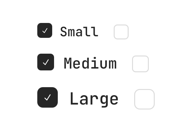
Only a bare box gets hitSlop. Once there is a label the row is already a wide target, and slop
on top of that would overlap the row below.
API
A checkbox is a Pressable, so feedback, haptic and the rest are inherited — see
Pressable. onPress is withheld in favour of
onCheckedChange, and disabled in favour of isDisabled, which the label reads through context.
Prop
Type
Checkbox.Group
Owns the selection for the boxes inside it, and publishes the shared axes so each one does not
restate them. Extends ViewProps.
Prop
Type
Checkbox.Label
The checkbox's text, wired as its accessible name. Extends React Native's TextProps.
Prop
Type
Inside a group, a checkbox's value is required — the group tracks selection by it. A box without
one is invisible to the group's checked array, so it renders but never reports.