Chip
An interactive pill — a filter that toggles, a tag, or a token with a remove control.
Installation
Chip ships with the library — install it once, then import:
import { Chip } from "@delacour/react-native-ui/chip";Or copy the source into your project, to own and edit it:
bunx delacour@latest add chipUsage
import { Chip } from "@/components/ui/chip";
import { useState } from "react";
import { View } from "react-native";

export default function Example() {
  const [isOpen, setOpen] = useState(true);

  return (
    <View className="flex-1 items-center justify-center p-4">
      <Chip isSelected={isOpen} onSelectedChange={setOpen}>
        Open only
      </Chip>
    </View>
  );
}
Variants and colours
variant is how an unselected chip is painted and color is what it means — the same tones as Badge.
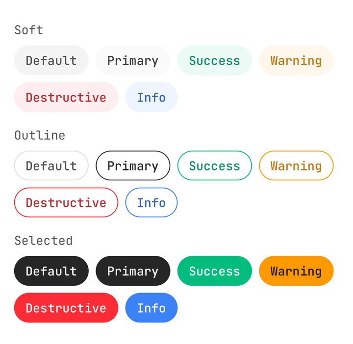
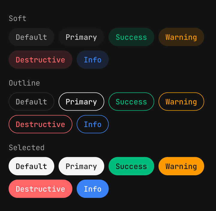
<Chip>Default</Chip>
<Chip color="success">Shipped</Chip>
<Chip variant="outline" color="warning">Beta</Chip>
<Chip defaultSelected color="primary">Selected</Chip>
Sizes
A size sets padding, the label's type scale and the icon step, never a height.
<Chip size="sm">Small</Chip>
<Chip size="md">Medium</Chip>
<Chip size="lg">Large</Chip>
Filters
Any selection prop makes the chip a toggle, announced to a screen reader as selected or not.
const [active, setActive] = useState(new Set(["pizza"]));

<Chip
  isSelected={active.has("pizza")}
  onSelectedChange={(isSelected) => toggle("pizza", isSelected)}
  variant="outline"
>
  <Icon icon={IconPizza} />
  <Chip.Label>Pizza</Chip.Label>
</Chip>;
Uncontrolled
defaultSelected lets the chip hold its own state and report each change.
<Chip defaultSelected onSelectedChange={(isSelected) => save(isSelected)}>
  Notifications
</Chip>
Removable
onClose adds a remove control with a press of its own, so removing a chip never also toggles it.
<Chip closeAccessibilityLabel={`Remove ${topic}`} onClose={() => remove(topic)}>
  {topic}
</Chip>
Start and end content
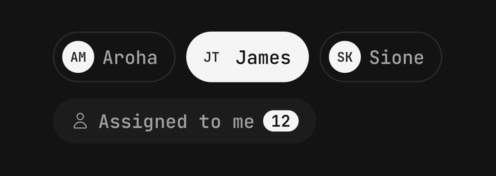
An Icon needs no wrapper; an avatar or a count goes in Chip.StartContent or Chip.EndContent.
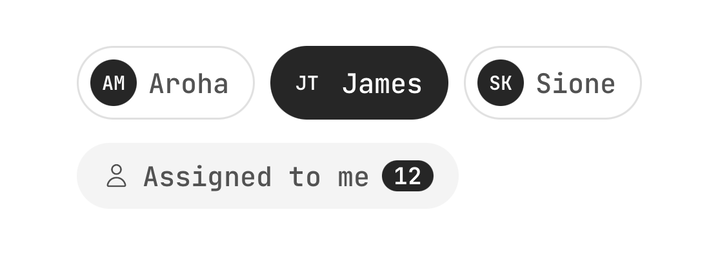
<Chip variant="outline">
  <Chip.StartContent className="size-6 rounded-full bg-primary">
    <Text className="text-[10px] text-primary-foreground">AM</Text>
  </Chip.StartContent>
  <Chip.Label>Aroha</Chip.Label>
</Chip>
Tags and buttons
With no handler a chip is a plain view; with only onPress it is a button.
<Chip color="info">Feature</Chip>
<Chip onPress={openTag}>Design</Chip>
API Reference
ChipProps
A pressable chip is a Pressable, so feedback, haptic, onPress and the rest are inherited — see
Pressable. asChild, busy and disabled are withheld: use
isDisabled.
Prop
Type
Chip.Label
The chip's text. Picks its colour and type scale from the chip's variant, colour, size and selection.
Extends React Native's TextProps.
Prop
Type
Chip.CloseButton
The remove pressable. Defaults its accessibilityLabel to "Remove" and its feedback to fade.
Extends PressableProps.
Prop
Type
Chip.StartContent / Chip.EndContent
Centred wrappers for leading and trailing content that is not an Icon.
Prop
Type
useChip
Reads the enclosing chip's variant, color, size, isSelected and isDisabled, for a custom child
that restyles itself on selection. Throws outside a <Chip>.