Button
A pressable action, with composed icons and a loading state that costs no layout.
Installation
Button ships with the library — install it once, then import:
import { Button } from "@delacour/react-native-ui/button";Or copy the source into your project, to own and edit it:
bunx delacour@latest add buttonUsage
import { Button } from "@/components/ui/button";
import { useState } from "react";
import { View } from "react-native";

export default function Example() {
  const [isSaving, setIsSaving] = useState(false);

  function save() {
    setIsSaving(true);
    setTimeout(() => setIsSaving(false), 1500);
  }

  return (
    <View className="flex-1 items-center justify-center p-4">
      <Button isLoading={isSaving} onPress={save}>
        Save
      </Button>
    </View>
  );
}
Variants
Use the variant prop to change how the surface is painted.
<Button variant="primary">Continue</Button>Sizes
One axis drives five values: the height, the label's type scale, the icon step, the horizontal
padding and the corner. --radius-button-* is half each height, so a button is a capsule by
default and a square one a circle. Square one off with className="rounded-lg", or retune the
three tokens to change every button at once.
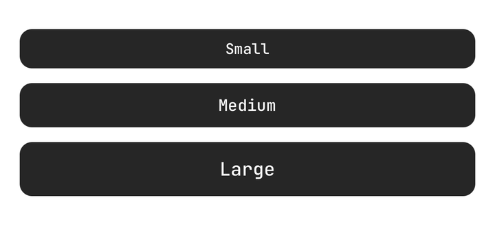
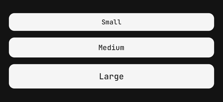
<Button size="sm">Small</Button>
<Button size="md">Medium</Button>
<Button size="lg">Large</Button>
The same axis carries the square sizes — see Icon button.
Icons
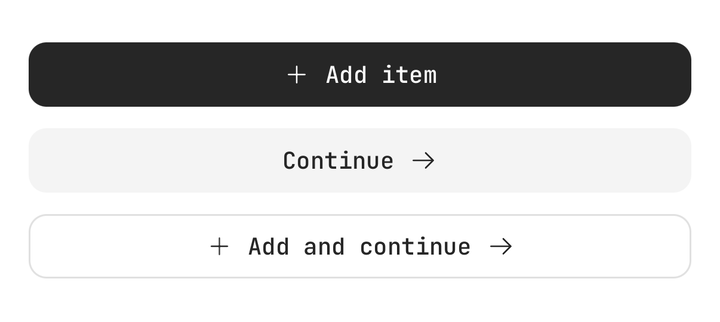
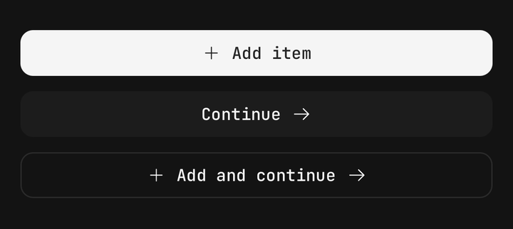
Icons are composed, not passed as props — put an Icon in the children, before or after the label.
import { Icon } from "@delacour/react-native-ui/icon";
import { IconArrowRight, IconTrash } from "@delacour/react-native-ui/icons/central";

<Button onPress={next}>
  <Button.Label>Continue</Button.Label>
  <Icon icon={IconArrowRight} />
</Button>

<Button variant="destructive" onPress={remove}>
  <Icon icon={IconTrash} />
  <Button.Label>Delete</Button.Label>
</Button>
The button publishes its size and its variant's foreground token to the subtree, so a bare <Icon>
comes out right with nothing said at the call site. An explicit size or color still wins.
Icon button
Use an icon-* size for a square button whose only content is an icon. Each one is its labelled
step — the same height, corner and icon token — with the horizontal padding traded for a width off
that step's own token, so the footprint is square by construction rather than by two numbers
agreeing.
<Button accessibilityLabel="Favourite" size="icon-md" variant="ghost">
  <Icon icon={IconHeart} />
</Button>icon-sm, icon-md and icon-lg are 36, 44 and 52 points square — the same three heights the
labelled sizes stand at, so an icon button sits level with the text button beside it.
Always pair an icon-* size with an accessibilityLabel. There is no text for a screen reader to
fall back on.
Loading
Use isLoading to compose a spinner in and block presses.
<Button isLoading onPress={save}>Save</Button>The spinner takes the place of the composed Icon rather than joining it, so nothing shifts when
work begins.
Spinner placement
Use spinnerPlacement to choose which side the spinner takes, or only to replace the content.
<Button isLoading spinnerPlacement="start">Save</Button>
<Button isLoading spinnerPlacement="end">Save</Button>
<Button isLoading spinnerPlacement="only">Save</Button>
Loading is not disabled
isLoading blocks the press and announces the button as busy, but keeps full contrast. Pass
isDimmedWhileLoading to opt into the faded treatment.
Press feedback
A button is a Pressable, so feedback, haptic and pressedScale are inherited. Only the
default differs — scale.
<Button feedback="fade">Fade on press</Button>
<Button haptic="selection">With haptic</Button>
<Button pressedScale={0.92}>Deeper press</Button>
Group
Button.Group joins several controls into one run. Each member squares the pair of corners
crossing a seam and overlaps its neighbour by a point, so two adjacent borders draw as one
hairline rather than two.
React Native has no sibling selector, so a member's place is worked out in JavaScript and published through context rather than matched with CSS. A group of one is indistinguishable from the control on its own.
<Button.Group variant="outline">
  <Button onPress={archive}>Archive</Button>
  <Button onPress={report}>Report</Button>
  <Button onPress={snooze}>Snooze</Button>
</Button.Group>
The group owns the axes because it owns the shape. It sets every member's step — controls of
different heights do not join — while variant, isDisabled and feedback are defaults a member
may still override, so one member can disable itself inside a group that did not.
A member keeps its own shape, though, so a square button still works inside a run: an
icon-md member of an sm group comes out icon-sm — square, and the same height as everything
beside it.
<Button.Group isDisabled size="sm" variant="outline">
  <Button>Save</Button>
  <Button variant="destructive">Discard</Button>
</Button.Group>
Group orientation
A vertical run squares top and bottom instead of the ends. A horizontal one squares the inline axis, so it flips under right-to-left layout without being told to.
<Button.Group orientation="vertical" variant="outline">
  <Button accessibilityLabel="More" size="icon-md" onPress={increment}>
    <Icon icon={IconPlusMedium} />
  </Button>
  <Button accessibilityLabel="Fewer" size="icon-md" onPress={decrement}>
    <Icon icon={IconMinusMedium} />
  </Button>
</Button.Group>
Horizontal groups are content-width, because that is what a segmented control is. For a run that
fills its parent, set isFullWidth.
Full-width group
isFullWidth spans the parent and splits it equally between the members, whatever each label
says. Every member gets flex-1 basis-0: the zero basis is what makes the split equal — with
flex-1 alone Yoga shares out only the space left after each label, so a long label still takes
a wider segment and the dividers move whenever the copy changes. A separator and a
Button.Group.Text keep their own width. A member's own className still wins, so
className="flex-none" opts one out. On a vertical group it only fills the width, which its
members already stretch across.
<Button.Group isFullWidth variant="outline">
  <Button>Monthly</Button>
  <Button>Annual</Button>
  <Button>One-off</Button>
</Button.Group>
The parent has to have a definite width. Yoga resolves a percentage against the parent's content
box, so w-full inside a container that is itself content-sized falls back to the content width —
the group collapses onto its buttons and a flex-1 member between them is squeezed to a few
points. It reads as though w-full were ignored; there was simply no width to take a percentage
of.
Spaced group
isAttached={false} keeps what the group shares — variant, size, isDisabled, feedback —
and drops the joined shape. Every member draws its own corners, nothing overlaps, and the run takes
a gap: a toolbar rather than a segmented control. With no seam to tear, a press scales again, as
it does on a lone button. A separator still draws between spaced members.
<Button.Group isAttached={false} size="sm" variant="outline">
  <Button onPress={find}>Find</Button>
  <Button onPress={exportAll}>Export</Button>
  <Button onPress={share}>Share</Button>
</Button.Group>
Group separator
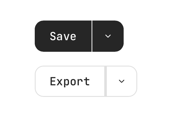
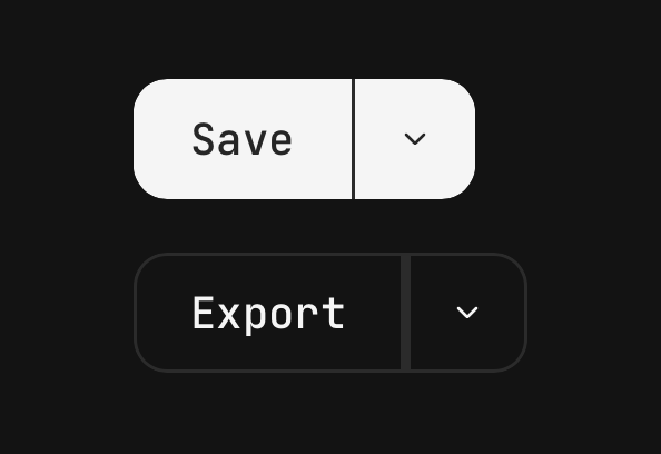
Button.Group.Separator draws a rule between two members — a split button. It takes no position
of its own, so the buttons either side of it are still the run's first and last and keep their
rounded outer corners. The member after it does not overlap either: a one-point rule under a
one-point overlap would be invisible.
<Button.Group>
  <Button onPress={save}>Save</Button>
  <Button.Group.Separator />
  <Button accessibilityLabel="More save options" size="icon-md" onPress={openMenu}>
    <Icon icon={IconChevronDownSmall} />
  </Button>
</Button.Group>
Group text
Button.Group.Text is a member that says something rather than doing something. It draws the
button's own chrome, so its height, padding and corner match the buttons beside it exactly. It
falls back to secondary rather than primary when nothing names a variant — a chunk that
cannot be pressed should not wear the group's action paint.
<Button.Group variant="outline">
  <Button accessibilityLabel="Fewer" size="icon-md" onPress={decrement}>
    <Icon icon={IconMinusMedium} />
  </Button>
  <Button.Group.Text>12 items</Button.Group.Text>
  <Button accessibilityLabel="More" size="icon-md" onPress={increment}>
    <Icon icon={IconPlusMedium} />
  </Button>
</Button.Group>
Group with an input
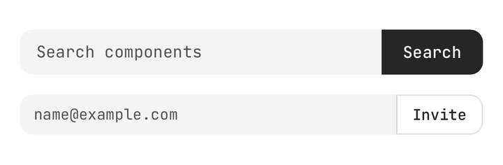
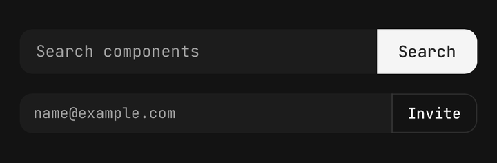
An Input joins a run like any other member. Alone it draws the generic corner ramp; joined, it takes the group's corner instead, so both ends of the row draw the same arc.
<Button.Group className="w-full">
  <Input className="flex-1" placeholder="Search components" variant="secondary" />
  <Button onPress={search}>Search</Button>
</Button.Group>
Reading the button's state
Use useButton() to match the parent from a custom child, without prop drilling.
import { useButton } from "@delacour/react-native-ui/button";

function ButtonCount({ count }: { count: number }) {
  const { variant, size, isDisabled } = useButton();
  // …
}
API Reference
Button
Prop
Type
ButtonProps
Extends PressableProps, minus busy, children, disabled, pressedOpacity and
pressedScale.
Prop
Type
ButtonLabelProps
React Native's TextProps, plus className.
ButtonGroupProps
Extends React Native's ViewProps.
Prop
Type
ButtonGroupSeparatorProps
Prop
Type
The orientation is read from the group and inverted — a rule crosses the run — so it is not a
prop. Must be rendered inside a Button.Group.
ButtonGroupTextProps
Extends React Native's ViewProps.
Prop
Type
useButtonGroup() · useButtonGroupItem()
useButtonGroup() reads the enclosing group's axes. useButtonGroupItem() reads this member's
place in the run — which is how a control this package has never heard of can join one and
square its own corners.
Prop
Type
useButton()
Prop
Type
size is the prop verbatim, so an icon button reports icon-lg, not lg. Compare against
BUTTON_ICON_SIZES rather than a bare step when a child has to know it is inside a square one.
Exports
import {
  BUTTON_VARIANTS,
  BUTTON_SIZES,
  BUTTON_LABEL_SIZES,
  BUTTON_ICON_SIZES,
  BUTTON_SPINNER_PLACEMENTS,
  BUTTON_GROUP_ORIENTATIONS,
  BUTTON_GROUP_POSITIONS,
  BUTTON_FOREGROUND_TOKEN,
  buttonVariants,
  resolveGroupPositions,
  resolveGroupSeams,
} from "@delacour/react-native-ui/button";
BUTTON_SIZES is every value size accepts. BUTTON_LABEL_SIZES and BUTTON_ICON_SIZES are the
two families it is composed from — map one when a list should hold only labelled buttons, or only
square ones.
BUTTON_FOREGROUND_TOKEN maps each variant to the theme token its icons and text are drawn in.
buttonVariants is the tv() slot set — useful when building a component that has to match a
button exactly.
resolveGroupPositions and resolveGroupSeams are the pure walks behind a group: given which
children are members, they return each one's place in the run and which ones overlap their
neighbour. They take arrays of booleans rather than children, so they stay free of React and the
whole matrix is unit-tested.