Icon
Central Icons, sized and coloured by inheritance.
Installation
Icon ships with the library — install it once, then import:
import { Icon } from "@delacour/react-native-ui/icon";Or copy the source into your project, to own and edit it:
bunx delacour@latest add iconUsage
import { Icon } from "@/components/ui/icon";
import { IconHeart } from "@/lib/icons/central";
import { View } from "react-native";

export default function Example() {
  return (
    <View className="flex-1 items-center justify-center p-4">
      <Icon icon={IconHeart} />
    </View>
  );
}
Sizes
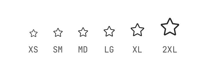
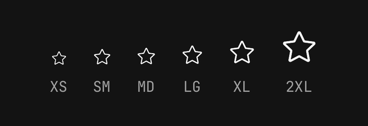
xs 14, sm 16, md 18, lg 20, xl 24, 2xl 32 — the shared icon scale, which Spinner
reads too.
<Icon icon={IconHeart} size="sm" />
<Icon icon={IconHeart} size={22} />
A named step is a class; a number bypasses the class chain entirely. The precedence ladder is in Sizing, and the full guide to the set is Icons.
Colour
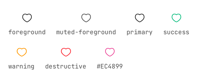
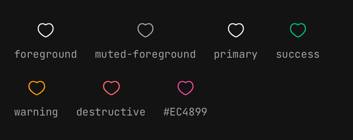
<Icon icon={IconHeart} color="destructive" />
<Icon icon={IconHeart} color="#EC4899" />
Inherited defaults
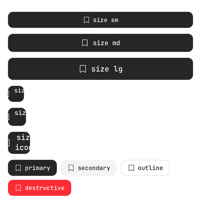
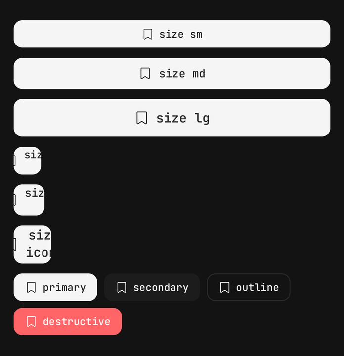
A bare <Icon> takes its size and colour from the nearest provider.
import { IconDefaultsProvider } from "@delacour/react-native-ui/icon";

<IconDefaultsProvider value={{ className: "size-icon-lg", color: "muted-foreground" }}>
  {children}
</IconDefaultsProvider>;
A subtree of defaults
<IconDefaultsProvider value={{ className: "size-icon-2xl", color: "primary" }}>
  <Icon icon={IconHeart} />
  <Icon color="destructive" icon={IconBell} />
</IconDefaultsProvider>Button, Badge and ListGroup.ItemPrefix all publish into this, so a bare <Icon> inside one
needs nothing at the call site. An explicit size or color still wins.
API Reference
IconProps
Extends SvgProps, minus color, width and height.
Prop
Type
Exports
import {
  Icon,
  type IconProps,
  type IconComponent,
  IconDefaultsProvider,
  useIconDefaults,
  ICON_SIZES,
  ICON_FALLBACK_COLOR,
  ICON_FALLBACK_SIZE_CLASS,
  iconVariants,
  isIconSize,
  resolveIconSizeClass,
} from "@delacour/react-native-ui/icon";