Skeleton
A placeholder that shimmers or pulses while content loads.
Installation
Skeleton ships with the library — install it once, then import:
import { Skeleton } from "@delacour/react-native-ui/skeleton";Or copy the source into your project, to own and edit it:
bunx delacour@latest add skeletonUsage
import { Skeleton } from "@/components/ui/skeleton";
import { View } from "react-native";

export default function Example() {
  return (
    <View className="flex-row items-center gap-3 p-4">
      <Skeleton shape="circle" />
      <Skeleton.Lines className="flex-1" lines={2} />
    </View>
  );
}
Anatomy
<Skeleton.Group>
  <Skeleton />
  <Skeleton.Lines />
</Skeleton.Group>
Skeleton is one placeholder. Skeleton.Lines is a paragraph of them. Skeleton.Group holds one
clock and one loading flag for everything inside it. Each works on its own.
Sized by its content
Pass the real content as children and the placeholder takes its exact size — the content is rendered
invisibly underneath while it loads. Flip isLoading off and it fades in with nothing moving, and
because it was never unmounted it keeps its own state.
<Skeleton isLoading={!user} shape="circle">
  <Avatar user={user} />
</Skeleton>
Shapes
rect for a card or an image, line for a line of text, circle for an avatar. A skeleton with no
children takes a default size for its shape, which a className overrides.
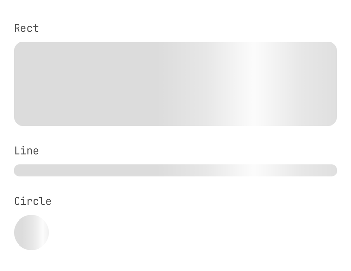
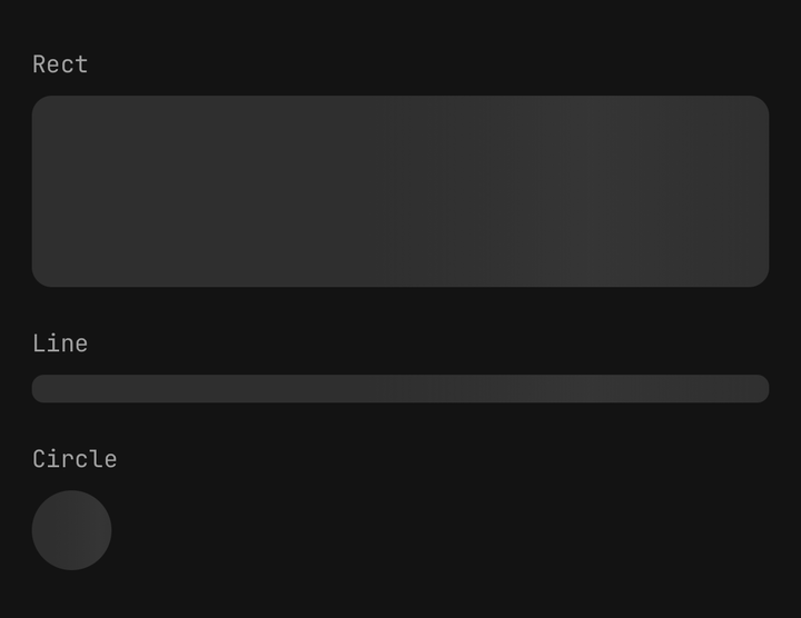
<Skeleton className="h-40 w-full" />
<Skeleton shape="line" className="w-3/4" />
<Skeleton shape="circle" className="size-12" />
Animations
shimmer sweeps a glint across the shape, pulse breathes its opacity and none holds it still. The
fill is a tint of muted-foreground, so it steps off the page or a card in either theme, and the glint
is painted in the elevated token, which rises above it in both. Both run on the
UI thread and never re-render the component.
<Skeleton animation="shimmer" />
<Skeleton animation="pulse" />
<Skeleton animation="none" />
Under the OS reduce-motion setting every animation holds still, and under DelacourProvider's
isMotionCalm — an E2E build's switch, so a test runner
never waits out a shimmer. The placeholder stays: the shape is the message, and a shape that stops
moving still reads as content on its way.
Lines
Skeleton.Lines draws a paragraph. Only the last line is shortened, and only when there are two or
more. Pass the paragraph as children and it is shown in place of the lines once loaded.
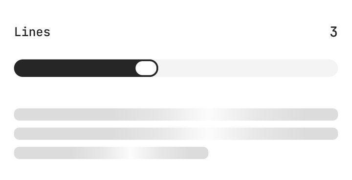
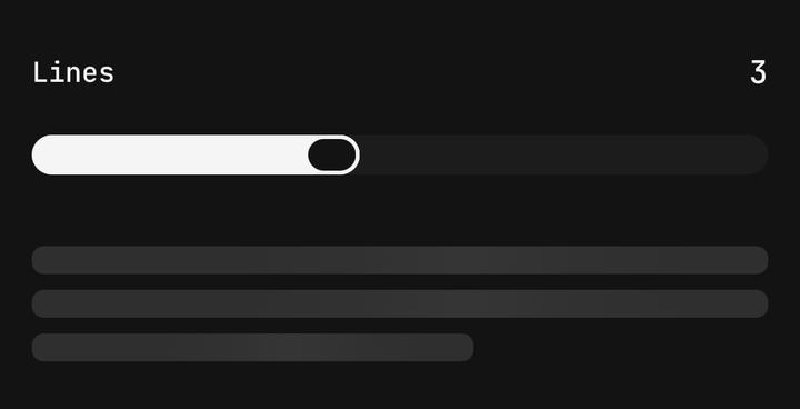
<Skeleton.Lines isLoading={!post} lines={3}>
  <Text.Paragraph>{post?.body}</Text.Paragraph>
</Skeleton.Lines>
Groups
Separate skeletons start their clocks when they mount, so rows that mount a frame apart shimmer out of
step. Inside a Skeleton.Group they all read one clock and move as one sweep, and a single
isLoading reveals the whole region. A skeleton's own isLoading or animation still wins.
<Skeleton.Group isLoading={isFetching} label="Loading messages" className="gap-4">
  {rows.map((row) => (
    <View className="flex-row items-center gap-3" key={row.id}>
      <Skeleton shape="circle" />
      <Skeleton.Lines className="flex-1" lines={2} />
    </View>
  ))}
</Skeleton.Group>
Composition
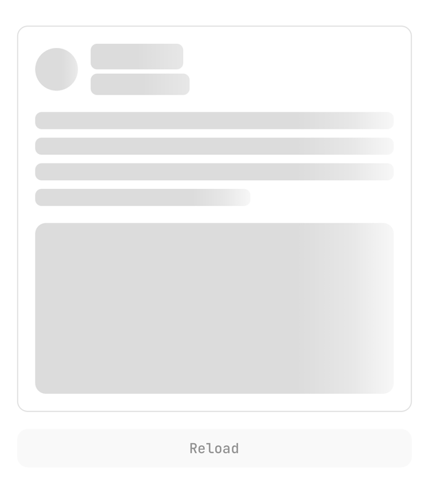
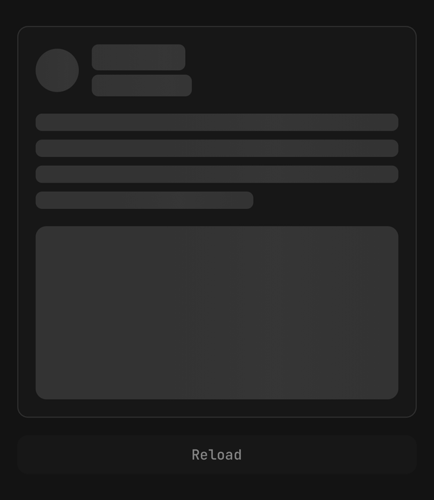
Match the shape of the real content. A placeholder the wrong size is worse than none, because the layout jumps when the data lands.
Accessibility
A placeholder is a picture of content that is not there, so it is hidden from screen readers by
default. Pass label on the one skeleton — or the group, or the paragraph — that stands for the
region, and the wait is announced once as a busy progress status. Leave it off the rest. Once loaded,
the skeleton adds nothing and the content speaks for itself.
API Reference
Skeleton
Prop
Type
Skeleton.Lines
Prop
Type
Skeleton.Group
Prop
Type