Tabs
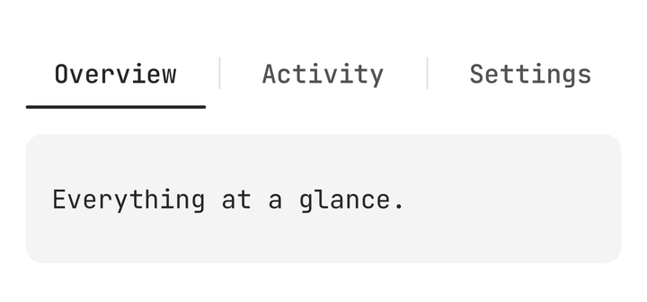
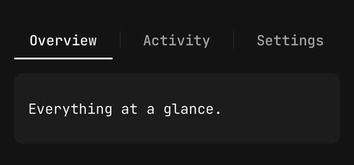
A row of tabs and the panels they switch between, with a swipeable pager.
import { Tabs } from "@delacour/native-ui/tabs";
import { TABS_VARIANTS, Tabs } from "@delacour/native-ui/tabs";import { Text } from "@delacour/native-ui/text";import type { ReactElement } from "react";import { View } from "react-native";const PANELS = [ { body: "Everything at a glance.", title: "Overview", value: "overview" }, { body: "What changed, and when.", title: "Activity", value: "activity" }, { body: "Nothing here is saved.", title: "Settings", value: "settings" },] as const;/** * One bar per variant, on the same three tabs. * * The panels carry a fixed height so the bars stay level down the demo — * without one, each pager takes the height of its own tallest panel and they * drift apart as you switch tabs. */export function Demo(): ReactElement { return ( <View className="gap-6"> {TABS_VARIANTS.map((variant) => ( <View className="gap-2" key={variant}> <Text.Caption size="xs">{variant}</Text.Caption> <Tabs variant={variant}> <Tabs.List> <Tabs.Indicator /> {PANELS.map((panel) => ( <Tabs.Trigger key={panel.value} testID={`${variant}-${panel.value}`} value={panel.value}> {panel.title} </Tabs.Trigger> ))} </Tabs.List> {PANELS.map((panel) => ( <Tabs.Content key={panel.value} value={panel.value}> <View className="h-16 justify-center rounded-lg bg-secondary px-4"> <Text.Paragraph>{panel.body}</Text.Paragraph> </View> </Tabs.Content> ))} </Tabs> </View> ))} </View> );}<Tabs value={tab} onValueChange={setTab}>
<Tabs.List>
<Tabs.Indicator />
<Tabs.Trigger value="all"><Tabs.Label>All</Tabs.Label></Tabs.Trigger>
<Tabs.Trigger value="unread"><Tabs.Label>Unread</Tabs.Label></Tabs.Trigger>
</Tabs.List>
<Tabs.Content value="all">{…}</Tabs.Content>
<Tabs.Content value="unread">{…}</Tabs.Content>
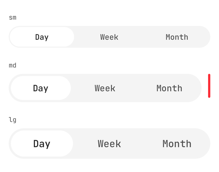
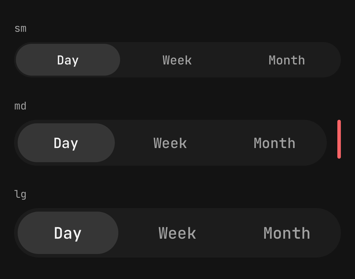
</Tabs>Variants: primary — a fully rounded capsule inside a muted track — and secondary, an
underline rule. Sizes: sm, md, lg: the trigger's floor and padding, the gap ladder, the
label's Text step and the glyph step a composed Icon inherits, on one axis.
Anatomy

import { TABS_SIZES, Tabs } from "@delacour/native-ui/tabs";import { Text } from "@delacour/native-ui/text";import type { ReactElement } from "react";import { View } from "react-native";const PANELS = [ { title: "Day", value: "day" }, { title: "Week", value: "week" }, { title: "Month", value: "month" },] as const;/** * One bar per size, with a 44pt rule drawn beside the default one. * * The rule is the check that matters here: `md`'s trigger floor has to clear the * platform hit target, and it is a floor rather than a height so a large * accessibility text step grows the row instead of clipping the label. */export function Demo(): ReactElement { return ( <View className="gap-6"> {TABS_SIZES.map((size) => ( <View className="gap-2" key={size}> <Text.Caption size="xs">{size}</Text.Caption> <View className="flex-row items-start gap-3"> <View className="flex-1"> <Tabs size={size}> <Tabs.List> <Tabs.Indicator /> {PANELS.map((panel) => ( <Tabs.Trigger key={panel.value} testID={`${size}-${panel.value}`} value={panel.value}> {panel.title} </Tabs.Trigger> ))} </Tabs.List> </Tabs> </View> {size === "md" ? <View className="h-11 w-1 rounded-full bg-danger" /> : null} </View> </View> ))} </View> );}| Part | What it is |
|---|---|
Tabs | The root. Owns the order walk, the value flow and the pan |
Tabs.List | The bar: the track, and the frame every trigger measures itself into |
Tabs.ScrollView | A horizontal scroller for a bar with more tabs than room |
Tabs.Indicator | The one layer that slides. Write it out as the row's first child |
Tabs.Trigger | One tab. A Pressable, so it inherits the whole vocabulary |
Tabs.Label | A trigger's text. Bare string children become one automatically |
Tabs.Separator | A hairline between two tabs, which retreats as either is approached |
Tabs.Content | One panel. Must be a direct child of Tabs |
The panels are the order of record
The root walks its own children for Tabs.Content, and their source order is the tab order.
Triggers are not walked — each finds its place by looking its value up in that list, so a trigger
can sit behind a wrapper or come out of a .map().
Tabs.Content must be a direct child of Tabs. Triggers may be nested; panels may not.
Writing the triggers in a different order from the panels puts the indicator on the wrong tab, with
nothing in the source to point at — so the list checks the measured x values ascend and warns by
name in development.
Everything moves off one shared value
position is a float index into the panels' order. A press springs it, a drag writes it directly,
and the pager's translation, the indicator's frame and every separator's opacity are three readings
of it. Two clocks is how a capsule ends up a frame behind the panel it is meant to be sitting on.
onValueChange fires once, when the finger lifts, before the spring finishes — so the trigger
highlights immediately rather than 300ms later. It is never called for a re-press of the current
tab.
value is string | null, never undefined
null means "controlled, nothing selected". Omitting the prop is what makes the bar uncontrolled,
so a useState<string>() seeded with undefined would silently hand the component its own state
and then switch it to controlled on the first press. Pass tab ?? null.
Swiping
isSwipeable is exactly one thing: whether the pan is enabled. It does not change what mounts.
Every panel mounts either way — you cannot drag to a panel that is not there, and one that
unmounted would lose what was typed into it.
There is no isLazy, because "lazy" is not one thing: a form wants to stay mounted, a video wants
to stop, and a report wants never to have been built. Use Tabs.Content's function children for
the per-panel decision.
The pan claims sideways and gives up vertical, so a pager works inside
Screen.ScrollArea. A horizontal scrollable inside a panel is
yours to settle — the pager publishes its pan on useTabsMotion(), and you write
Gesture.Native().blocksExternalGesture(panGesture).
The indicator

import { Button } from "@delacour/native-ui/button";import { TABS_SCROLL_ALIGNS, Tabs, type TabsScrollAlign } from "@delacour/native-ui/tabs";import { Text } from "@delacour/native-ui/text";import { type ReactElement, useState } from "react";import { View } from "react-native";const SECTIONS = [ "Overview", "Activity", "Members", "Billing", "Integrations", "Notifications", "Security", "Audit log", "Webhooks", "API keys", "Domains", "Danger zone",] as const;/** * Twelve tabs in a scroller, at every alignment. * * The two things to watch are the clamps: selecting the first tab must not scroll * the row past its own start, and selecting the last must not scroll past its * content. Both are the difference between a bar that settles and one that drifts * a few points every time you reach an end. */export function Demo(): ReactElement { const [align, setAlign] = useState<TabsScrollAlign>("center"); const [value, setValue] = useState<string>(SECTIONS[0]); return ( <View className="gap-3"> <View className="flex-row flex-wrap gap-2"> {TABS_SCROLL_ALIGNS.map((option) => ( <Button key={option} onPress={() => setAlign(option)} size="sm" testID={`align-${option}`} variant={align === option ? "primary" : "outline"} > {option} </Button> ))} </View> <Tabs onValueChange={setValue} value={value}> <Tabs.List> <Tabs.ScrollView scrollAlign={align}> <Tabs.Indicator /> {SECTIONS.map((section) => ( <Tabs.Trigger key={section} testID={`section-${section}`} value={section}> {section} </Tabs.Trigger> ))} </Tabs.ScrollView> </Tabs.List> {SECTIONS.map((section) => ( <Tabs.Content key={section} value={section}> <View className="h-24 justify-center rounded-lg bg-secondary px-4"> <Text.Subheader>{section}</Text.Subheader> <Text.Caption color="muted">Panel for {section}.</Text.Caption> </View> </Tabs.Content> ))} </Tabs> </View> );}It animates width and translateX, never scaleX. A scale is cheaper and wrong three times
over: rounded-full stretches to an ellipse at the 2.3× a short tab to a long one asks for, a
border thickens on two edges only, and any children you pass are squashed with it.
The cost is bounded because the indicator is absolutely positioned — its size change never dirties a sibling, so the row's layout stays settled.
A render prop must not change a trigger's size
A trigger's width is the indicator's geometry, so content that appears only on selection — a badge, a count — re-measures the row and shifts the whole bar on every tab change. Swap a treatment rather than adding or removing content.
Labels

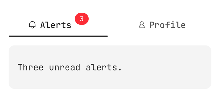
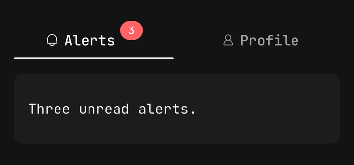
import { Badge } from "@delacour/native-ui/badge";import { Icon } from "@delacour/native-ui/icon";import { IconBell, IconUser } from "@delacour/native-ui/icons/central";import { Tabs } from "@delacour/native-ui/tabs";import { Text } from "@delacour/native-ui/text";import type { ReactElement } from "react";import { View } from "react-native";export function Demo(): ReactElement { return ( <Tabs variant="secondary"> <Tabs.List> <Tabs.Indicator /> <Tabs.Trigger testID="composed-alerts" value="alerts"> {({ isSelected }) => ( <> <Icon icon={IconBell} /> <Tabs.Label>Alerts</Tabs.Label> <Badge color="danger" size="sm" variant={isSelected ? "solid" : "soft"}> 3 </Badge> </> )} </Tabs.Trigger> <Tabs.Trigger testID="composed-profile" value="profile"> <Icon icon={IconUser} /> <Tabs.Label>Profile</Tabs.Label> </Tabs.Trigger> </Tabs.List> <Tabs.Content value="alerts"> <View className="h-20 justify-center rounded-lg bg-secondary px-4"> <Text.Paragraph>Three unread alerts.</Text.Paragraph> </View> </Tabs.Content> <Tabs.Content value="profile"> <View className="h-20 justify-center rounded-lg bg-secondary px-4"> <Text.Paragraph>Your profile.</Text.Paragraph> </View> </Tabs.Content> </Tabs> );}The label's colour crossfades, off the same position everything else reads, so it fades with
the capsule arriving rather than flipping at a midpoint. That means it is a style, not a class — the
label slot names no colour at all, and a test enforces it.
Selection changes the label's colour and nothing else. A weight change would re-measure the label, which moves the frame the indicator is sitting on, on every tap.
A composed Icon takes its colour as a resolved value, so it cannot be half way between two — it
swaps at the midpoint with a hysteresis band. On a trigger holding both a glyph and a label the
glyph steps while the text fades.
Separators

import { Tabs } from "@delacour/native-ui/tabs";import { Text } from "@delacour/native-ui/text";import type { ReactElement } from "react";import { View } from "react-native";export function Demo(): ReactElement { return ( <Tabs variant="secondary"> <Tabs.List> <Tabs.Indicator /> <Tabs.Trigger testID="sep-overview" value="overview"> Overview </Tabs.Trigger> <Tabs.Separator betweenValues={["overview", "activity"]} /> <Tabs.Trigger testID="sep-activity" value="activity"> Activity </Tabs.Trigger> <Tabs.Separator betweenValues={["activity", "settings"]} /> <Tabs.Trigger testID="sep-settings" value="settings"> Settings </Tabs.Trigger> </Tabs.List> <Tabs.Content value="overview"> <View className="h-20 justify-center rounded-lg bg-secondary px-4"> <Text.Paragraph>Everything at a glance.</Text.Paragraph> </View> </Tabs.Content> <Tabs.Content value="activity"> <View className="h-20 justify-center rounded-lg bg-secondary px-4"> <Text.Paragraph>What changed, and when.</Text.Paragraph> </View> </Tabs.Content> <Tabs.Content value="settings"> <View className="h-20 justify-center rounded-lg bg-secondary px-4"> <Text.Paragraph>Nothing here is saved.</Text.Paragraph> </View> </Tabs.Content> </Tabs> );}A separator fades only while the pager is crossing it. At rest the bar shows every rule it has; a drag dips the one it travels over and brings it back.
A faded separator still takes its width, so the row never reflows. That also means separators make
a bar wider — enough to tip a row that only just fits into one that scrolls. Reach for
Tabs.ScrollView when the tabs genuinely do not fit, not by default.
The elevated token
The capsule is painted on elevated, a theme token minted for it. The surface has to sit above
muted in both themes and nothing in the neutral ramp did: card is the same white as
background in light and darker than muted in dark, so a capsule painted on it reads as
raised in one theme and sunken in the other.
Deliberate omissions
No Tabs.ListBackground and no background prop — bg-muted on the list slot is the whole
feature, and variant already says whether there is one. No public pager, no orientation (a
vertical tab bar is a sidebar, a different component), and no router prop: onValueChange is where
your app calls its router.
There is no Field rung on the axis ladder and no isInvalid. Tabs are navigation — nothing here
has a value that can be wrong, and a Field around a Tabs would grey out a navigation bar from a
form's state.
API
Prop
Type