Card
A content surface with a header, a body and a footer, built on Surface.
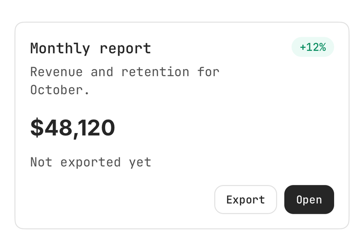
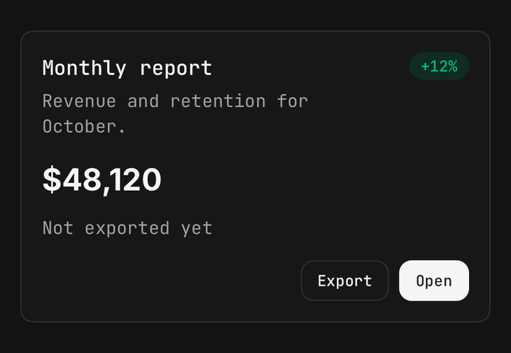
Installation
Card ships with the library — install it once, then import:
import { Card } from "@delacour/react-native-ui/card";Or copy the source into your project, to own and edit it:
bunx delacour@latest add cardUsage
import { Button } from "@/components/ui/button";
import { Card } from "@/components/ui/card";
import { Text } from "@/components/ui/text";
import { View } from "react-native";

export default function Example() {
  return (
    <View className="flex-1 justify-center p-4">
      <Card>
        <Card.Header>
          <Card.Title>Monthly report</Card.Title>
          <Card.Description>Revenue and retention for October.</Card.Description>
        </Card.Header>
        <Card.Content>
          <Text.Title>$48,120</Text.Title>
        </Card.Content>
        <Card.Footer>
          <Button size="sm">Open</Button>
        </Card.Footer>
      </Card>
    </View>
  );
}
Anatomy
<Card>
  <Card.Header>
    <Card.Title />
    <Card.Description />
    <Card.Action />
  </Card.Header>
  <Card.Content />
  <Card.Footer />
</Card>
The parts carry the padding and the card carries none, so every part lines up on one inset. Card.Action
is pinned to the header's top-right corner wherever in the header it is written, and the title wraps in
the width it leaves.
Variants
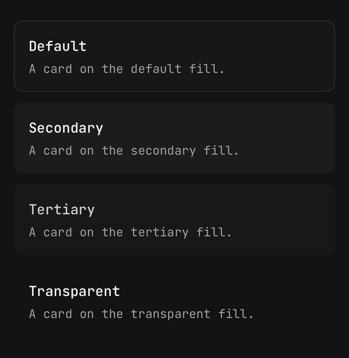
A card takes Surface's four fills. Omitted, a card on the page is default and a card inside another
surface steps to the next fill.
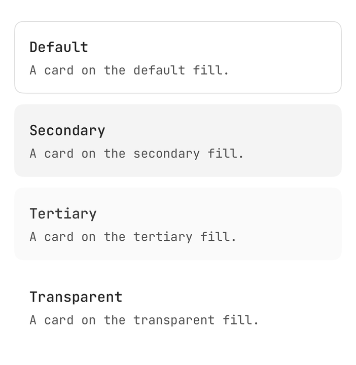
<Card variant="secondary">…</Card>
<Card variant="tertiary">…</Card>
<Card variant="transparent">…</Card>
Sizes
One axis for the inset, the gaps between the parts and the title and description scale — sm, md and
lg, on Surface's own padding steps.
<Card size="sm">…</Card>
<Card size="lg">…</Card>
Footer band
variant="band" sets the footer into the card: a rule across its top, the next fill down, and the card's
own bottom corners. Keep it the card's last child — it pulls itself down over the card's bottom padding.
<Card>
  <Card.Header>…</Card.Header>
  <Card.Footer variant="band">
    <Button size="sm">Invite</Button>
  </Card.Footer>
</Card>
Media
The card clips and its root has no horizontal padding, so media placed straight in it reaches the side
edges. className="pt-0" bleeds it to the top.
<Card className="pt-0">
  <Image className="h-36 w-full" source={cover} />
  <Card.Header>
    <Card.Title>Lake Tekapo</Card.Title>
  </Card.Header>
</Card>
Nesting
A card inside a card steps to the next fill, and a band footer inside it steps once more.
<Card>
  <Card.Content>
    <Card size="sm">
      <Card.Header>…</Card.Header>
      <Card.Footer variant="band">…</Card.Footer>
    </Card>
  </Card.Content>
</Card>
Selectable cards
A card is layout. A card that selects or navigates is a Pressable around it, which keeps the role, the
feedback and the haptic at the call site that knows what the press means.
<Pressable
  accessibilityRole="radio"
  accessibilityState={{ checked: isSelected }}
  haptic="selection"
  onPress={() => setPlan("pro")}
>
  <Card className={isSelected ? "border-primary" : undefined} size="sm">
    <Card.Header>
      <Card.Title>Pro</Card.Title>
      <Card.Action>
        <Text.Label>$20/mo</Text.Label>
      </Card.Action>
    </Card.Header>
  </Card>
</Pressable>
Composition
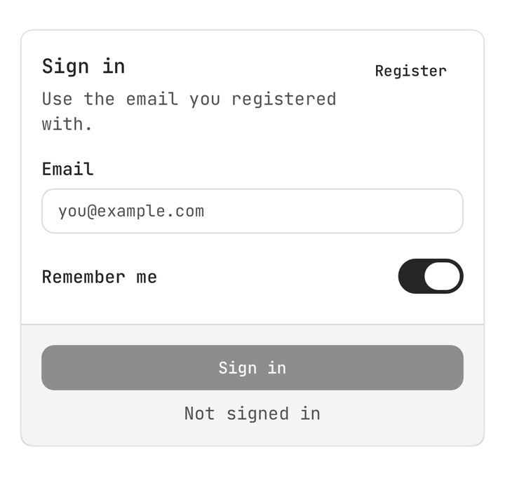
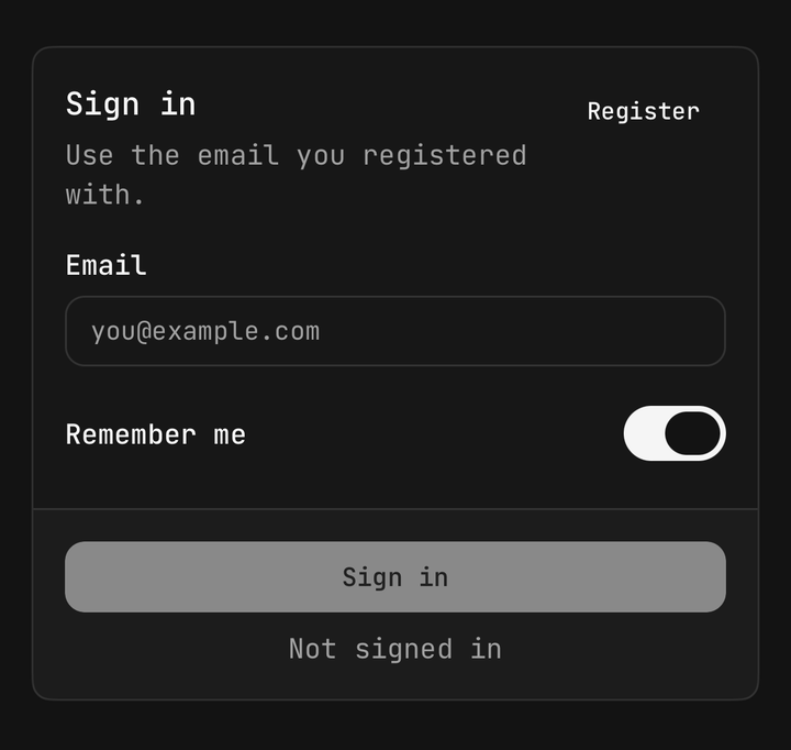
<Card>
  <Card.Header>
    <Card.Title>Sign in</Card.Title>
    <Card.Description>Use the email you registered with.</Card.Description>
  </Card.Header>
  <Card.Content>
    <Field isInvalid={isEmailInvalid}>
      <Field.Label>Email</Field.Label>
      <Input onChangeText={setEmail} value={email} />
      <Field.Error>Enter a valid email address.</Field.Error>
    </Field>
  </Card.Content>
  <Card.Footer variant="band">
    <Button className="flex-1" isLoading={isSubmitting} onPress={submit}>
      Sign in
    </Button>
  </Card.Footer>
</Card>
API Reference
Card
Extends React Native's ViewProps.
Prop
Type
Card.Header
Stacks its title and description, and lifts any Card.Action to the top-right corner. Bare text becomes a
Card.Title. Extends ViewProps.
Card.Title
The heading, on the foreground token of the card's fill, announced as a header. Extends Text's props.
Card.Description
The muted supporting line under the title. Extends Text's props.
Card.Action
A control pinned to the header's corner — a button, a badge, a switch. Extends ViewProps.
Card.Content
The body, inset to line up with the header and footer. Extends ViewProps.
Card.Footer
Extends ViewProps.
Prop
Type
useCard
Reads the enclosing card's size and fill, for a custom part that has to match it. Throws outside a Card.
Prop
Type
A card does not colour its text. A React Native View does not cascade colour to a Text descendant, so
Card.Title and Card.Description carry their own — a bare Text in Card.Content keeps the page's.