SlideButton
A handle dragged across a rail to confirm — for an action a stray tap should never reach.
Installation
SlideButton ships with the library — install it once, then import:
import { SlideButton } from "@delacour/react-native-ui/slide-button";Or copy the source into your project, to own and edit it:
bunx delacour@latest add slide-buttonUsage
import { SlideButton } from "@/components/ui/slide-button";
import { useState } from "react";
import { Text, View } from "react-native";

export default function Example() {
  const [shipped, setShipped] = useState(0);

  return (
    <View className="flex-1 items-center justify-center gap-4 p-4">
      <SlideButton
        accessibilityActionLabel="Ship order"
        isAutoReset
        onComplete={() => setShipped((count) => count + 1)}
      >
        <SlideButton.Label>Slide to ship</SlideButton.Label>
      </SlideButton>
      <Text className="text-muted-foreground">Shipped {shipped}</Text>
    </View>
  );
}
Anatomy
<SlideButton onComplete={ship}>
  <SlideButton.Label>Slide to ship</SlideButton.Label>
  <SlideButton.Thumb />
</SlideButton>
SlideButton.Thumb is composed in when you leave it out. The handle tracks the finger exactly; only
the release is sprung.
Variants
secondary, destructive and success. The handle stays neutral; the rail, trail and label take
the colour.
<SlideButton variant="secondary">
  <SlideButton.Label>Slide to archive</SlideButton.Label>
</SlideButton>
<SlideButton variant="destructive">
  <SlideButton.Label>Slide to delete</SlideButton.Label>
</SlideButton>
<SlideButton variant="success">
  <SlideButton.Label>Slide to pay</SlideButton.Label>
</SlideButton>
Sizes
The same heights and corners as a Button at each size.
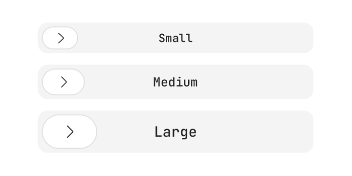
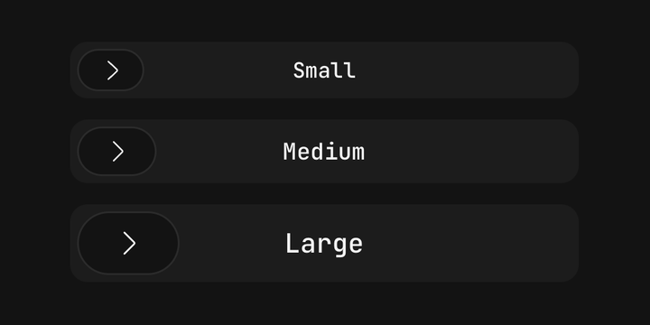
<SlideButton size="sm">…</SlideButton>
<SlideButton size="md">…</SlideButton>
<SlideButton size="lg">…</SlideButton>
Threshold
How far a release must reach, from 0.1 to 1. At 1 only a release at the far end confirms.
<SlideButton threshold={0.5}>
  <SlideButton.Label>Slide to send</SlideButton.Label>
</SlideButton>
<SlideButton accessibilityActionLabel="Delete account" threshold={1} variant="destructive">
  <SlideButton.Label>Slide to delete</SlideButton.Label>
</SlideButton>
Controlled, with slow work
The handle waits at the end until isCompleted answers, so a request in flight never looks refused.
const [isSent, setIsSent] = useState(false);

<SlideButton isCompleted={isSent} onComplete={() => transfer().then(() => setIsSent(true))} variant="success">
  <SlideButton.Label>Slide to transfer $240</SlideButton.Label>
</SlideButton>
Auto reset
isAutoReset takes the handle home autoResetDelay after it confirms.
<SlideButton autoResetDelay={800} haptic="selection" isAutoReset>
  <SlideButton.Label>Slide to clock in</SlideButton.Label>
</SlideButton>
Custom handle
Children on SlideButton.Thumb replace the chevron.
<SlideButton isFullWidth size="lg">
  <SlideButton.Label>Slide to unlock</SlideButton.Label>
  <SlideButton.Thumb>
    <Icon icon={IconUnlocked} />
  </SlideButton.Thumb>
</SlideButton>
Disabled
isDisabled fades the control and refuses the drag — the handle does not move at all.
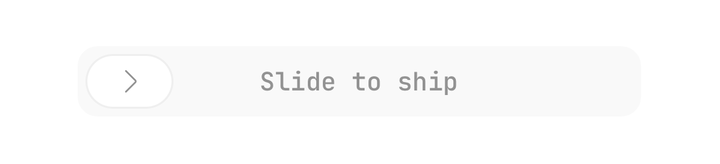

<SlideButton isDisabled>
  <SlideButton.Label>Slide to ship</SlideButton.Label>
</SlideButton>
API Reference
SlideButton
The rail. Extends ViewProps, except style.
Prop
Type
SlideButton.Label
Centred in the rail; never fades. Its text is the rail's accessibility label. Extends TextProps.
Prop
Type
SlideButton.Thumb
The handle. Extends ViewProps, except style.
Prop
Type
useSlideButton
Returns { variant, size, isCompleted, isDisabled, isRTL, offset, travel, handleWidth, glyph } — the
last four are Reanimated shared values. Throws outside a <SlideButton>.