Pie
A second root — slices, a donut hole, a gauge, and a tap that reports the slice under the finger.
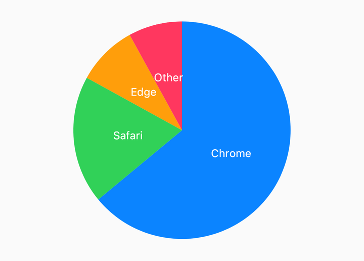
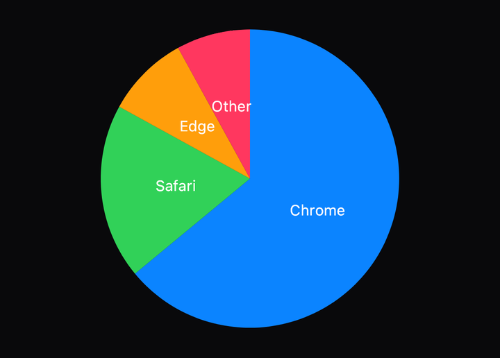
import { PieInset, PieSlices, PolarChart } from "@delacour/react-native-charts";

<PolarChart data={rows} labelKey="browser" valueKey="share">
  <PieSlices colors={["#0A84FF", "#30D158", "#FF9F0A", "#FF375F"]} />
  <PieInset color="#FFFFFF" strokeWidth={2} />
</PolarChart>;
PolarChart reads a value and a label from each row and nothing else; colours are mark props,
cycled when there are more slices than colours. PieInset strokes the edge between neighbouring
slices — in the background colour it reads as a gap, in a foreground colour as a border. Angles
are degrees, 0° at 12 o'clock, clockwise.
Donut
import { PieLabel, PieSlices, PolarChart, useSystemFont } from "@delacour/react-native-charts";

const font = useSystemFont(undefined, 12);

<PolarChart data={rows} font={font} innerRadius="60%" labelKey="plan" valueKey="seats">
  <PieSlices colors={["#0A84FF", "#30D158", "#FF9F0A"]} />
  <PieLabel color="#FFFFFF" formatLabel={(slice) => `${Math.round(slice.fraction * 100)}%`} minSweep={12} />
</PolarChart>;
innerRadius is the hole, in points or as a percentage of the radius. PieLabel prints Skia text
on the bisector of every slice at least minSweep degrees wide — a label on a two-degree slice
lands on its neighbours. formatLabel receives the resolved slice: its label, value,
fraction and angles.
Gauge
<PolarChart circleSweepDegrees={180} data={rows} innerRadius="70%" startAngle={270} valueKey="share">
  <PieSlices colors={["#30D158", "#E5E5EA"]} />
</PolarChart>
circleSweepDegrees is how much of the circle the slices fill; startAngle is where the first
begins. A half circle starting at 9 o'clock is a gauge.
Selection
const [selected, setSelected] = useState<number | null>(null);

<PolarChart data={rows} labelKey="source" onSlicePress={setSelected} selectedIndex={selected} valueKey="sessions">
  <PieSlices colors={palette} dimUnselected={0.4} />
</PolarChart>;
The selection is yours. onSlicePress reports the tapped slice's index, or null for a tap
outside every slice, and selectedIndex is what the marks read: PieSlices dims every slice but
that one. The root never changes it, so a wrapper that already keeps selection state keeps one
copy of it.
The tap overlay mounts only with onSlicePress. A pie without one takes no touches at all and
scrolls with its parent like a picture.
A single slice
<PolarChart data={rows} valueKey="share">
  <PieSlice color="#0A84FF" index={0} />
  <PieSlice color="#E5E5EA" index={1} />
</PolarChart>
PieSlice takes index or slice, the way a cartesian mark takes yKey or points. On mount
it grows out of the centre: the entrance path is the same slice at radius zero.
API Reference
PolarChart
Prop
Type
PieSlices
Prop
Type
PieSlice
Prop
Type
PieLabel
Prop
Type
PieInset
Prop
Type