Axes and grid
Tick labels in Skia text, one path for every gridline, and the root props that decide where the ticks fall.
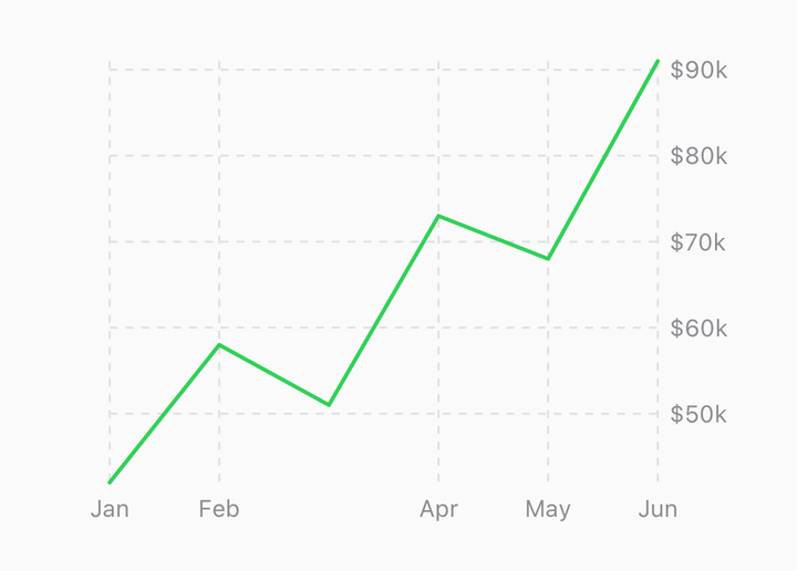
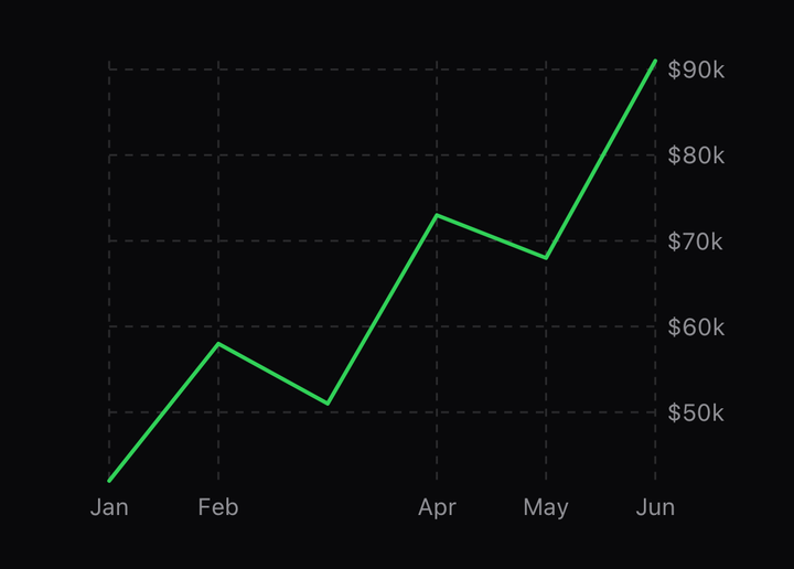
import { CartesianChart, ChartGrid, ChartLine, ChartXAxis, ChartYAxis, useSystemFont } from "@delacour/react-native-charts";

const font = useSystemFont(undefined, 12);

<CartesianChart
  data={rows}
  font={font}
  xKey="day"
  yAxis={{ tickCount: 4, formatLabel: (value) => `$${value}k` }}
  yKeys={["revenue"]}
>
  <ChartGrid axis="both" color="#E5E5EA" />
  <ChartYAxis color="#8E8E93" side="right" />
  <ChartXAxis color="#8E8E93" />
  <ChartLine color="#0A84FF" curve="monotone" yKey="revenue" />
</CartesianChart>;
The root decides the ticks; the marks draw them. ChartGrid rules the plot at every tick,
ChartXAxis prints the labels below it and ChartYAxis beside it, on whichever side it is
given. All three are ordinary marks, so they draw in the order they are placed — the grid first.
The font
Axis labels are Skia text, so they move with the canvas rather than lagging it by a frame from a
React Native view. That means they need an SkFont, passed to the root as font and called
above it — useSystemFont resolves one from the operating system, or load your own. While
font is null the axes draw nothing, and the plot rect takes the whole canvas.
The labels are measured with that font, which is how the plot rect knows how much room to leave for them: two passes, with the measuring between — see Composition.
Tick options
<CartesianChart
  data={rows}
  xAxis={{ tickCount: 6, formatLabel: (value) => new Date(value).toLocaleDateString() }}
  yAxis={{ tickValues: [0, 50, 100], show: true }}
/>
xAxis and yAxis take an AxisOptions each. tickCount is a suggestion the generator rounds
to human values; tickValues names the exact values and generates none. formatLabel receives
the domain value — epoch milliseconds on a time scale, the row's index on a categorical one — and
the tick's index.
A categorical x axis ticks on its own data, one per row, and prints the original label; more rows
than tickCount are evenly downsampled, both ends kept.
The domain
<CartesianChart data={rows} domain={{ y: [0, undefined] }} niceDomain />
<CartesianChart data={rows} includeZero domainPadding={0.1} />
<CartesianChart data={rows} domainPadding={{ x: 0.5, y: 0.05 }} padding={{ top: 8, right: 8 }} />| Prop | What it does |
|---|---|
domain | Explicit bounds per axis. Either end may be undefined to keep the data's own — pin the floor, let the ceiling grow |
includeZero | Pulls zero into the y domain. What a bar wants; a line usually does not |
niceDomain | Rounds the y domain out to tick values, so the top gridline is a round number |
domainPadding | A bare number pads y as a fraction of the extent. x is measured in steps — 0.5 is half a band each side |
padding | Space between the canvas edge and the axes, in points |
A constant series comes back with a zero-width domain and draws flat through the middle rather
than being stretched to fill the height; an empty series falls back to [0, 1], so the axis still
has something to say.
Log scale
<CartesianChart data={rows} yScaleType="log" />yScaleType and xScaleType take linear, time or log. A log domain is floored above zero,
because d3 returns -Infinity for the whole range otherwise.
API Reference
AxisOptions
Prop
Type
ChartGrid
Prop
Type
ChartXAxis
Prop
Type
ChartYAxis
Prop
Type
CartesianChart
The root's props, in full. Those above are the ones that shape the axes.
Prop
Type