Composition
Where the provider sits, the two ways a mark gets its points, and how marks share one chart.
A chart is a root and the marks placed inside it. The root does all of the arithmetic — scales, ticks, the plot rect, every row turned into a canvas point — and publishes the result through a context. A mark reads that context and draws one thing.
import { CartesianChart, ChartGrid, ChartLine, ChartXAxis, ChartYAxis } from "@delacour/react-native-charts";

<CartesianChart data={rows} xKey="day" yKeys={["revenue"]}>
  <ChartGrid color="#E5E5EA" />
  <ChartYAxis color="#8E8E93" />
  <ChartXAxis color="#8E8E93" />
  <ChartLine color="#0A84FF" curve="monotone" yKey="revenue" />
</CartesianChart>;
Marks draw in the order they are placed. The grid goes first so it sits under everything.
The provider is inside the canvas
View        onLayout, and the only thing that knows the chart's size
  Canvas    the Skia reconciler starts here
    Provider  ← rendered INSIDE the canvas, so marks below can read it
      children
  Overlay   an ordinary RN view; the canvas has no touch targets
Skia's Canvas mounts a second React reconciler, and a context does not cross a reconciler
boundary — it resolves by which reconciler renders the provider node. So the root renders its
provider as a child of the canvas, which puts it in the Skia tree, and every mark below resolves
it normally.
The consequence for anything above the chart: hooks are called above the canvas and their results passed down as values. A theme hook, a font hook, anything backed by a context of your own — there is nowhere inside the canvas to call one.
import { CartesianChart, ChartLine, ChartXAxis, useSystemFont } from "@delacour/react-native-charts";

function Revenue() {
  const font = useSystemFont(undefined, 12);
  const color = useThemeColor("primary");

  return (
    <CartesianChart data={rows} font={font} xKey="day" yKeys={["revenue"]}>
      <ChartXAxis color="#8E8E93" />
      <ChartLine color={color} yKey="revenue" />
    </CartesianChart>
  );
}
A context hook called from a mark, for a provider that sits above the canvas, returns that
context's default value — with no error and no warning. A chart painted in undefined draws
nothing.
Declarative marks read the context
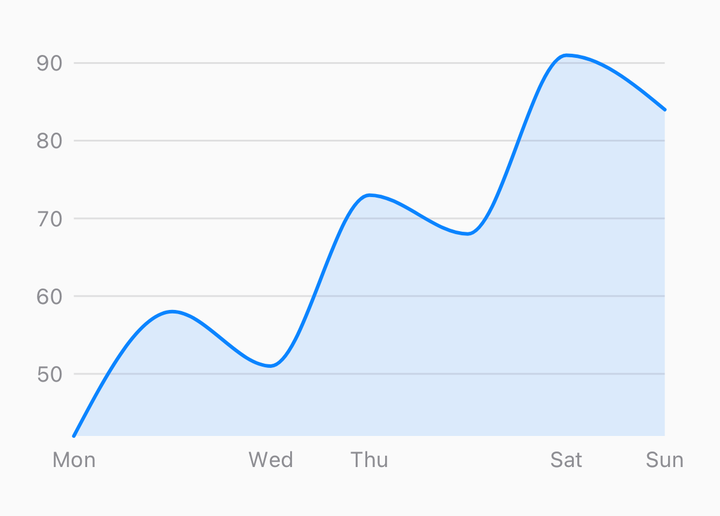
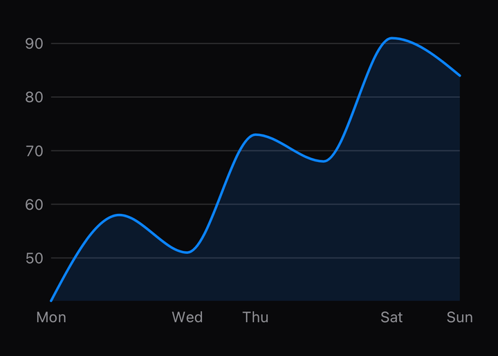
<CartesianChart data={rows} xKey="day" yKeys={["revenue", "cost"]}>
  <ChartLine color="#0A84FF" curve="monotone" yKey="revenue" />
  <ChartLine color="#FF9F0A" curve="monotone" yKey="cost" />
</CartesianChart>
yKey names one of the root's yKeys. The mark looks it up in chart.points and draws it. This
is the form to write by default — the mark owns nothing, so a data change reaches it through the
context like any other.
The render prop hands the points over
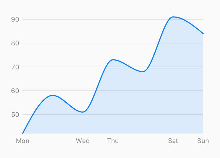
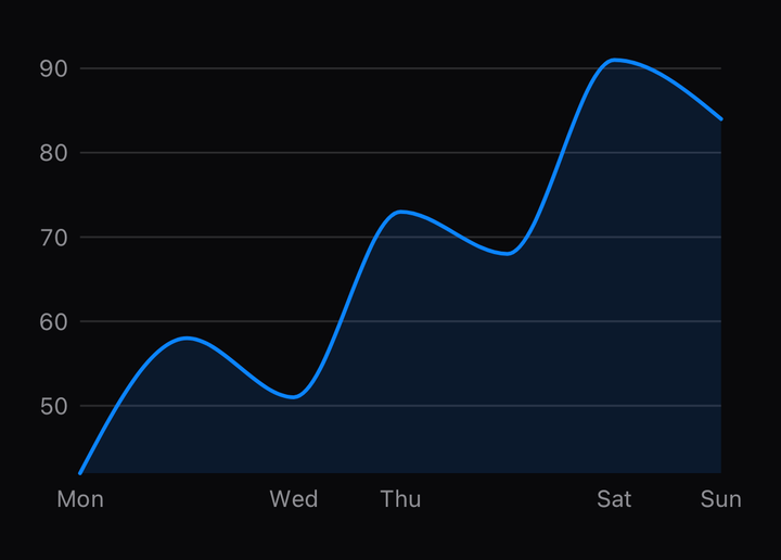
<CartesianChart data={rows} xKey="day" yKeys={["revenue"]}>
  {({ points, bounds }) => (
    <>
      <ChartArea baseline={bounds.bottom} color="#0A84FF22" curve="monotone" points={points.revenue} />
      <ChartLine color="#0A84FF" curve="monotone" points={points.revenue} />
    </>
  )}
</CartesianChart>
children may be a function of the resolved chart. It receives everything the context holds —
points, bounds, the scales, the ticks — plus data, and points is typed by the yKeys you
gave, so points.revenue is a property rather than a lookup. Reach for it when a mark's props
depend on the chart's geometry: an area's baseline, a label placed at bounds.top, a mark of
your own built from the scale.
yKey or points, never both
Every cartesian mark takes one or the other. Given points, it draws exactly those; given
yKey, it reads the context. That is one implementation serving both call sites, which is what
keeps the two from drifting apart or growing different bugs.
| Given | The mark draws |
|---|---|
points | those points, whatever yKey says |
yKey alone | chart.points[yKey] |
| neither | nothing — an empty path, no error |
ChartArea adds a third, segments, for a stacked band; it wins over both.
Data becomes a context
rows ─▶ useChartModel ─▶ ChartContextValue ─▶ marks
              │
              ├─ plan the axes against the whole canvas
              ├─ measure the labels with the font
              └─ shrink the plot rect by the gutters, rebuild the scales inside it
useChartModel runs on every data change, on the JavaScript thread. Two layout passes: tick
values are chosen against the full canvas, the labels are measured, and the plot rect is resolved
from the measurements. The tick values never change between the passes, so the measure–gutter
loop never iterates.
What the context carries, and where a mark reads it:
| Field | What it is |
|---|---|
points | One ChartPoint[] per y key, in canvas points and domain values at once |
xPositions, xStep | Where each row's category sits, and the width one row owns |
stacked | One ChartSegment[] per key in stackKeys — the band each stacked mark draws between |
bounds, canvas | The plot rect, and the whole canvas including the gutters |
xScale, yScale | The canvas axes' scales, as plain numbers |
xTicks, yTicks, xLabels, yLabels | What the axes and the grid draw |
font, lineHeight, fontMetrics | The font, or null while it resolves |
curve, animation, orientation | The root's defaults, which a mark may override |
scrub | The shared values from useChartScrub, or null |
ready | Whether there is room to draw in and rows to draw |
useChartModel is exported. A wrapper that wants the model without the root — to size a legend,
say — can call it with a canvas of its own.
Mixed marks share one chart
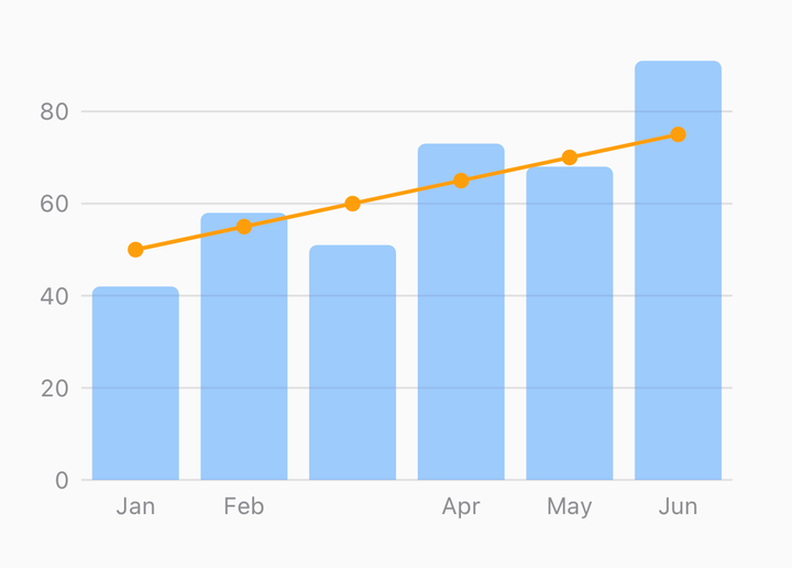
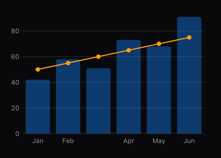
<CartesianChart data={rows} domainPadding={{ x: 0.5 }} includeZero xKey="month" yKeys={["orders", "revenue"]}>
  <ChartGrid color="#E5E5EA" />
  <ChartBar color="#0A84FF55" roundedCorners={{ topLeft: 4, topRight: 4 }} yKey="orders" />
  <ChartLine color="#FF9F0A" curve="monotone" yKey="revenue" />
  <ChartXAxis color="#8E8E93" />
</CartesianChart>
There is no band scale. A bar's width is xStep, the smallest gap between neighbouring x values,
and the root publishes it alongside the same linear or time scale the line is plotted on. That is
what lets a bar and a line stand on one x axis, one scrub and one tooltip — and it is why the
root, not the bar, takes domainPadding: only the root can widen the domain so the outermost
bars sit inside the plot.
Stacking is a root prop
<CartesianChart data={rows} domainPadding={{ x: 0.5 }} stackKeys={["web", "ios", "android"]} xKey="month" yKeys={["web", "ios", "android"]}>
  <ChartBarStack colors={["#0A84FF", "#30D158", "#FF9F0A"]} yKeys={["web", "ios", "android"]} />
</CartesianChart>
stackKeys names the series to stack, bottom first. The root stacks them in data space, before
the y scale is built, because the y domain has to cover the running totals and only the root
builds the scale. ChartBarStack reads chart.stacked and draws; a mark that stacked for itself
would draw past the top of the plot.
points[key] stays the raw series, which is what a readout prints. stacked[key] holds the
segments, which is what a mark draws — and what ChartArea takes as segments for a stacked
band.
Writing your own mark
Read the chart from useChartContext and draw with Skia primitives. It throws outside a chart,
because a mark that silently drew nothing would be a blank canvas with no error and no element
inspector to look at.
import { Circle } from "@shopify/react-native-skia";
import { useChartContext } from "@delacour/react-native-charts";

function LastValueDot({ yKey, color }: { yKey: string; color: string }) {
  const { points } = useChartContext();
  const last = points[yKey]?.at(-1);
  if (last === undefined || last.y === null) return null;
  return <Circle color={color} cx={last.x} cy={last.y} r={5} />;
}

<CartesianChart data={rows} xKey="day" yKeys={["revenue"]}>
  <ChartLine color="#0A84FF" yKey="revenue" />
  <LastValueDot color="#0A84FF" yKey="revenue" />
</CartesianChart>;
useOptionalChartContext returns null outside a chart instead, for a part that is legitimately
usable on its own. CartesianChartContext itself is exported too: a mark that needs a context of
its own inside the canvas mounts its provider the same way the root does, as a child of the
canvas.
A pie composes the same way
PolarChart is mounted like CartesianChart — a measuring view, the canvas, the provider inside
it — and its marks follow the same rule. PieSlice takes index or slice, never needing both;
usePolarContext and useOptionalPolarContext are the hooks; the render prop receives the
resolved slices.
<PolarChart data={rows} labelKey="browser" valueKey="share">
  {({ slices }) => slices.map((slice) => <PieSlice color={palette[slice.index]} key={slice.index} slice={slice} />)}
</PolarChart>
See Pie for the marks.