Line
A stroked line through one series.
import { CartesianChart, ChartLine } from "@delacour/react-native-charts";<CartesianChart data={rows} xKey="day" yKeys={["revenue"]}>
<ChartLine color="#0A84FF" curve="monotone" strokeWidth={2} yKey="revenue" />
</CartesianChart>One ChartLine per series. The whole series is one Skia path, and a change of data morphs it —
see Animation.
Curves
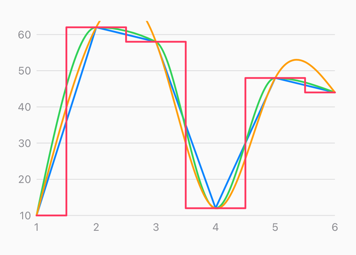
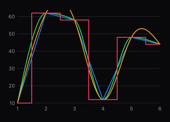
<CartesianChart curve="step" data={rows} xKey="day" yKeys={["a", "b"]}>
  <ChartLine color="#0A84FF" yKey="a" />
  <ChartLine color="#FF9F0A" curve="monotone" yKey="b" />
</CartesianChart>
curve is set on the root and overridden per mark. The root's default is linear. monotone is
the one to reach for on a value-over-time series: it is the only interpolating curve here that
cannot overshoot, so a line through non-negative data never dips below zero between two points.
CurveType | |
|---|---|
linear | Straight segments |
monotone | Smooth, and never overshoots a point |
natural | A natural cubic spline |
cardinal, catmullRom | Splines through every point, with more give |
bumpX, bumpY | A smooth step, curving at each point |
step, stepBefore, stepAfter | Horizontal runs, changing at the midpoint, the start or the end |
basis | A B-spline — see below |
basis approximates rather than interpolates: the drawn line does not pass through its own
data. A cursor dot placed on that curve will not coincide with
any datum, and nothing warns. Fine for a decorative sparkline, wrong for anything a reader will
measure.
Time series
const rows = [
  { at: new Date("2026-01-05"), users: 1200 },
  { at: new Date("2026-02-02"), users: 1450 },
  { at: new Date("2026-03-02"), users: 1380 },
];

<CartesianChart data={rows} font={font} xKey="at" yKeys={["users"]}>
  <ChartXAxis color="#8E8E93" />
  <ChartLine color="#0A84FF" curve="monotone" yKey="users" />
</CartesianChart>;
A Date in the x field makes a time scale on its own; xScaleType="time" says so explicitly for
a field holding epoch milliseconds. The ticks come from d3's scaleTime, which is what knows that
a spring-forward day is 23 hours and that months are four different lengths — a hand-rolled ladder
snapping on epoch multiples puts every tick an hour off midnight for half the year.
A scrub on a time axis inverts the touch through the same scale, so the dot lands on the nearest day rather than the nearest index.
Gaps
<ChartLine color="#0A84FF" yKey="revenue" />
<ChartLine color="#0A84FF" connectMissingData yKey="revenue" />
A row whose y value is null or missing is a gap, not a dropped row: the line breaks there
and every later point keeps its x position. connectMissingData draws straight across the gap
instead. The default breaks, because a line drawn across missing data asserts a trend that was
never measured.
API Reference
ChartLine
Prop
Type
The round cap and join are not cosmetic: a butt cap on a two-point series leaves the stroke
visibly short of its own endpoint, and a miter join spikes at a sharp reversal in volatile data.